Nada y Nada y Nada

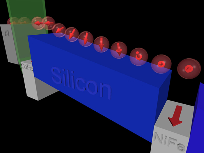
Today’s image comes to us from a University of Delaware press release about spintronics; you can also take a look at an associated animation that shows something similarly incomprehensible.

So, first off, you should know that “spintronics” refers to a flavor of electronics that relies on an electron’s spin (as well as its charge) to communicate information. It holds great promise for computation, blah blah blah, and indeed, the advances reported in the aforementioned press release sound significant. But the image…

For those who have studied quantum mechanics, the idea of spin being represented by an arrow will be familiar, but certainly the word “spin” does not connote such a mental image, and incorporating the 3-D arrow icon into the visuals (sans explanation) isn’t exactly a compelling starting point. Then, what exactly is going on, with an electron apparently splitting in two before one (half?) tumbles down a silicon ramp toward… What exactly? The whole sequence of images really, truly communicates nothing. Nada. Nada y nada y nada. Makes me feel like a nihilist.

Also, is it trying to look patriotic, with red electrons, blue silicon, and white “Al,” “CoFe,” and “NiFe” (which, taken together, look more like misspellings than chemical formulae)? The research group did get funding from the U.S. Office of Naval Research. Which also makes me feel like a nihilist.

It’s kewl that a researcher can learn to use freeware to create graphics, but that doesn’t mean the fruits of his efforts are ready for public consumption.

Have a great weekend! I myself am off to New York for a few days.

Side-by-Side

I know I already posted one hurricane-related entry this week, but I have another. This one is related to a press release from the National Center for Atmospheric Research (NCAR) about a new technique “that provides a detailed 3-D view of an approaching hurricane every six minutes.” I was curious what a 3-D view of an approaching hurricane might look like, so I followed the links, and…

I got the above. Hmmm.

To be fair, the page makes no claim for the above to be any kind of 3-D view, but it does supposedly offer a “side-by-side” comparison of radar data (on the left) and “NCAR’s ARW experimental forecast” (on the right). An animation shows the evolution of the hurricane, and as the caption duly notes, “The radar vantage point is stationary, on the Gulf Coast, while the ARW viewpoint follows the hurricane itself.” And therein lies my cavil (I’m trying to find synonyms for “gripe”).

The presentation of the images should facilitate side-by-side comparison; instead, the camparison seems hampered by the graphical choices. The change in background color strikes me as mildly annoying, but the field of view of the two images is also slightly different, and the manner in which the left-hand image obscures the state lines makes comparison even more difficult. It’s rather hard to tell how well the model replicates the observed behavior of the hurricane.

The animation only exacerbates the problems because the simulation follows the eye of the storm whereas the Doppler radar remains stationary (as noted in the caption). C’mon, folks, this is data! You can plot it however you want! Why not present it in a way that allows us to get a real feel for how well the computer model matches reality?

How to do it right, in brief: make the background of the two (observed data and computed data) as similar as possible, in terms of scale and markings (e.g., state and county lines), then plot the same quantities using the same color bar (which, as far as I can tell, is what they did in the above example). Would that be so hard?

Salt of the Earth

I think this may qualify as the oddest image about which I’ve blogged. But, um, wow. It speaks to the power of a simple photograph, although in this day and age, one could be forgiven for thinking that it’s photoshopped. At first glance, you might not even notice the people in the photo, but once you do, the image really plays with your sense of scale.

The photo comes from a landscape architecture blog, via my friend Allison Duncan. Many more pictures show up on the blog. And for more info on the caves, you can also check out the official Naica Caves website or news stories from the BBC and National Geographic.

Parallel Towers of Pisa

You’re looking at the winner of the 3rd Annual Best Visual Illusion of the Year Contest. I admire it for its simplicity. As the web page describing the illusion explains: “Normally, if two adjacent towers rise at the same angle, their image outlines converge as they recede from view due to perspective, and this is taken into account by the visual system. So when confronted with two towers whose corresponding outlines are parallel, the visual system assumes they must be diverging as they rise from view, and this is what we see.”

Spiffy!

Building Towers in the Tempest

The teeny-tiny image above comes from a NASA press release about a energy flow near the eye of a hurricane. A high-resolution TIFF of the same inexplicably eliminates the captions, leaving one with an unlabelled, multicolored, meaningless image—my favorite!

The image above bears some resemblance to a previous visualization of Hurricane Bonnie, but I’m actually not going to complain about this awful image presented with a press release of some interest. Instead, I’m going to call attention the remarkable new visualization that supports the above story. The full video (at several resolutions) and numerous stills (at resolutions of 320×180 or 144 times larger, but none in between) can also be downloaded from Goddard’s Science Visualization Studio website.

The full piece does a respectable job of explaining the whole “tower cloud” concept shown in the above image. I recommend watching it. The visuals and narration mesh nicely, telling a pretty good story. Furthermore, if you’re interested in how such media pieces come into being, you can take a look at an illustrated storyboard for the video. Well done!

Dilemmas, Ethical and Pictoral

A brief post today, in reference to today’s New York Times article, “Genetic Testing + Abortion = ???”

The caption for the image above reads, “BEYOND ROE New technology may complicate the debates over abortion.” But of course, the ultrasound technology depicted in the image is not the technology in question. Instead, we’re talking about the role genetic tests play in people’s decisions about whether to abort a fetus.

I admit that the art director in me understands why one would select an image that says “prenatal technology” over one that says something less specific to the headline. But it’s a bit like doing the wrong keyword search in Google. Much more germane to the topic would be more abstract images of magnified amniotic fluid or genetic test analysis.

This strikes me as a good example of the competing interests in selecting imagery to complement a complex story. Both image choices (the Times’ and mine) relate to the story, but one has to ask what the purpose of the image is: whether it’s to act as an attractor or to illuminate a story element. Both approaches have their faults, since I would admit that the images I dug up in two minutes’ of searching don’t exactly clarify what’s going on so much as they offer visual stand-ins for the techniques that contribute to the growing ethical dilemma.

Moon and Pen

Above, we have Ewen Whitaker’s 1954 map of the lunar south pole, which shows up as today’s Lunar Photo of the Day (LPOD), although of course, it’s not a photo… Well, why be picky? It’s a gorgeous drawing described as follows in the LPOD entry: “Despite a fleet of lunar probes and modern high resolution imaging, the best observer’s map of the south polar region of the Moon remains one drawn a half century ago.”

What strikes me as utterly compelling about the above image is what I read as simplicity and clarity in it: the bold lines that delineate craters and ridges, the dotted lines offering a sense of depth, the multiple but surprisingly unobtrusive names and labels. At the same time, these are conventions that I recognize and understand (as well as the general depiction of perspective), and I’m curious to know how a novice would read this image.

Perhaps because I draw, I find such illustrations very compelling. But I think it’s simply the human touch… Utterly apparent in the handwritten words (right down to the question marks) and the quality of the lines on the page (or computer screen). These elements pull me into the image in a way that almost no Adobe Illustrator images can.

But LPOD author Chuck Wood makes an interesting point: there is a clarity and interpretive value lent by the human touch. “The best observer’s map of the south polar region” issues from an artist’s pen, not a digital camera.

Yesterday’s LPOD tells a related but somewhat different story, comparing a drawing and a photo of the same region of the Moon. As the post says, “Sally, an experienced observer and skilled artist, captured the essence, the feeling of this area, and Simon captured the reality. ” The drawing and photo, side by side, reveal something unsurprising yet somewhat poignant. The eye and hand versus the CCD.

Magical Healing Powers

I noticed the above image in a press release about using oncolytic viruses alongside more traditional cancer treatments. The caption reads, “Recent studies also indicate that reoviruses work synergistically with standard anti-cancer drugs, providing significantly stronger responses than either agent alone.”

Sounds great, if only slightly creepy. I think of viruses as things to be avoided, but hey, if we can get the little buggers on our side, all the better.

I don’t have much to say about the picture, except that it, too, strikes me as slightly creepy. The disembodied (presumably cancerous) lungs hovering inside a transparent body that recalls Wonder Woman’s invisible jet. The glowing blue treatment entering the un-body intravenously. Everything inside a completely sterile, indeed blank and empty box. I have no idea what this image says about medicine, but let’s jsut say that it doesn’t exude warmth.

But then, I just saw the extremely compassionate Sherwin Nuland as part of my new institution’s lecture series, so perhaps I set my sights too high.

Motionless Conveyor Belt

Today’s image comes from a press release telling us that “Optoelectronic Tweezers Push Nanowires Around” (whether we like it or not, I suppose).

I’m minutes away from attending a symposium here in Edmonton, Alberta, so this will have to be brief. But I was struck, the moment I saw the above image, that I felt as though I knew what was going on. It’s analogous to a board game in which pieces are moved along a path; the thing is, it’s probably even more analogous to the cartoons used to describe a charge-coupled device (CCD), with which I’m all too familiar.

So my question is how familiar this iconography would be to somebody unfamiliar with computers and CCDs and such. Does it immediately call to mind games of parcheesi and thus convey its message clearly and concisely? Or does it in fact communicate little or nothing? The caption explains that it’s an “image of an ‘optical conveyer belt’ in which particles can be trapped while moving under the influence of electric fields,” which is probably exactly the right amount of information to convey the essence of what’s happening (in spite of misspelling “conveyor”). But what kind of mental image is the reader left with?

I guess I feel as though I’m coming at the image with a lot of (possibly erroneous) information—about electronics, about how CCDs operate, which makes me read a certain amount into the image as it’s presented. I’m curious what someone without my background (or biases) sees in it.

Anyone care to offer their $0.02?

Wee Molten Mercury

Wow! Has it really been over a month since I posted anything? I cannot apologize enough for my laxity, but I hope you will forgive me. In the last several weeks, I have actually made a leap across country to accept a new position as Director of the Morrison Planetarium and Science Visualization at the California Academy of Sciences in San Francisco, California. I talk about the shift on my Yahoo 360° blog, but in this forum, I’ll stick to kvetching about visualizations.

Today’s image comes from an NRAO press relase about measuring slight variations in Mercury’s spin rate, which leads to the conclusion that Mercury’s core is molten, not solid. Yay! Great science. But this picture… (I apologize to Bill Saxton, whose name appears so prominently associated with the picture. I don’t know you, Bill, but I have to admit that your image doesn’t win me over.) As we used to say in the 80s, “So close and yet so far.”

The caption for the image runs a little long for haiku, but not by much: “High-precision planetary radar technique sent signal to Mercury, received reflection.”

The essential point of the image, therefore, must be the little lines (with directional markings) that run between Earth and Mercury: yellow represents radio transmissions, red represents signals reflected back toward Earth (information that could have gone into the caption, I’m just sayin’…). I actually think this comes across pretty well in the picture.

But then, things go slightly awry. In addition to the elements above, we have orbit lines as well as the Sun and Venus—all confusing the central message of the diagram. I even had to do a double-take, looking at the spherical object partially eclipsed by the Sun for a moment before I realized it was Venus (i.e., the planet in between Mercury and Earth that has nothing whatsoever to do with the story). What makes matters worse is that Earth’s orbit and Venus’s seem to lie nearly atop one another! We all know the Mies van der Rohe quote about less being more, and indeed, in diagrams, the aphorism often holds true.

A further note… This strikes me as a situation in which the perspective view is not particularly helpful. A top-down view might communicate the whole situation more clearly, particularly since it would give a little more room to show the path difference between the reflected signals.

(And I can’t help but add one final complaint, which has to do with the random, speckled, “starry” background. Grrrr. We have perfectly good, real stars to use as a background, so why create unrealistic artwork when the real thing looks much, much better?)

Whew! Well, it’s nice to be back. I thought about posting something cheery and positive for my return to the blogosphere. You can see how easily that impulse was overcome!