Colorful flutter-by

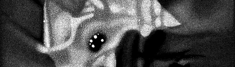
Featured on the EurekAlert news service (but inexplicably, not on the GeorgiaTech site that supposedly ran the story), I found an intriguing article on adjusting the color of butterfly wings. The above image shows the effect of depositing different thicknesses of aluminum oxide on a wing, thereby changing its color. Spiffy.

The caption for the image also strikes me as rather spiffy: short and to the point. It reads, “An optical microscope image of coated butterfly wing scales show color differences related to the thickness of the deposited alumina.” Certainly enough info for me, since I know that “nm” means “nanometer,” which presumably refers to the thickness of the aluminum oxide, also mentioned in the image, albeit by its chemical formula (but at least I know that “Al” means “aluminum,” so I felt comfortable extrapolating from the caption). In short, it strikes me as an excellent caption for the scientifically literate, perhaps not so hot for a general audience.

Great picture, regardless. And the rest of the press release is sufficiently complicated that the caption really just serves as a litmus test for further comprehension, so my nit-picking is probably irrelevant.

The press release also contains the mildly amusing line, “The artificial wing scales produced by the researchers also reflect bluish light, though the color is of slightly longer wavelength than that of the original butterfly.” At least it’s amusing if you think of “original butterfly” as a unit of distance, as I did (probably because I was still finishing my first cup of coffee). A very long wavelength, indeed.

Cellular Derailment

The weekend is wrapping up, I just got back from a long weekend in Chicago (without too many delays), and friends I ran into on the subway complimented me on this blog… I should be able to find something nice to say. But no.

I came across the above image in a press release from the Berkeley lab entitled “Regulating the Nuclear Architecture of the Cell” (which has a lot to say about how genetic material clumps in the nucleus, none of which I will discuss because I’m going to obsess over the accompanying image). Even though the press release also presents a nice picture of mutant cell nuclei and a straightforward conceptual diagram on the topic, the article leads with the above image. Why, why, why, why? I beg of you, please tell me why.

I can guess why. I’d call it the “planetarian effect,” simply because that’s where I first encountered the problem, but I suppose it could be called the “press-release effect” or “the b-roll effect” or something similar. In the classic planetarium show, cobbled together by a staff (often at the last minute), one often encounters a line of reasoning to pair images with text: “Hey, we mention the Horsehead Nebula here, so where’s a picture of the Horsehead Nebula?” And the first image that you can find is one that, yeah, shows the Horsehead, but it’s kinda small, since the picture really shows all of Orion’s belt, but at least it’s got the Horsehead in it, so the slide gets dropped in the slide tray (or the JPEG added to the file), and you end up with an image in your show that potentially causes viewers to stop, wonder what it has to do with the narration in the show, and get distracted by imagery that should in fact be helping people understand what’s going on.

I’m guessing that’s what happened here. The thought process probably went along the lines of… “Oh, we’re doing a press release on the nucleolus, so we should have an image that shows what that is.” An absolutely correct and well-intended goal! But then you have to find a decent image. And IMNSHO, the above does not qualify. The relevant part of the caption reads, “The nucleolus (dark blue) resides within the cell nucleus, surrounded by heterochromatin.” Okay. But how does the image fit into the cell as a whole? Is the entire thing the nucleus or just the blurry, less-pixelated part? And how ’bout those heterochromatin? Maybe those are the little diamond-shaped blobs? (Take a look at the Wikipedia article on “cell nucleus” for a decent image of a cell, which might help answer some of those questions. It’s actually quite similar to the one above, but with better labels and clearer lines—and intriguingly similar color choices.)

If you’re lucky, an uninitiated reader will shake their head slightly and continue reading the article. But you run the risk of losing them entirely! All because a poor image distracts or confuses them. The best intentions can completely derail your audience.

Or maybe I’m just grumpy after dealing with Newark and O’Hare in the same day.

Gorrillas off the Map

The image above comes from a Max Planck press release about the effects of ebola on gorilla populations in southern Africa, which was also published in the current issue of Science magazine. The research has disturbing implications (as discussed in a New York Times piece today), but of course, I’m interested in the diagram…

The caption for the image reads simply enough: “Protected areas with major ape populations.” But it took me a moment to absorb exactly what the image was communicating. The grey area represents the range of the gorilla; the outlined regions indicate protected areas (as per the caption). The color of the protected areas is tan if unaffected by ebola, or in the range from white to dark blue depending on the year of the outbreak(s). For some reason, I found this initially unclear.

I think it’s because the affected areas vary in value—i.e., from a very light color to a very dark color—whereas, if I were creating a similar map, I would opt for varying the value between affected and unaffected regions. To represent the dates, I’d most likely use variation in hue while keeping the value pretty much the same. (If you’re unclear on my usage of the terms “value” and “hue,” I’d recommend a page from Charlotte Jirousek’s online textbook on “Art, Design, and Visual Thinking” at Cornell University.)

Aside from the color choice, I think this is a pretty decent diagram. A fair bit of information crammed into a quite small space.

You Got Frost in My Crater!

I’m on the road again, with less-than-stellar Internet access, but here goes. Malin Space Science Systems posted a page on Cantauri Crater and another on Sirenum Crater, both of which show evidence that suggests water flowed on Mars within the last decade—in not just one but two locations! A NASA press release also describes the findings.

It’s hard to come up with a better example of a picture being worth a thousand words, because the pair of images above make the story quite clear. The light-colored gully just looks like what planetary geologists suggest that it is. N.B., however, that the later image was taken in 2005. It’s not like they downloaded the data from the Mars Global Surveyor and posted them the next day! The science team went back and observed the same features over a period of a year, under a variety of lighting conditions, in order to make sure they weren’t falling victim to a trick of light.

So with the clarity comes a caveat: the picture may tell a story in and of itself, but good researchers don’t rely on a single image to form their results.

Well-Behaved Sheep

I always wonder how people without a physics background perceive images such as the one above. It illustrates an ellipse of cobalt atoms (the series of peaks encircling the colorful, rippled interior) enclosing electrons (basically the ripples). So much symbolic language is built into this illustration that I can’t imagine it communicating much of anything to an audience not steeped in the visual parlance of physics. The cartesian plane representing the substrate on which the cobalt atoms are placed, the color-coded quantity in arbitrary units, the unexplained labels “F1”and “F2” right in the middle of everything… What does all this say to the non-specialist?

The image caption describes the enclosed electrons as “behav[ing] like standing waves in a pond.” So if uninitiated readers can wrap their heads around the idea that electrons (which they probably imagine as little particles) behave like waves, then the description might mean something to them.

That description is a far sight better than the press release from the Max Planck Society, which claims that “randomly vapour-deposited atoms arrange themselves in regular structures within the circular fencing – as if they were sheep arranging themselves neatly in a pen.” Now, I didn’t grow up on a farm or anything, but sheep don’t strike me as the most self-organized critters. I mean, if you pack any roughly regularly-shaped objects tightly enough, you often end up with patterns, but that’s not what they’re talking about here. The analogy falls short.

In short, the image above neatly illustrates a problem I touch on in my “What Is Viz?” PowerPoint, namely the challenge of a well-developed visual language getting in the way of communicating. Graphic elements that make sense when presenting data to one’s peers can prove insurmountable to a wider audience unacquainted with the (often complex) grammar and vocabulary of such a visual language.

Follow the Arrows

The above image comes from a Vanderbilt Medical Center Reporter article about mathematical modeling the behavior of tumors. Aside from the minuscule size (they seem to have no larger version online), there’s at least one bizarre omission.

In case you can’t read the teeny-tiny text in the image, it says, in clockwise order from top left: “tumor,” “tumor slice,” “tumor in lattice,” “tumor cells,” “mathematical representation of tumor growth and invasion,” and… Nothing. The last image in the series has no label. From the article, you can glean that the final result is a prediction of tumor growth, but it does seem as though that could be directly addressed in the teeny-tiny graphic.

Or maybe the message is that “mathematical representation of tumor growth and invasion” leads to… Pretty flower-like pictures? Small explosions? Low-res graphics and trapped white space?

Visualize Slacking!

The folks at Slacker Astronomy interviewed me for podcast SG 4.0, and I show up about a third of the way in (that’s 23 minutes into the MP3, although you really should listen to the entire podcast).

Aside from a not-so-hot Skype connection and a fair bit of stammering, it came out pretty well. I talk a bit about my job, the blog, and a recent astro-viz conference. If only I’d known they were chatting about Apothis earlier in the show, I could have described a bit about its uncredited cameo in Cosmic Collisions. C’est la vie. La vie de slack.

Huh?

The figure appears as part of an ESO press release about asymmetric supernovae. The closer I look at the figure, the more confused I get. I mean, the exploding star on the right indeed appears somewhat asymmetrical, but… What’s actually happening in this image?

The caption for the image reads, “Artist’s impression of how Type Ia supernovae may look like as revealed by the spectr-polarimetry observations. The outer regions of the blast cloud is asymmetric, with different materials found in ‘clumps’, while the inner regions are smooth.” Type Ia supernovae take place when gas from a companion star falls onto a white dwarf. The bright white star on the left looks suspiciously like a white dwarf, but it ain’t the one doing the exploding!

Then there’s the region of what appear to be brighter stars clumped around the “white dwarf.” Maybe that’s supposed to suggest infalling gas? But as previously noted, that’s not the star going boom.

So, yeah, I’m a little confused by this picture.

Tomography Tick-Tock

I like this image. It comes from an article in today’s Nature magazine about the Antikythera Mechanism, an ancient astronomical timekeeping device dredged up from the bottom of the sea more than a century ago. Having sat underwater for a few millennia, it experienced significant degradation, and it’s taken a while to put this Hellenic Humpty Dumpty back together again. The latest iteration on our understanding relied on x-ray tomography to gain a better, three-dimensional picture of the object’s inner workings.

And doesn’t the above image express that nicely? It obeys the common, airport-security conventions of what an x-ray should look like, as well as presenting the compelling, eroded face of the timekeeping device (as well as an inset of the same at home in a museum setting). One look and you get it: not the details, but the overall picture. And it’s aesthetically pleasing!

The research seems to be discussed on a website that remains persistently unavailable at the moment, but you can take a listen to this week’s Nature podcast. If you’re interested in more (albeit not so up-to-date) details, you can also read through Tony Phillips’s archive of “What’s New in Math to learn about the overall mechanism as well as details about its differential gears.

For those of you with a Nature subscription (or the willingness to shell out some bucks for the articles, you can read the full research letter as well as a bit of historical background that also appear in today’s issue. The story also receives coverage in a New York Times article (available for free for the next week only).

Tactilizing?

A press release from Johns Hopkins University describes work being done to incorporate haptic (i.e., touch-related) feedback to surgical systems. I first heard about such technologies when touring the University of North Carolina’s computer science department a year or so ago.

In the case of the Johns Hopkins technology, doctors using robotic surgical technology receive an additional layer of feedback, attempting to restore their sense of touch during robotic procedures. The Carolinans, on the other hand, are using a similar feedback mechanism to manipulate things at the nano-scale, making such objects feel “sticky” or repulsive (in the sense of electrical or magnetic repulsion) via feedback from a mechanical interface.

This is kewl.

While not necessarily “visualizing” data, it is interaction that offers a remarkable way of interacting with datasets. It would be great to see technology like this in a science center—can you imagine stepping up to a display and being able to feel the electrical forces in a 3-D molecule? Or maybe you could touch an image from an electron microscope? Or perhaps you would be exposed to gravitational or pressure differences on a variety of planets? Sounds like (insightful) fun to me.