Pros and Contrails

Sometimes a picture really does communicate a concept simply and clearly—particularly when it’s an image of a familiar object or phenomenon seen from a different perspective. That’s what’s great about imaging Earth from orbit, since it provides an opportunity to view our home planet in a new way.

As explained in an impressively clear and simple caption page, the image above shows contrails over the Midwest as imaged by the Terra satellite a few days ago. Everyone who looks up at the sky over the United States knows what a contrail is, but wow, take a look at the durn things from orbit! Hmmm. (Second-order question: I wonder what that does to the atmosphere…)

Also, note the unobtrusive scale and directional markers! Yay!

For obvious reasons, this reminds me of one of the winners of the NSF/Science magazine 2006 Visualization Challenge.

By JoVE!

[Image taken offline.]

The Journal of Visualized Experiments (JoVE) makes its debut later this week, although some videos are already online. JoVE presents videos of (presumably common) advanced laboratory experiments, to help graduate students understand how experiments are done properly.

As a less-than-gifted laboratory kind of guy (although I can solder really well), I can understand the need. A Nature article about JoVE begins with the story of Cemille Guldal, a graduate student at Princeton, who claims that, &ldquoFor about a year, my boss thought I was completely incompetent because I couldn’t replicate those beautiful published pictures.” Turns out she’d been scrubbing away surface yeast instead of washing it under running water. Ooops.

The above image is a snapshot from a page on “Monitoring actin disassembly with timelapse microscopy,” which is approximately as exciting to watch as it sounds; however, I have no doubt that I’d nod off more quickly if I had to read directions for the experiment. Interestingly, the video ends with a cartoon of what’s taking place—having seen reality, one then needs to superimpose a means of integrating the experience into the mental constrcuts provided by your textbooks and other instruction. What better mental stand-in than a diagram?

Unfortunately, I don’t see a way to step through the videos on the site. I dug around the source code and found the video file, which I downloaded, resulting in a WMV file I couldn’t play (I use a Mac, of course, but I do have the appropriate software, so, I dunno…).

As I look at the above image, it reminds me a little of the one I posted yesterday. Hmmm. At least, they’re the two images I’ve presented thusfar that are most like abstract art.

You Can Tell by the Arrow

The above image comes from today’s ESA press release about the discovery of a nova near the galactic center. It shows two x-ray images of a nova-like event brightening near the galactic center. You can tell because of the arrow. (Duh!)

I would think that most people would have the same initial reaction I would… So what are all the other blobs brightening, dimming, appearing or disappearing between the images? Doesn’t that merit a mention in the press release or the caption? The text suggests an answer (follow-up of a particular event revealed it to be something special, which isn’t necessarily obvious from a single image or pair of images), but a little greater clarity would be nice.

We are also treated to an artist’s impression of the nova, which shows the red- and blue-shifting of the light in the disk and jets around the compact object—without bothering to offer any explanation. C’mon, what’s one more sentence between friends and surfers?

Was Lost But Now Am Trouvelet

Browsing through the New York Public Library (NYPL) Digital Library collection, I ran across Trouvelot’s drawing (well, chromolithograph) of the planet Saturn, as observed on 30 November 1874. A beautiful drawing at first glance, but as I looked at it more, I grew troubled. Care to guess what troubled me?

Aside from being (at least partially) responsible for introducing the gypsy moth to North America, Etiene Leopold Trouvelot worked for the Harvard Observatory and executed numerous drawings of “celestial phenomena as they appear to the trained eye and to an experienced draughtsman through the great modern telescopes.” A search through his drawings available from NYPL shows some pretty psychedelic stuff (check out his voluptuous, almost sexual sunspots), but given that astrophotography was still in its infancy, it makes sense that “an experienced draughtsman” would be given the task of reproducing what was seen through the eyepiece.

I have previously blogged on the challenges of using artwork as a basis of scientific communication, but I’m surprised by a major failing of this image—namely, the depiction of Saturn’s shadow on its rings. From Earth’s perspective (and presumably, Trouvelet was observing from a terrestrial vantage point), the Sun always appears to “our back” and Saturn’s rings look basically fully lit, with only a sliver of shadow at most—the highly angled, asymmetrical lighting shown in the image above simply isn’t possible. Furthermore, the shadow doesn’t appear to fall from the disk of the planet (it doesn’t line up properly), and it also suggests that the rings are not planar.

Given what was known 125 years ago about the solar system and Saturn, Trouvelet should have known better than to draw Saturn in this manner. It’s totally non-physical! And this is after he’d been working for Harvard for two years! And even if Trouvelet thought it appropriate, why would the astronomers for whom he worked allow such images to be printed?

I’m terribly confused…

This guy walked off with the Valz Prize from the Académie Française (whatever that is)? He even got a lunar crater named after him? And what exactly was his contribution to science? On the one hand, I would hope that he could have let go of some of his self-imposed prejudices (e.g., his art-deco Mars or his ouija-board meteors), but on the other hand, I wish he could have imposed more common sense on his drawings as well. Perhaps those are mutually exclusive, but looking at Trouvelet’s work, is it difficult to understand why people believed there were canals on Mars?

More 3D Dangers

I honestly pay little attention to Astronomy Picture of the Day (APOD), but it drew my attention to the image above (describing it as “a just-for-fun 3D presentation of the Mercury transit”). Hmmm.

If you take a look at the original source of the image, you can also find a Flash animation of the image and a “3D orbit” of the same. My issues? Fake stars for a start (in the animated versions of the above image, and admittedly, you want something in the deep background to optimize the dimensionality), although that’s just a pet peeve. Also, creating artificial stereo and labeling it as the ”transit” seems very deceptive to me (why not take two successive images of the transit from the same location on Earth, then create a stereo pair from them, which would reveal more about the underlying phenomena). And the “3D orbit” is utterly bogus and reinforces confusions that many people have about the scale of planets and their orbits.

At least the APOD description made it clear that it’s“just for fun.” Some explanatory text (aside from the sources of the imagery) would be helpful on the source page, too. For example… “Since the 17th Century, observations of planetary transits have allowed astronomers to determine the three-dimensional scale of the solar system—the actual distances between the Sun and planets. This 3D view of Mercury and the Sun pays homage to that achievement, using spacecraft data in lieu of actual terrestrial observations.“ Or something similar.

Honestly, I feel bad about being such a critic, especially since the Sungazer website, which offers scads of gorgeous images of the Sun in various wavelengths. It represents the work of one guy working on his own, and obviously, Greg Piepol is providing a great service to the web community. My kvetching should not be interpreted as any kind of indictment.

In the Womb (and the Dark)

An article in The Daily Mail reports on a new documentary from National Geographic showing the development of three mammal species—dog, elephant, and dolphin—from conception to birth. The Daily Mail piece suggests that a variety of techniques were used, including direct imaging.

The caption for the above image includes a credit for “CGI Artist, Steve Gomez,” which doesn’t tell much of a story. A “Behind the Scenes Facts” page goes into some detail on “4-D ultrasound” techniques (although the very phrase obfuscates the simple fact that it’s just 3-D scans in time), but how those data are reconstructed into the imagery used in the show gives me pause. Briefly, during the preview, one sees what appears to be raw data from the ultrasound. showing the dog fetus moving around—let’s just say that it’s not as spiffy as the elephant above.

The main page of “In the Womb: Animals” also features an interactive timeline that I quite fancied. Perhaps they’ll add greater detail on the process used to go from low-res ultrasound to slick 3-D (um, 4-D) animation.

What Are the Chances?

Two violent physics simulations in one day?

A friend just pointed me to a post by David Pogue at The New York Times in which he describes Line Rider, an online applet that allows you draw (potentially dangerous) terrains that a little sledder proceeds to cruise along (potentially fatally), subject only to the law of gravity. Oddly enough, Seed magazine’s “Daily Zeitgeist” for today linked to a video on YouTube that also uses physics simulators for nefarious ends.

It’s about time we brought some humanity to an otherwise abstract science!

Compressing 3-D into 2-D

The Ulysses spacecraft has just started its second pass over the Sun’s south pole, and NASA illustrated the orbital geometry with the above diagram. Perhaps they’re slightly embarrassed by it, because I couldn’t find a larger version online.

What’s wrong with this image? Let me count the ways… First off, what’s the spacecraft doing on Jupiter’s orbit? But more importantly, what’s going on with those dashed lines? The one connecting spacecraft perihelion and aphelion, fine. The one proceeding downward from perihelion, also fine—that follows standard convention and indicates that the spacecraft’s orbit is passing below the plane of Jupiter’s orbit. But the one connecting “2006” and the little, unlabelled star? What’s up with that? Even though I know better, I initially interpreted the orbit to pass above the plane of Jupiter’s orbit at that point. Plus, “2006” seems to lie on Jupiter’s orbit (albeit in a different spot from the spacecraft cartoon). And what does the little star indicate, anyway?

Then, to add insult to injury, look at the blue triangles representing Ulysses’s polar passes. The top one, lying above the plane of Jupiter’s orbit, looks okay, but the lower one doesn’t obey diagrammatic conventions at all and appears to pass in front of Jupiter’s orbit line. Argh! The tools for creating visuals are more powerful than ever before, but powerful tools do not good visuals make.

The ESA announcement does a better job with its figure depicting the orbit, and I think it’s more accurate to boot.

The best option of all, in my opinion, is an applet that allows you to rotate around a model of the solar system in three dimensions (also available in a smaller-sized and presumably less graphics-intensive version).

It’s always a challenge to represent three dimensions in two, but the above illustration is a brilliant example of how not to do it.

Poor Genesis

You may remember the Genesis mission as the one that crashed in the Utah desert a few years ago. Its mission was to study the solar wind by collecting samples of particles trapped in “concentrator targets.” The craft’s hard landing (a parachute didn’t deploy properly) threatened to compromise the mission goals, but in fact, curators claimed that many of their science objectives were attainable.

But it took a lot of elbow grease, which is perhaps why so many pictures to come from the mission show people working with samples—cf. the above image. The subtext is, “We’re working on it!” Or perhaps, “Science is hard!” But the science itself gets shortchanged.

Thus, when you read the press release about the new findings (inexplicably released three full days after the research article in Science magazine), you get no references to the animations and illustrations that have been created to support the Genesis mission educational goals. I find this rather puzzling.

The science results, BTW, are interesting. By studying isotopes of neon and comparing Genesis measurements to lunar samples, scientists have ruled out long-term variability of solar wind fluxes, as had once been proposed. Reassurance about the stability of the Sun—pleasant and comforting knowledge, I’d say.

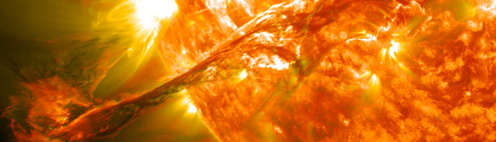
(Having referenced the Wikipedia solar wind article above, I just have to note that it has a bizarre collection of images on it. For example, the topmost image, aside from being non-intuitive as an introductory thought, could do with a label on, say, the Sun. Without question, it requires a better, more descriptive caption, and I know, because it’s Wikipedia I should just write one, but first, I need to complain. To add insult to injury, “This is a featured picture, which means that members of the community have identified it as one of the finest images on the English Wikipedia, adding significantly to its accompanying article.” Um, yikes! This strikes me as an example of people who understand the image admiring it for its content without thinking about how others might interpret it.)

Circle—Er, Tree of Life

I just ran across the above image, although it has evidently been around for a while. It shows about 3,000 species, arranged in a circle and linked by relationships revealed through analysis of subunit rRNA sequences. A fuller description on the Hills/Bull Laboratory website gives more details, as well as a PDF that allows for either large printing or significant zooming.

What I find absolutely intriguing about this is that the diagram really only offers aesthetics over other illustrations of the Tree of Life, perhaps linking as it does to the “Circle of Life” concept (insert cheesy Elton John ballad here). Siyo Nqoba! But really, the circular representation has no meaning; it just looks good. And there’s absolutely nothing wrong with that, particularly since it evidently continues to inspire people to blog about it. Let’s hear it for aesthetics!

Anyway, for kicks, compare the above to Darwin’s 1837 sketch of branching species, as he was beginning to work out the concepts we now know as Darwinian.

To digress further… Does everyone know about the Darwin Correspondence Online Database? Hours of fun! But sadly, the database privileges the written word over the drawn image, as in this letter to Huxley, which ends with an annoying “DIAGRAM HERE.” Grrr.