Visualizing Subjectivity

An article in today’s Science Times describes the artwork of Anne Adams, who suffered from frontotemporal dementia (FTD), which effectively rewires the brain in a way that can produce compulsive behaviors ranging from shoplifting to increased creativity. Adams, as you may guess, exhibited signs of the latter, increasing her output (and some might say her innovativeness) as an artist.

Some of her drawings and paintings appear on a web page from the UCSF Medical Center (“UCSF” refers to the University of California, San Francisco, BTW, so this is a shout out to my new homies) as part of the Patient Art Gallery of their Memory and Aging Center. The title of the above image is “Migrane,” which got me to thinking…

While it might be a little overblown to equate Adams’s drawings with a totally different condition, I nonetheless immediately thought of the effects of Charles Bonnet syndrome, when a person’s increasing blindness can occasionally result in vivid hallucinations—resulting from brain stimuli “bleeding over” into the visual cortex, if I can be forgiven for such a slapdash description.

I first read about Charles Bonnet syndrome in V S Ramachandran’s brilliant Phantoms in the Brain, which has much to recommend it if you’re at all interested in brain physiology—hateful as it is to think of one’s grey matter as, well, matter. As I recall, Ramachandran suggests that some of James Thurber’s later drawings may have been partly inspired by the hallucinations he experienced. Of course, I read the book about nine years ago (and it currently sits, unpacked and unavailable for review, in a box until I get my new office), so my recollection may have suffered.

The folks at Damn Interesting had a damn interesting entry about the syndrome earlier this year.

At any rate, I often like to talk about the subjectivity of science visualization, but these examples take subjectivity to the ultimate level: the completely subjective experience of an individual’s brain state.

(Oh, and happy birthday, Mom!)

Theorems as Decoration

An article in this week’s Science News describes mathematical decorations known as sangakus—visual representations of geometric proofs that appear in Japanese temples. The article shows a sample theorem, but I find particularly striking is the use of mathematical representations for their aesthetic impact—presumably both visual and intellectual.

Tony Rothman presents several high-resolution images of sangaku on his web page, and he has also coauthored the forthcoming Sacred Mathematics with Hidetoshi Fukagawa. With any luck, that volume will shed additional light on the topic and offer a much more complete perspective on the intersection of mathematics and aesthetics in a seemingly unusual venue.

(Rothman, BTW, has authored several books: including The provocative Doubt and Certainty, which looks at epistemological questions in science from both Eastern and Western perspectives, and
the more light-hearted Everything’s Relative: And Other Fables from Science and Technology, which presents a laundry-list of oddities from the history of science. At least, those are two of his that happen to grace my shelves.)

Skytruth II: The Wrath of the Satellite

A colleague pointed me to an announcement from the Environment News Service about how bottom trawling (an industrial fishing practice that scars the seafloor) is visible from space! Witness the above, a Landsat image taken off the coast of Louisiana (admittedly, in 1999, but there are many more images where that came from).

The images come from Skytruth, a non-profit organization that uses “remote sensing and digital mapping to educate the public and policymakers about the environmental consequences of human activities, and to hold corporations and governments to higher standards of accountability around the globe.” I saw a presentation by these folks at the International Symposium on Digital Earth, and in fact, I blogged about them at that time. Great work…

Visualizing Refuse

Quick post. A friend pointed me to a page of work by the photographer Chris Jordan. The image above “depicts two million plastic beverage bottles, the number used in the U.S. every five minutes.” The actual image measures five by ten feet, and the web page zooms in on views of the individual bottles.

Um, yikes! I want to see these in person… I think.

Muddled Maps

Last weekend, I saw the spectacular film Helvetica, which, as you might expect, discusses the infamous typeface. But the film delves deeply into the history and motivations for design over the last several decades, and it provides some thought-provoking glimpses into the minds and attitudes of several major designers.

Browsing the Helvetica website, I came across a clip of Vignelli showing remarkable disconnect from reality as he discusses the 1972 subway map (a section of which is replicated above, although the entire map is online, too). It’s amazing how he can’t perceive the practical failures of his design…

(A friend pointed out that these comments are a little difficult to understand out of context. So, to clarify, here’s a current map of the New York City subway system. Not the tangle of lines around Lower Manhattan and Brooklyn; those become incomprehensible in Vignelli’s version.)

As usual, I see this somewhat in the context of the theme of the “What’s Viz?” PowerPoint I give occasionally. When we forget the reason for which we design something, the results can utterly fail us. When astronomers attempt to communicate with broad audiences using a visual language intended for their peers, problems develop. And when designers allow aesthetics to trump function, subway riders get confused.

Anyway, I know this ain’t sci viz per se, but it’s on my mind…

BTW, the Helvetica site also links to an entry on Design Observer about the map, and although the author seems not to disagree with me, he chooses his words a bit more kindly. You can also reada blog entry that talks a little bit more about the London Underground map that inspired Vignelli, which links to the original 1933 map designed by Harry Beck.

Independently, I also ran across a fellow at Columbia University who has created his own Vignelli-inspired version of the MTA, and it’s current! Use at your own risk.

The Duelity of Nature

Thanks to a post on my friend David’s blog, I just ran across Duelity. It tells two creation stories—one from Genesis, one from modern science—using contradictory visuals and verbiage.

The introduction to the site hints at the conceit:

“According to the records of the General Organization of Development labs [GOD] it took a mere six days to manufacture a fully-operational universe, complete with day, night, flora and fauna, and installing Adam as its manager to oversee daily functions on Earth.

“If thou shalt believe the Book of Darwin, [’tis] five billion years after The Big Bang that we behold what the cosmos hath begat: the magma, the terra firma, the creeping beaste, and mankind, whose dolorous and chaotic evolution begat the gift of consciousness. ”

You get the idea. What I find interesting is that the approach is mirrored not just in the language used but also in the imagery that tells the stories. The General Organization of Development flick uses the visual language of a corporate training video, while the Book of Darwin employs an illustration style that recalls renaissance prints and stained glass. Brilliant stuff, really, and particularly impressive when viewed side-by-side, with the separate narratives intertwined.

I would say that I kind of object to the final tag line, though: “Duelity is a split-screen animation that tells both sides of the story of Earth’s origins in a dizzying and provocative journey through the history and language that marks human thought.” “Both sides”? As if there were only two…

Mars versus HTML


What started out as an impassioned diatribe turns out to be a mere complaint about HTML…

I get press releases in my email. They have URLs. I follow those URLs and (once in a while) end up writing about the press releases on my blog. So, this morning, I received “ESA: Mars Express watches a dust storm engulf Mars,” which pointed me to a page on the ESA site that featured the three images above, inset at different points in the article, and described (from left to right) as, “a dust storm on Mars,” “temperatures in the Martian atmosphere,” and “Mars – thermal radiation spectra.” I clicked on the wee pictures, hoping to be linked to something—nada—and looked for a link to a page of graphics that might offer some explanation—nada y nada y nada.

My ire began to build. That’s an artist’s conception of a dust storm, not an actual image! It should be labelled as such! And those graphs, lacking any axes, any interpretation? Argh! Then I noticed the URL. “SEMPWD361AF_index_2.html”? Hmmm. I changed the “2” to a ”1,” and lo and behold,… A whole page about the images.

Then I remembered the typical ESA page-naming scheme. I changed the “1” to a ”0” and found exactly what I expected in the first place.

So what can I say now? Other than recommend the email notices include the top-level ”index_0.html” link? Well, I think the caption for the animated dust storm should clearly say “artist’s rendition.” And the abscissas in the temperature plot should match. Otherwise, I guess I just have to get started with my day…

Trailing APOD

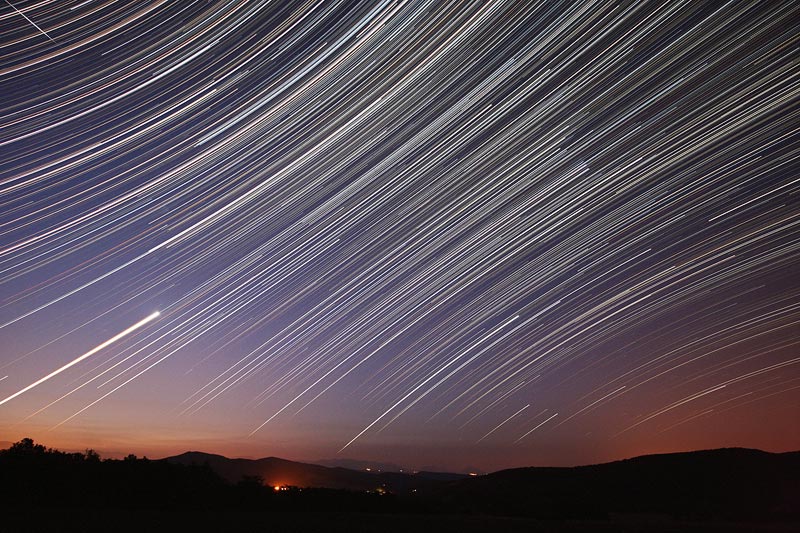
I’m not the biggest fan of the Astronomy Picture of the Day (APOD), but today’s post is pretty kewl. What you see above is a time-lapse image of the sky (well, actually, 477 30-second exposures taken over a period of 4.3 hours) that reveals the apparent motion of the stars that results from Earth’s rotation. I’ve never seen a wide-angle image that shows the celestial equator crossing directly across the image: thus, the star trails in the upper left and lower right appear to arc in different directions. Neato.

The image was taken (and is copyrighted) by Koen van Gorp.

Antarctic Mysteries

An article in today’s New York Times describes new websites from NASA and from USGS, showing high-resolution imagery of Antarctica. Check it out now before it all melts away!

I have some quibbles with the operation of the USGS site (the Java applet behaves a little oddly, provides effectively no information about the location displayed, and shows a map of Antarctica surrounded entirely with white), but it holds promise. And the NASA site has some spiffy stuff…

The image above comes from the “Antarctic Mysteries” game, which presents several unidentified photos for the viewer to identify. As a “game,” well, it’s not the most compelling, but I imagine I’m not the only person who looks at the grid of pictures, wonders what such-and-such might be, then clicks on the link to find out. Abstract and unusual, the images seem quite compelling.

What I truly admire, however, is the little extra info that the site provides about each image. For example, the feature above is about 25 kilometers across, located at 79°S, 80°W. Even better, the description includes a note: “This image appears darker than bright white snow because it has been enhanced to make slight contrasts in the snow more visible.” Excellent! Now, that wasn’t so hard, was it? One itsy-bitsy little extra line of text? Good work, NASA!