Mouse Brains!

I am far too queasy ever to dissect a mouse; that’s why I went into the physical sciences. That’s also why I appreciate tools that allow me to experience biology from the comfort of my desktop.

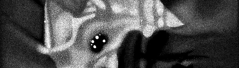
I took the above snapshot from the “Brain Explorer” program available (for both Windows and Macintosh) from the Allen Institute for Brain Science. It shows (what else?) the structure of a mouse’s brain. Turns out the little critters, inbred as they are, display little variation in their brains’s structures, making them easy to compare to one another.

So you’ve got your 3-D model of the rodent’s brain. After loading a gene database into the Brain Explorer, one can rotate around the structure, displaying the loci of activity for the gene as well as adding or subtracting 3-D overlays (or 2-D slices) that show different parts of the brain. Fiddling with the software made me think about how novices must react to the Digital Universe data and software that my institution makes available: ignorance of the underlying science makes it rather enjoyable to fly around, but I don’t think I’m extracting much useful information from the experience.

Of course, I’m not the audience for the software. In a story that appeared in today’s New York Times “Science Times” section (rapidly picked up by Reuters, too), several brain researchers interviewed claimed that the resource is of remarkable value to their community. Complemented with some supporting material (as we do with our atlas of the Universe), it might make a fascinating tool for students or even interested aficiandos.

On the Allen Brain Atlas site, more sophisticated 2-D tools are available to analyze the existing data.

Photographic (Quantum) Loops

The image above represents “loop quantum gravity,” selected somewhat arbitrarily from Carlo Rovelli’s website. The inspiration for this image choice came from a lecture held at the Hayden Planetarium just last night. Lee Smolin showed up to promote his new book, The Trouble with Physics, which I will admit up front I have not read (although a copy now sits in my office, waiting for my attentions).

The use of a photographic subject to illustrate a highly abstract concept intrigues me greatly. In contrast to the award-winning attempt to make a tremendous amount of data look photographic, we have here a photograph attempting to make a tremendously complex concept look real. Furthermore, Rovelli offers the image (and another) effectively without comment, stating only that it gives “an intuitive picture of the ‘loopy’ structure of space predicted by loop quantum gravity at very short scale.” Hmmm.

The problem with expecting intuition when confronted with an image—particularly an image intended to function essentially as a metaphor—is that intuition is a hard-won and highly specialized skill. Personally, my intuition on astronomical imagery is quite respectable; on physics, pretty decent; on biology, almost non-existent. So the message that I will extract from Rovelli’s images differs tremendously from his own reaction, I’m certain, and a layperson’s response could have little or nothing to do with the specialists’ interpretation.

Smolin’s lecture (and presumably his book) suggested that physics needs to go back to its experimental roots, reconnecting highly-complex concepts to observable events, such as gamma-ray bursts, that could provide a real-world (or -universe) evidence for esoteric theories. A podcast of the lecture is scheduled to appear on Seed magazine’s website in the not-too-distant future. Keep your eyes (and Internet connections) peeled!

The Way of the Dodo

Like many research organizations, the Royal Society has a “Picture of the Month” that it displays on its web page. This month, they reproduce the image above, a 19th-century lithograph based on a 17th-century oil by Roelandt Savery. I would like to draw your attention to a critical attribute of this lithograph: it sucks. Particularly if you have no idea what a dodo looks like.

Comparing the above image to Savery’s most famous oil of a dodo, it seems as though the 19th-century copyist (somebody named “Erxleben”) may simply have lacked talent. Admittedly, the caption on the web site indicates that it merely reproduces “a small detail” of the lithograph, but even at that, it’s hard to take the person’s skill seriously.

I choose this image to highlight how far we’ve come. Three-dimensional computer reconstructions and digital images from spacecraft a billion miles from home are only the tip of the iceberg! We have a plethora of techniques to take scientific data and transform them into pictures. But the work started with scientists and artists putting pencil to paper, or brush to canvas, or crayon to limestone,… Photography, of course, only started in the middle of the 19th Century, and digital imaging techniques are thirty-some-odd-years old.

What we now take for granted is the fidelity of a representation to its sources. Specialists might quibble over the use of color or the “fixing” of errors such as bad pixels, but fundamentally, we all think of contemporary visualizations as accurate in a way that few drawings or paintings, even those executed by gifted artists, could ever hope to be. When you couple that inherent limitation with the potentially incompetent skills of a secondary or tertiary artist such as, say, Erxleben, then you quickly see how successive copies of a work used to grow worse over time. (For another good example, compare Galileo’s orginal delicate watercolors of moon phases with the respectable engravings he commissioned for Siderius Nuncius as well as the mediocre woodcuts that appeared in a knock-off, unauthorized printing of the same.) We no longer need to worry about such things.

Of course, there are plenty of other things for science visualizers to worry about (or at least consider and mull over). That’s why I started this blog, after all…

Visualization Challenge

The National Science Foundation and Science magazine sponsor an annual “Visualization Challenge,” and you can see this year’s first place winner in the photography category above. What I find interesting about the choice is that this image is not a photograph at all: it’s actually a two-dimensional representation of a three-dimensional reconstruction, pieced together from some 60,000 200-micron-thin scans of the mummified remains. For purposes of the competition, the photography category includes “film or digital photographs and photomicrographs, as well as images obtained from electron microscopes, STMs, AFMs, telescopes and similar instruments,“ which is even more simply defined as “images created by sensors.” A rather expansive definition…

Other winning images and multimedia pieces can be seen in a slide show from Science magazine or on a web page at the NSF site. Interestingly, no astronomy visuals appear in the winning entries.

I worked on a piece that garnered attention in the very first Science & Engineering Visualization Challenge, and with our most recent show in the can, perhaps we will enter again next year. Until then, the 2006 winners offer some pretty delightful imagery—I particularly like the visualization of air traffic over the United States.

Mars Facial Reconstruction

The Face on Mars is back! Now using data from the Mars Express orbiter, we have the above reconstruction of the site that was orginally observed by the Viking orbiter back in 1976. The lighting in the original image (as well as a few “bit errors” in the transmission of the data to Earth) made the geological feature look a little like a face, which of course caused some people to speculate that Martians built the site to resemble a face.

The whole story gets interesting on many levels. First of all, no one denies that the initial image looks like a face: people differ on the explanation, however, divided between those who attribute it to Martians and those (including me) who atrribute it to the human propensity for seeing faces everywhere. Humans have evolved to recognize faces, so our brains are built to see the pattern clearly, even when reduced to its simplest elements (think yellow smiley face).

The other thing I find interesting from a science visualization standpoint. The new Mars Express image is not a “picture” of Mars in the same way that the 1976 image is. Instead, it is a reconstruction of data taken by a stereo camera on the orbiting satellite. Basically, you can use information from multiple images taken along a single orbit to reconstruct the three-dimensional shape of the geological formation. But the image as presented is not like a point-and-shoot photo of the site.

So you can almost see where the argument that pro-Martian face-makers could go with this… The orginal image supposedly had “errors” that made it look more like a face. To make the thing look less like a face, those scientists have to resort to all kinds of fancy technical trickery! Such are the complex origins of images to which we are exposed.

Speaking of a Pale Blue Dot…

I referenced this image in my Yahoo 360 blog, but it’s worth presenting again. Taken by the Cassini spacecraft (currently in orbit around Saturn), it shows Earth as a point of light viewed through Saturn’s rings. You can read more about the image on NASA’s Cassini page. As Carl Sagan wrote, regarding a similar image: “Our posturings, our imagined self-importance, the delusion that we have some privileged position in the Universe, are challenged by this point of pale light. Our planet is a lonely speck in the great enveloping cosmic dark. In our obscurity, in all this vastness, there is no hint that help will come from elsewhere to save us from ourselves.”

Visualizing Science

I just attended two conferences, back to back: the Astronomical Society of the Pacific (ironically, held in Baltimore) and Pale Blue Dot III (in Chicago). Although I blogged about both Baltimore and Chicago, I left feeling dismayed on certain counts but also inspired, particularly by a talk given by Aaron Price. So what’s a guy to do but start another blog?

Okay, okay, okay, I already have two blogs, but they have issues. First off, I don’t blog well—in the sense that I tend to write full-blown essays, not concise little blog entries. And secondly, I tend to avoid contemporary science issues; doing science-y stuff as a job every day makes the latter less appealing, but I feel now that it’s part of my brain I need to exercise a bit. Thus, “Visualizing Science: Seeing Science in Everyday Life.”

We’ll see what happens next…