Compressing 3-D into 2-D

The Ulysses spacecraft has just started its second pass over the Sun’s south pole, and NASA illustrated the orbital geometry with the above diagram. Perhaps they’re slightly embarrassed by it, because I couldn’t find a larger version online.

What’s wrong with this image? Let me count the ways… First off, what’s the spacecraft doing on Jupiter’s orbit? But more importantly, what’s going on with those dashed lines? The one connecting spacecraft perihelion and aphelion, fine. The one proceeding downward from perihelion, also fine—that follows standard convention and indicates that the spacecraft’s orbit is passing below the plane of Jupiter’s orbit. But the one connecting “2006” and the little, unlabelled star? What’s up with that? Even though I know better, I initially interpreted the orbit to pass above the plane of Jupiter’s orbit at that point. Plus, “2006” seems to lie on Jupiter’s orbit (albeit in a different spot from the spacecraft cartoon). And what does the little star indicate, anyway?

Then, to add insult to injury, look at the blue triangles representing Ulysses’s polar passes. The top one, lying above the plane of Jupiter’s orbit, looks okay, but the lower one doesn’t obey diagrammatic conventions at all and appears to pass in front of Jupiter’s orbit line. Argh! The tools for creating visuals are more powerful than ever before, but powerful tools do not good visuals make.

The ESA announcement does a better job with its figure depicting the orbit, and I think it’s more accurate to boot.

The best option of all, in my opinion, is an applet that allows you to rotate around a model of the solar system in three dimensions (also available in a smaller-sized and presumably less graphics-intensive version).

It’s always a challenge to represent three dimensions in two, but the above illustration is a brilliant example of how not to do it.

Poor Genesis

You may remember the Genesis mission as the one that crashed in the Utah desert a few years ago. Its mission was to study the solar wind by collecting samples of particles trapped in “concentrator targets.” The craft’s hard landing (a parachute didn’t deploy properly) threatened to compromise the mission goals, but in fact, curators claimed that many of their science objectives were attainable.

But it took a lot of elbow grease, which is perhaps why so many pictures to come from the mission show people working with samples—cf. the above image. The subtext is, “We’re working on it!” Or perhaps, “Science is hard!” But the science itself gets shortchanged.

Thus, when you read the press release about the new findings (inexplicably released three full days after the research article in Science magazine), you get no references to the animations and illustrations that have been created to support the Genesis mission educational goals. I find this rather puzzling.

The science results, BTW, are interesting. By studying isotopes of neon and comparing Genesis measurements to lunar samples, scientists have ruled out long-term variability of solar wind fluxes, as had once been proposed. Reassurance about the stability of the Sun—pleasant and comforting knowledge, I’d say.

(Having referenced the Wikipedia solar wind article above, I just have to note that it has a bizarre collection of images on it. For example, the topmost image, aside from being non-intuitive as an introductory thought, could do with a label on, say, the Sun. Without question, it requires a better, more descriptive caption, and I know, because it’s Wikipedia I should just write one, but first, I need to complain. To add insult to injury, “This is a featured picture, which means that members of the community have identified it as one of the finest images on the English Wikipedia, adding significantly to its accompanying article.” Um, yikes! This strikes me as an example of people who understand the image admiring it for its content without thinking about how others might interpret it.)

Circle—Er, Tree of Life

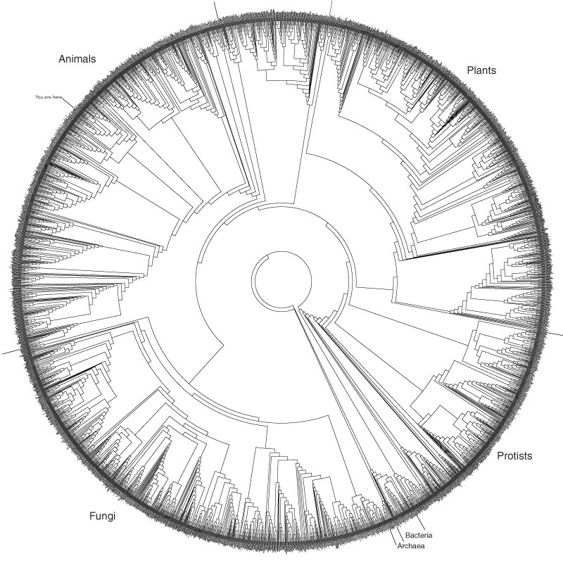
I just ran across the above image, although it has evidently been around for a while. It shows about 3,000 species, arranged in a circle and linked by relationships revealed through analysis of subunit rRNA sequences. A fuller description on the Hills/Bull Laboratory website gives more details, as well as a PDF that allows for either large printing or significant zooming.

What I find absolutely intriguing about this is that the diagram really only offers aesthetics over other illustrations of the Tree of Life, perhaps linking as it does to the “Circle of Life” concept (insert cheesy Elton John ballad here). Siyo Nqoba! But really, the circular representation has no meaning; it just looks good. And there’s absolutely nothing wrong with that, particularly since it evidently continues to inspire people to blog about it. Let’s hear it for aesthetics!

Anyway, for kicks, compare the above to Darwin’s 1837 sketch of branching species, as he was beginning to work out the concepts we now know as Darwinian.

To digress further… Does everyone know about the Darwin Correspondence Online Database? Hours of fun! But sadly, the database privileges the written word over the drawn image, as in this letter to Huxley, which ends with an annoying “DIAGRAM HERE.” Grrr.

Scrunch-o-rama

Studies announced this week by UCLA and Rutgers researchers (and reported in Science magazine) reveal clues as to the process by which DNA is transcribed into RNA. (As with any of my commentary on biological stuff, the following comes with a caveat: I’m interpreting the article as best I can as a non-specialist, so if anyone out there knows better, please comment accordingly.)

The basic question: how do cells turn DNA instructions into RNA messengers? Biochemist types would like to understand this process at the molecular level, so they tagged the molecules involved with fluorescent compounds and watched to see how they jiggled around during the transcription process. Fluorescent Resonance Energy Transfer (FRET) yields information about changes in distance between the two fluorescent markers, so researchers could tell how the molecules changed shape. Three models had been proposed, but only the model that involved “scrunching” of the DNA predicted the changes observed.

Executive summary: we understand the mechanics of DNA transcription better than before.

What I find intriguing about the image above (which comes from the UCLA press release) is the combination of visual language used to describe the molecules. I always find this intriguing, probably because it’s a visual language in which I am not fluent! Three molecules show up as surfaces—the pink and orange strands of DNA and the blue RNA polymerase (RNAP)—while everything else is shown as a stick models—including the three fluorescent tags (in red, yellow, and green) used to measure the &mdquo;scrunching” of the molecules. It makes sense ’cuz you want to show what’s going on inside the complex RNAP structure in which the transcription takes place. I have to say, though, that I find the dotted arrows visually confusing, and it seems like a little more elegant Photoshop work would make the image a little easier on the retina.

Also, it’d be lovely to have a way of visualizing data like this in 3-D. How spiffy would it be to have a virtual model distributed with the press release? There must be some keen software out there for looking at this stuff, but my half-hearted searches have revealed very little: the Chemis3D applet and Java3D Molecular Visualization System are all I could track down, so if you know of other software (especially freeware, of course), please comment! I want my molecules in 3-D.

(I’m biased, of course. My work with the Hayden Planetarium Digital Universe and space show production has convinced me that the more 3-D we can make scientific results, the better.)

Also, the combination of pink and orange makes me wonder if the researchers are fans of the Pet Shop Boys. Or are these colors standard?

Holy Hole Punch, Batman!

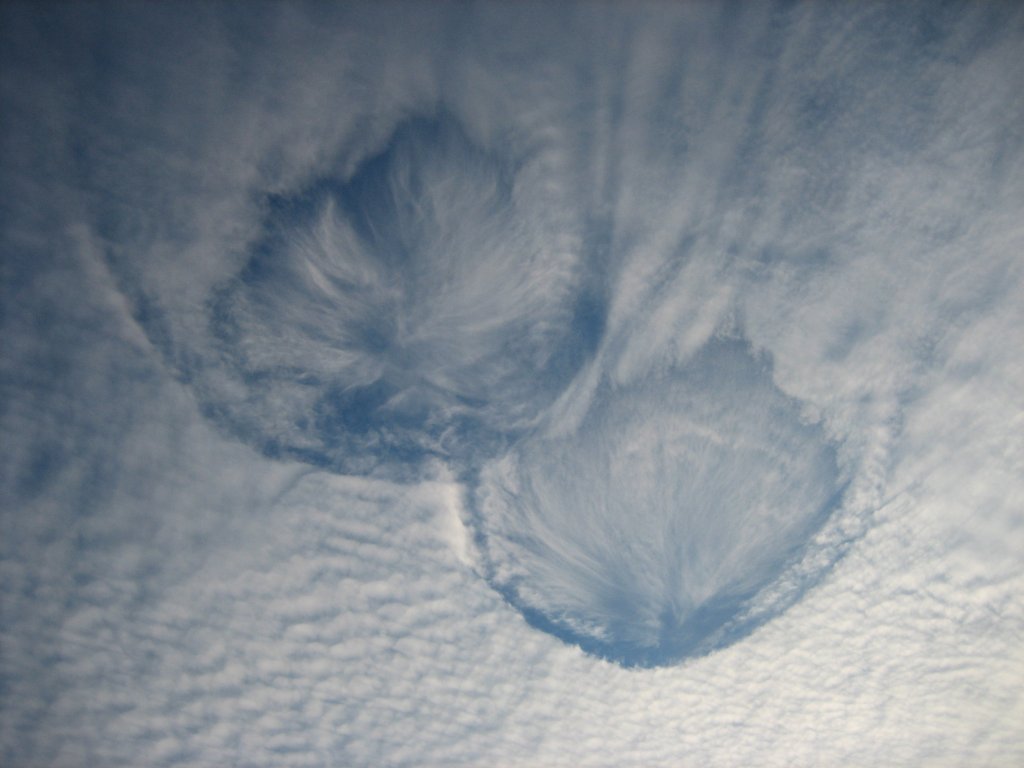
The image above comes from Spaceweather.com, which describes observations made in Wisconsin on Wednesday. The National Weather Service has a page on “hole punch clouds” that reports earlier sightings and photographs.

It’s interesting when an mage can provoke a nice, simple, “Well, that’s odd.” Particularly when it turns out that scientists, too, have questions about the phenomenon pictured. Evidently, meteorologists “can only speculate on what caused this common but relatively infrequent awesome phenomena to occur.” The speculation involves ice crystals coexisting with supercooled water droplets (still in a liquid state, even though their temperature lies below freezing), but it gets, um, nebulous after that. (Pun intended, I’m afraid.)

Virtual Phantoms

Talk about visualizing!

A Reuters article describes work being done by the Advanced Interfaces Group at the University of Manchester, using virtual reality interfaces to treat phantom limb pain. Some people who have lost a limb experience extreme discomfort—the sensation that a missing hand remains tightly clenched, for example—and successful therapies seem to trick the brain into believing it has control over the “phantom limb.”

Enter virtual reality (glad it’s still good for something). According to Reuters, the process “uses a headset and sensors to transport patients into a virtual world where they see themselves with two limbs which they can control and move to do tasks and play games.” In four out of five of the patients they worked with, pain was ameliorated.

One of the best descriptions I’ve read of such disorders, BTW, is a book by the neuroscientist V.S. Ramachandran, which eloquently sheds light on all of brain function by an examination of various traumas that can occur. Highly recommended.

Subducted

A brief post, since people are waiting for me to go to dinner. (Added a little to it after the fact…)

The image above comes from the website for Quark Park, a temporary park set up to highlight interactions between Princeton artists and scientists. The specific installation is called “Subduction & Orogeny,” illustrating geological processes at work. Interestingly, the work takes the form of a diagram, given added heft (so to speak) by samples of rock representative of the geological strata in question. Other works appear far more abstract.

An article in Science News describes some of the more mathematical installations, but there’s a wide variety of odds and ends to choose from on the website. Unfortunately, you have to shuttle back and forth between the “Photo Gallery” page and the “Team Bios” page (which links to descriptions of the projects) to figure out what’s going on.

Tom Wolfe noted that “without a theory to go with it, I can’t see a painting,” which is oddly true, for very different reasons, in this case as well. With this work, without the scientific theory, you can’t see the meaning. In fact, with a lot of visualization, one misses (or misinterprets) the meaning if you don’t get an explanation of the theory to go with it.

Quark Park is open through the end of November, so if you happen to live near Princeton, New Jersey, you might want to check it out.

Sea Urchins from the Inside-Out

An image similar to the one above appears as part of Science Magazine’s interactive poster on sea urchins that appeared as part of this week’s issue. What we’re looking at is cell division. The image comes from the University of Washington Center for Cell Dynamics, the work of George von Dassow.

In my previous post, I asked questions about use of “enhanced color,” and the images of cells call to mind similar questions. I assume that what’s going on is simple color-coding of different cell structures (part of what gives me that idea is an image about a third of the way down the associated page on cytokinesis and a QuickTime showing the actin filaments and microtubules in cross section, side by side). The technique for observing the different cell structures remains a mystery, since I can find no clues on the website, but it seems like an interesting part of the story.

The gallery page at the Center for Cell Dynamics offers more still images and movies, as well as at least one spiffy little interactive. Given the warning at the top of the gallery page, I have the impression they don’t think of these movies as anything of interest to a broad audience, but I have to say, these are pretty compelling visuals. And I, as a layperson, would love to know more about what I’m looking at and where the images came from.

As far as the color choice, I might suggest something a little different. My slight color-blindness makes discerning the difference between red and green slightly tricky at points, so it’d be a lot easier if the two separate images were colored, say, blue and yellow or somesuch. A spiffy article entitled “Color Theory for the Color Blind” does a nice job introducing some of the issues or percention and contrast, although it talks mainly about web pages. Some answers might also lie in a book I just acquired that describes the physiology of vision and how it relates to art, but I have yet to get far enough into it to say.

By the bye, the Science poster is part of a special issue that focuses on the Sea Urchin Genome. Turns out the little critters have played an important role in the last century and a half, giving biologists clues to pronuclear fusion, cromosonal development, the role of mRNA, gene expression, and on and on. Sea urchins lie near an important branching point on the evolutionary tree, making its genomic sequence of great interest. Go figure!

Questions

This may seem lazy, but… We ended our visualization conference today with a discussion of imaging philosophy. And the above image came up in discussion. It’s the (in)famous “Pillars of Creation” image of the Eagle Nebula, taken by the Hubble Space Telescope, of course, and it’s gotten about as much visibility as any astronomical image of the last few decades. So without much ado, maybe I could just pass along a few questions for those of you who consider yourself members of “the general public” (whatever that means, anyway).

Did you know that the Eagle Nebula doesn’t shine in those particular colors? In fact, it looks more like this pink-ish image from Rob Gendler, which is at least closer in color to what you would see with your eye up to a telescope. Does it bother you that the image represents something that you wouldn’t see through the eyepiece of a telescope? Do you think image specialists are lying to you by presenting images in this manner? (You can learn how the Hubble team makes thir color images by reading “Behind the Pictures” at their website.)

For that matter, how do you think we should describe images like the one above? They’ve often been called “false color.” Does that sound appropriate? What does the term suggest to you? Hubble describes such images as ”representative color.” How does that sound?

As you might guess, those of us in the biz have our own ideas, but I’m curious if anyone out there would like to share their opinion(s).

Thanks!

In Saturn’s Shadow

It’s tempting to do a simple report from the Astro-Viz ”06 workshop, since we’re starting to have conversations that might be of interest, but David Malin distracted me by presenting the above image as part of his keynote address this morning.

The Photojournal description of “In Saturn’s Shadow” tells us that the image “was created by combining a total of 165 images taken by the Cassini wide-angle camera.” We can see light scattered through the rings, as well as light cast on the dark side of the planet by the rings themselves. Obviously, one gets a sense of the extended nature of the rings as well.

“Color in the view was created by digitally compositing ultraviolet, infrared and clear filter images and was then adjusted to resemble natural color.” A sentence that gives me pause. I appreciate the description, but I’d like a little more detail (even if I think I can piece together what’s going on anyway). And the annotated image doesn’t help.

The corresponding page from the CICLOPS site provides a little more detail, describing color variations in the E ring in the “color-exaggerated” image above. Maybe there could be a link to a page describing what “color-exaggerated” means? Basically, I think they’re just trying to acquire a longer baseline (in terms of wavelength, stretching from ultraviolet to visible to infrared), thereby enhancing color contrasts.

Spiffy image, that’s for sure. Very spiffy. And it speaks to one of the points Malin made this morning: that compelling images can simply make one look more closely and phenomena, which excites curiosity and promotes thinking about the cosmos.