Holy Ozone, Batman!

(N.B. that the animated GIF above is rather large, about four megabytes, so it could take a little while to load in your browser. If you prefer, a smaller version is also available online.)

Not a new story, really, but an interesting choice of animation to illustrate it. New data from the SCIAMACHY instrument onboard the European Space Agency (ESA) satellite Envisat shows a record-breaking ozone hole—after a few years of improvement, the hole seems to be deepening once again.

When I first glanced at the above image sequence, I reacted with a basic, nonplussed “hmmm.” The data in the middle look screwed up, and I’ve never been a big fan of false color, so I scanned down and started reading the article on the ESA website. When I glanced back at the animated GIF, it was much more interesting! How embarrassing to discover that I’m as much a victim of our culture’s impatience effect as the museum- and planetarium-goers I’m trying to entice into taking lengthier looks at things.

Basically, the above animation does’t hit its stride until about halfway through (mid-September), at which point the change is quite striking (and depressing): a big, black hole develops over Antarctica, swallowing up the continent’s outline like a killer blob from a 1950s sci-fi film. And like the slower-paced films of that era, you have to wait a little while for the punchline.

The only other issue I have with the image is that it doesn’t quite underscore the story, namely that the ozone hole is “deeper” than at any time in the last eight years. To communicate that, the page of figures on the ESA website relies on a bunch of wiggly graphs. All well and good, but how ’bout a side-by-side comparison of two years, even as a still image? Or perhaps a viewer that would allow you to select two years to show side-by-side, clicking through dates in lock step? That would be an impressive and intuitive interface.

Environmental data demand good visualization, for personal impact and political import both. Sadly, we have no superheroes to save us from the ozone problem, and with humanity’s track record for addressing long-term problems, we need all the help we can get.

Mapmaking

A slow Monday. So I’ll highlight a reference I came across while reading the book Weighing the World, by Edwin Danson. (Danson’s book describes the processes of surveying in illuminating but excruciating detail; what struck me as most interesting was both the variety of individuals involved and the dramatic sweep of the effort, risking life and limb to determine once and for all that, in fact, Earth is not perfectly spherical, for example.)

Anyway, the reference is Antique Maps, by Carl Moreland, but you can read it online at its very own website. Now, the goal of this tome is to introduce prospective buyers to the essentials of map- and print-making, but the information passed along makes it well worth the occasional digressions. For example, Chapter Two, “The Printing of Old Maps,” gives a succinct and worthwhile survey of techniques that formed the foundation of all diagrams and printing techniques from the 16th to the 19th Centuries.

This historical stuff fascinates me, as my previous post about dodo lithographs may suggest. Printing maps made maps worthwhile in a way that drawing maps was not: a printed map could be amended and improved upon, and it could effectively incorporate input from myriad voyagers, surveyors, and sailors. In my opinion, that conceptual transformation has few parallels in the history of human thought.

More on that in posts to come…

Trying in Vein

Yes, I live in New York, but no, I did not attend NextFest while it was here. I nabbed the above image from their website, though!

It shows a Luminetx VeinViewer in action. Basically, the gadget takes an infrared image of a part of one’s body then re-projects it onto the corresponding surface of one’s skin. Veins don’t reflect the near infrared light, but the surrounding tissue does, so you get a high-contrast view of the veins. Hence, “VeinViewer.”

What I find amazing about the above image is that it communicates that concept fairly clearly—okay, not the near-infrared part, but the general function of the device. You see the image above, and you say to yourself, “Wow, I can see his veins!”

Now, that may not seem like such an accomplishment, but take a look at the images from the Luminetx gallery. Actually, I’ll save you the trouble and link one of the images below:

I mean, okay, the kid looks happy, but what’s that on his arm? It looks like he got a weird tattoo! (Or was the victim of some poor Photoshop work.) Having seen the other image, I understand what’s going on, but the image doesn’t read as clearly as the one from the NextFest site. Offhand, one might think that the real-world image from Luminetx would communicate the concept better than the somewhat stylized image of just the backlit hand. But the composition, lighting, and sheer simplicity combine to distill the concept in an impressively lucid (and certainly more aesthetically pleasing) manner.

High-Resolution Abstract Art

Having blogged remote sensing on Earth in my last post, I guess I should make the leap to remote sensing on Mars…

So, what annoys me about the way the press release describes the above image is that, although the story is “the highest-resolution camera ever to orbit Mars,” the reader is given no sense of scale. You have to go to the caption on the mission webpage to find out that the resolution is about a foot per pixel. If nothing else, the press release could indicate the size of something in the image—for example, the small crater in the lower right-hand corner is about 15 feet across (I checked).

To be honest, I’d like to see a graphic scale on the image, marking out a distance of, say, 100 feet. But that ruins the aesthetic that has started to develop around NASA images. Images from the rovers have their own appeal, but the Mars orbiters send back images that function more as abstract art (take, for example, the Mars Express image of Aureum Chaos). A little scale in the corner of the image would ruin that. I have in mind Elizabeth Kessler’s thesis about Hubble images and their relationship to American culture as I write this.

Mud Volcano

Okay, I’m an American, so no one would expect me to remain current in international events, but what’s with this “mud volcano” in Java? The images above come from the Centre for Remote Imaging, Sensing and Processing, which offers web page with a (must admit) spiffy viewer to examine the extent of the damage.

To me, the above images represent the power of remote sensing and our new-found ability to contextualize terrestrial events (cf. the extensive use of such imagery in Al Gore’s impressively illustrated An Inconvenient Truth).

Just bizarre. Listening to a bunch of talks at the recent Pale Blue Dot meeting convinced me that I really don’t understand geology, and this just confirms my suspicion…

Uranus in Season

Hubble just announced the discovery of a dark cloud in the atmosphere of Uranus, but as I looked at the press-release image, I realized that I was seeing Uranus from a slightly different angle compared to previous images. So I created the composite image above, using the various Hubble pictures of Uranus from 1994 through 2006. The Hubble crew did much the same thing with Saturn a few years ago, so it’s not an original idea. But it’s kinda kewl to see Uranus going through 14% of its orbit.

Sonar or Later

Several sources are reporting on the discovery of the remains of the U.S.S. Macon, one of the last dirigibles flown by the United States, which foundered and sank near Point Sur in the Pacific Ocean back in 1935. A webpage on the Monterey Bay Aquarium site describes the research project nicely—including an intriguing detective story (involving a girder and a seafood restaurant) and the plans to return to the site this month for further exploration.

It takes a little digging to find the image above, which is probably a good thing, since it’s not the easiest to interpret… It’s a sonar image that shows the track of the scanning device as a vertical white line on the left, with the debris field showing up as a mottled patch on the right of the image. The U.S.G.S. offers a good description of side scan sonar techniques, including a spiffy diagram at the top of the page that should make the above image somewhat more comprehensible.

Images like this one come in handy, however, when trying to describe the challenges of scientific discovery. Part of the detective story that doesn’t show up on the website is how you take miles and miles of scans like the one above and sift through them to determine the location of interesting stuff—remains of an early-20th-century airship, for example. The astronomical community will face just such a challenge in the near future, when the Large Synoptic Survey Telescope (LSST) comes online with several terabytes of imagery collected every day. How does one sift through so much data to find interesting events? And how does one convey the magnitude of that effort to the general public?

By the way, you may actually recognize the U.S.S. Macon from the famous picture of a dirigible over New York Harbor. That’s her! With Manhattan stretching out in the distance…

From Mice to Magnetospheres

A coworker just asked me a question about the magnetosphere, and in a quick online check, I came across the above image. I tend toward the nit-picky in matters concerning space weather, in large part because I attended a graduate program in “Space Physics and Astronomy” at Rice University. I see several problems with this image… Most disconcertingly, it makes the bow shock appear like a nearly solid boundary, with the interior and exterior vastly different in their texture and color; in fact, the bow shock simply represents the location where particles slow from supersonic (yes, there is a such a thing as sound speed in space). Furthermore, the little squiggly arrows presumably indicating particle motion through the magnetosheath look nothing like the actual flow. Finally Earth’s magnetic field should look more like a dipole, so all the field lines should not converge to a single point at the poles.

For contrast, allow me to reproduce a scene from the most recent space show produced by my institution, Cosmic Collisions:

We used data from the Center for Integrated Space Weather Modeling as the basis for the sequence, so the effect is not quite so diagrammatic. The grey surface represents the bow shock; the bluish surface represents the exterior of the region dominated by Earth’s magnetic field. And note that the flow moves through the bow shock and around the Earth’s magnetic field. You can see more from the show (and more of the data) in a short piece produced for our “Science Bulletins” AstroViz segment.

Finally, speaking of alma maters, a space weather story from Cornell just appeared in my inbox. Solar flares may cause problems with GPS receivers—no great shakes if you’re driving your Lexus down I-10, but more problematic if you’re flying through dense fog on a commuter jet.

Mouse Brains!

I am far too queasy ever to dissect a mouse; that’s why I went into the physical sciences. That’s also why I appreciate tools that allow me to experience biology from the comfort of my desktop.

I took the above snapshot from the “Brain Explorer” program available (for both Windows and Macintosh) from the Allen Institute for Brain Science. It shows (what else?) the structure of a mouse’s brain. Turns out the little critters, inbred as they are, display little variation in their brains’s structures, making them easy to compare to one another.

So you’ve got your 3-D model of the rodent’s brain. After loading a gene database into the Brain Explorer, one can rotate around the structure, displaying the loci of activity for the gene as well as adding or subtracting 3-D overlays (or 2-D slices) that show different parts of the brain. Fiddling with the software made me think about how novices must react to the Digital Universe data and software that my institution makes available: ignorance of the underlying science makes it rather enjoyable to fly around, but I don’t think I’m extracting much useful information from the experience.

Of course, I’m not the audience for the software. In a story that appeared in today’s New York Times “Science Times” section (rapidly picked up by Reuters, too), several brain researchers interviewed claimed that the resource is of remarkable value to their community. Complemented with some supporting material (as we do with our atlas of the Universe), it might make a fascinating tool for students or even interested aficiandos.

On the Allen Brain Atlas site, more sophisticated 2-D tools are available to analyze the existing data.

Photographic (Quantum) Loops

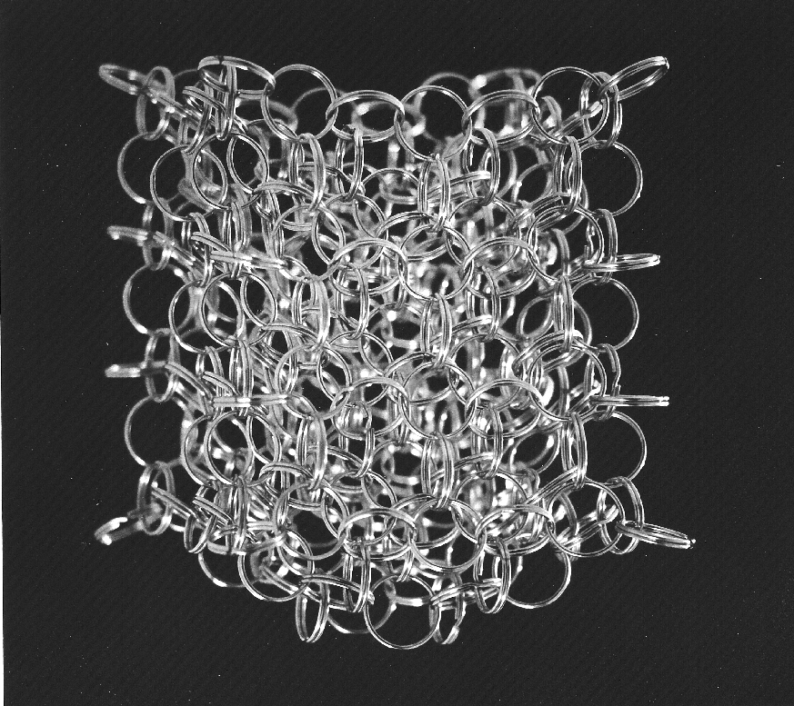
The image above represents “loop quantum gravity,” selected somewhat arbitrarily from Carlo Rovelli’s website. The inspiration for this image choice came from a lecture held at the Hayden Planetarium just last night. Lee Smolin showed up to promote his new book, The Trouble with Physics, which I will admit up front I have not read (although a copy now sits in my office, waiting for my attentions).

The use of a photographic subject to illustrate a highly abstract concept intrigues me greatly. In contrast to the award-winning attempt to make a tremendous amount of data look photographic, we have here a photograph attempting to make a tremendously complex concept look real. Furthermore, Rovelli offers the image (and another) effectively without comment, stating only that it gives “an intuitive picture of the ‘loopy’ structure of space predicted by loop quantum gravity at very short scale.” Hmmm.

The problem with expecting intuition when confronted with an image—particularly an image intended to function essentially as a metaphor—is that intuition is a hard-won and highly specialized skill. Personally, my intuition on astronomical imagery is quite respectable; on physics, pretty decent; on biology, almost non-existent. So the message that I will extract from Rovelli’s images differs tremendously from his own reaction, I’m certain, and a layperson’s response could have little or nothing to do with the specialists’ interpretation.

Smolin’s lecture (and presumably his book) suggested that physics needs to go back to its experimental roots, reconnecting highly-complex concepts to observable events, such as gamma-ray bursts, that could provide a real-world (or -universe) evidence for esoteric theories. A podcast of the lecture is scheduled to appear on Seed magazine’s website in the not-too-distant future. Keep your eyes (and Internet connections) peeled!