A Fine Aerosol Diagram

New results from the Cassini spacecraft reveal the chain of events (so to speak) that leads to the formation of complex aerosols in its atmosphere. Aside from the spiffy science, the NASA announcement includes the very nice diagram pictured above.

What I like about the graphic is that it tells the story very plainly and simply, yet with considerable detail and substantial visual interest: nice little PAHs and aerosols, decent image of Titan’s surface, Saturn in the background (tilted too much with respect to the ring plane, but that’s nothing new), and so on. It even includes altitude info on the right-hand side clearly indicating where specific processes take place. All in all, a lot of info packed into a single image.

And anther detail. I’m already on record as not being a fan of lens flares in the fulldome environment, and in general, I seem them as kind of cheesy. But this might be the first time I’ve seen a lens flare used as a didactic element, suggesting the flow of photons from the Sun. Nice touch!

The only thing that gives me pause is the depiction of “energetic particles” as little arrows pointing away from Saturn. The particles are trapped in Saturn’s magnetic field, so they aren’t really shooting out of the planet in straight lines, which makes that depiction a little deceptive. But then, the only real solution would be to depict Saturn’s magnetic field with particles streaming from it, and that might be a little cumbersome. So I suppose I can forgive the diagrammatic shorthand.

Another more mundane quibble. The NASA webpage for the diagram include links to smaller versions at 1600×1200, 1028×768, and 800×600, but those are all windowboxed versions of the (obviously portrait, not landscape) diagram. Thus, the only version of above image that you can download at its original aspect ratio is the full-resolution version: a whopping 2000×2776 pixels! Not the greatest for, say, linking to blog entries.

Anyway, nice work, Cassinifolk! I like the diagram. And the story it tells…

Hole Lotta Electron Going On!

I know it’s been a good long while since I posted anything to the blog, and my instinct suggests that I should ease into things, maybe start out with an astronomical image and a snarky comment… Keep things simple!

But I ran across this image, and I couldn’t resist. It accompanies a press release about high-powered lasers at UC Santa Barbara. And um, wow! Take a look at the caption:

“Artist’s rendition of electron-hole recollision. Near infrared (amber rods) and terahertz (yellow cones) radiation interact with a semiconductor quantum well (tiles). The near-ir radiation creates excitons (green tiles) consisting of a negative electron and a positive hole (dark blue tile at center of green tiles) bound in an atom-like state. Intense terahertz fields pull the electrons (white tiles) first away from the hole and then back towards it (electron paths represented by blue ellipses). Electrons periodically recollide with holes, creating periodic flashes of light (white disks between amber rods) that are emitted and detected as sidebands. (Credit: Peter Allen, UCSB)”

If brevity is the soul of wit, well…

I think the first thing that confuses is the poorly-conveyed temporal element. If I’m supposed to read something as a sequence in time, either follow a convention (e.g., left to right for English readers, rather than bottom to top, as in this case) or execute it as a sequence of images… Or an animation. But the static image above doesn’t convey the sense of time passing or a series of events.

The more fundamental issue, however, seems to be the presentation of diagrammatic information in what I think of as a “reified” manner. By taking a basic representational diagram and adding elements that suggest a photoreal environment, the image ends up confusing the issues: it takes an abstract representation and describes it with a visual language that suggests real, physical objects. Instead of color-coded dashed lines, for example, we get sparkly little cylinders that look like beads you’d pick up on West 37th Street in Manhattan.

I can only imagine that some grad student got their hands on Blender and went a little wild… “Ooh, I can make these transparent and shiny!” Which is all well and good, but it gets in the way of communicating he fundamental concepts: the gloss may attract attention, but it obscures the underlying content.

(Just as an aside, when I went in search of the Wikipedia article on excitons, in order to provide a helpful link, I ran across an even more psychedelic image! But my little brain just couldn’t deal with writing about both that one and the one above…)

Honestly, I don’t know how to illustrate the remarkably complicated subject of the press release. But the above illustration does not seem to help.

And unfortunately, this kind of thing happens quite a bit in the world of press release images… Because the main interest lies in choosing the flashiest possible image(s), the clarity of the message often becomes obfuscated.

Polarized Colo(u)r

Long time, no write, except for that silly link last week. I’m still working on that little project in San Francisco, which consumes an extraordinary amount of time.

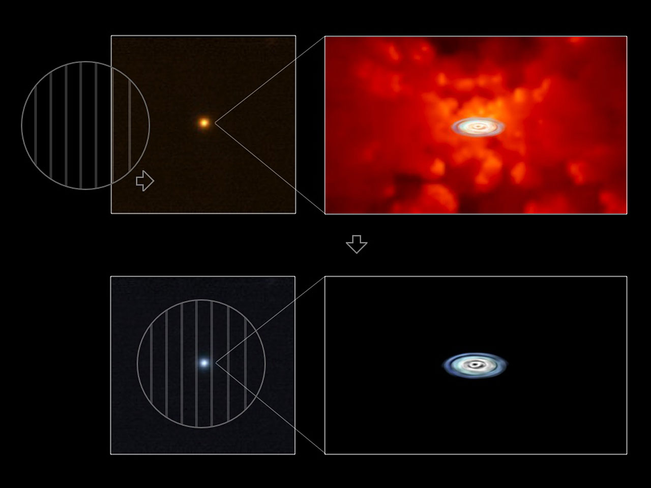
At any rate, I saw the above image, which accompanies a press release from the European Southern Observatory (ESO), and I figured I could express my thoughts quickly enough not to feel too guilty about taking the time to write.

The press release bears the title “Accretion Discs Show Their True Colours,” which describes the different appearance of quasars in polarized light. The press release describes the research well: “‘The crucial observational difficulty here has been that the disc is surrounded by a much larger torus containing hot dust, whose light partly outshines that of the disc,’ says Kishimoto. ‘Because the light coming from the disc is scattered in the disc vicinity and thus polarised, by observing only polarised light from the quasars, one can uncover the buried light from the disc.’”

The image does pretty well, too, except I have some nagging issues with it. Of course, the little circles with vertical lines suggest polarization to the initiated (although they also remind me of those glasses Chris Lowe wore back in the late 80s that I wanted so much), but I fear that visual shorthand is lost on a large percentage of the audience. And even if you get it, why does the little circle moving over the image change the color of the entire image? It would be much better if only the part inside the circle changed color. A little Photoshop work would make this image much, much clearer.

So how’s that for succinct?

(BTW, in nosing around for a link to “polarized light,” I ran across Polarization.com, which suggests to me that there really is a website for just about everything.)


The Duelity of Nature

Thanks to a post on my friend David’s blog, I just ran across Duelity. It tells two creation stories—one from Genesis, one from modern science—using contradictory visuals and verbiage.

The introduction to the site hints at the conceit:

“According to the records of the General Organization of Development labs [GOD] it took a mere six days to manufacture a fully-operational universe, complete with day, night, flora and fauna, and installing Adam as its manager to oversee daily functions on Earth.

“If thou shalt believe the Book of Darwin, [’tis] five billion years after The Big Bang that we behold what the cosmos hath begat: the magma, the terra firma, the creeping beaste, and mankind, whose dolorous and chaotic evolution begat the gift of consciousness. ”

You get the idea. What I find interesting is that the approach is mirrored not just in the language used but also in the imagery that tells the stories. The General Organization of Development flick uses the visual language of a corporate training video, while the Book of Darwin employs an illustration style that recalls renaissance prints and stained glass. Brilliant stuff, really, and particularly impressive when viewed side-by-side, with the separate narratives intertwined.

I would say that I kind of object to the final tag line, though: “Duelity is a split-screen animation that tells both sides of the story of Earth’s origins in a dizzying and provocative journey through the history and language that marks human thought.” “Both sides”? As if there were only two…

Dilemmas, Ethical and Pictoral

A brief post today, in reference to today’s New York Times article, “Genetic Testing + Abortion = ???”

The caption for the image above reads, “BEYOND ROE New technology may complicate the debates over abortion.” But of course, the ultrasound technology depicted in the image is not the technology in question. Instead, we’re talking about the role genetic tests play in people’s decisions about whether to abort a fetus.

I admit that the art director in me understands why one would select an image that says “prenatal technology” over one that says something less specific to the headline. But it’s a bit like doing the wrong keyword search in Google. Much more germane to the topic would be more abstract images of magnified amniotic fluid or genetic test analysis.

This strikes me as a good example of the competing interests in selecting imagery to complement a complex story. Both image choices (the Times’ and mine) relate to the story, but one has to ask what the purpose of the image is: whether it’s to act as an attractor or to illuminate a story element. Both approaches have their faults, since I would admit that the images I dug up in two minutes’ of searching don’t exactly clarify what’s going on so much as they offer visual stand-ins for the techniques that contribute to the growing ethical dilemma.

Red, Hot, and Blue

A simple enough image today—the cover of the 2007 Edmund Optics catalog. I saw a post on the Cosmic Variance blog about this image and decided that, although it’s a bit of a stretch, this does in fact touch upon “visualizing science.” Sadly, in a way that reflects poorly on the state of gender parity within certain disciplines.

What’s truly disheartening about the image is that the people who published it seem completely oblivious to what it says. I yammer on about visual language all the time, typically in the context of scientific vocabularies that can obscure or distort intended meanings. But here’s visual language of a different sort—imagery with an unintended cultural meaning that also says something about science, or at least the cultural practice of science.

If you feel inclined to write to Edmund Optics about the cover (and I encourage you to do so), take a look at the aforementioned Cosmic Variance post, which includes email addresses and such.

Small Bodies, Simple Graph

The image above accompanies Steve Soter’s Scientific American article about the new definition of planets. The image of the solar system deals with the typical issues of scale and two-dimensionality adequately enough, but I really like the little graph just below the center. It shows Soter’s proposed μ values for various solar system bodies, which gives a more mathematical expression to the concept of a planet “clearing its orbit.” (Note that the scale of the bar graph is exponential!)

Now compare the graph to Figure 3 in the astro-ph version of the article. Whereas the astro-ph version uses a standard scientific convention (plotting two quantities and revealing μ as a diagonal line on the plot), the Scientific American version translates the concept into simple visual vernacular. Excellent work.

Well-Behaved Sheep

I always wonder how people without a physics background perceive images such as the one above. It illustrates an ellipse of cobalt atoms (the series of peaks encircling the colorful, rippled interior) enclosing electrons (basically the ripples). So much symbolic language is built into this illustration that I can’t imagine it communicating much of anything to an audience not steeped in the visual parlance of physics. The cartesian plane representing the substrate on which the cobalt atoms are placed, the color-coded quantity in arbitrary units, the unexplained labels “F1”and “F2” right in the middle of everything… What does all this say to the non-specialist?

The image caption describes the enclosed electrons as “behav[ing] like standing waves in a pond.” So if uninitiated readers can wrap their heads around the idea that electrons (which they probably imagine as little particles) behave like waves, then the description might mean something to them.

That description is a far sight better than the press release from the Max Planck Society, which claims that “randomly vapour-deposited atoms arrange themselves in regular structures within the circular fencing – as if they were sheep arranging themselves neatly in a pen.” Now, I didn’t grow up on a farm or anything, but sheep don’t strike me as the most self-organized critters. I mean, if you pack any roughly regularly-shaped objects tightly enough, you often end up with patterns, but that’s not what they’re talking about here. The analogy falls short.

In short, the image above neatly illustrates a problem I touch on in my “What Is Viz?” PowerPoint, namely the challenge of a well-developed visual language getting in the way of communicating. Graphic elements that make sense when presenting data to one’s peers can prove insurmountable to a wider audience unacquainted with the (often complex) grammar and vocabulary of such a visual language.

Better Living through Chemistry

Doctors attending the American College of Emergency Physicians recently announced a problem with a certain household cleaner: it looks good enough to drink. David A. Masneri, who conducted the study in question, commented, “When looking at a bottle of Fabuloso—especially the yellow Limon, green Fresco Aman, and blue Ocean Fresh varieties—anyone will easily see a resemblance to certain popular beverages.” According to the Texas Poison Center, 104 people ingested Fabuloso during the first four months of 2006; more 60% were under the age of six.

I’d describe my initial reaction as rather intrigued (which perhaps sounds a little callous, but there you have it). The idea that people respond to specific visual cues fits very well into my ideas about how we process imagery and how well-developed our sense of “visual language” really is. Basically, the shape and color of the above bottle says, “Drink me!” Even to the under-six crowd! That’s really kind of astonishing. (Similarly, my idea about how many science visualizatons fail to communicate their ideas well is that they often fail to remove the scientific vernacular embedded in imagery used to communicate between peers. Again, I have a PowerPoint online that describes my ideas about visualization (but you need to read the comments on each slide, or else you’re just looking at a bunch of pretty pictures).

Of course, then the really scary aspect of this sunk in… We humans are conditioning ourselves to drink brightly- and artificially-colored liquids! After generations growing up on Gatorade and Pepsi Blue, we don’t even hesitate to put this stuff up to our lips. I’m glad I stick to healthier natural beverages—beer, for example.