Candy’s Bad for You

The image above was released as part of a press release entitled, “Why This Martian Full Moon Looks Like Candy.” Geez, what a great question, let me think a minute…

Maybe because you color-coded it to look “like a rainbow-colored jawbreaker” (to quote the press release)? It’s not as if Phobos is actually radiating the ugly rainbow color palette! It was a choice—likely on the part of an ill-informed scientist who created the image and certainly on the part of a lazy press officer who decided to roll with it and compose an insipid headline rather than trying to create an intelligible message for public audiences.

(Sigh. Deep breath…)

To their credit, they at least released a captioned image, too, with accompanying color bar and added information.

And I will note that, what with our possibly intuitive mapping of red to hot and blue to cold—reinforced by water taps and weather maps having long employed red and blue for temperature—there are worse applications of the rainbow palette (for anything other than temperature, basically).

Once upon a time, I wrote thoughtful, nuanced posts for this blog. Now I’m just railing about ending the rainbow! But desperate times call for desperate measures, I suppose, so I’ll just mention that there’s oodles of research out there that demonstrates how the rainbow color palette works against our natural visual perception—an open letter to the climate science community outlines the most egregious issues. I’ll put some more on my resources page soon. “End of the rainbow” even has its own hastag on Twitter!

My real issue with this, at the end of the day, is not even so much the poor (a.k.a. default) choice of color palette as the choice of how to reify the choice by suggesting that the moon of Mars actually looks like candy.

All I can say is, NASA, please don’t give us candy! Give us something nutritious instead.

And maybe next time, I can write about something more substantive, too.

All the Rain!

Vox recently posted the above visualization as All the rain that’s fallen over Houston so far, in one massive water drop. And although I like the shocking quality of the visual and appreciate its impact, I have to note that it underscores a significant perceptual issue with this kind of representation.

People are bad at judging two-dimensional representations of volume.

Just look at the difference between the largest upper sphere (the 14–15 trillion gallons plus the additional 5 trillion gallons) and the lower sphere (6.5 trillion gallons). The largest sphere represents three times the amount of water. Does it “feel” like three times the amount in the image? Even with the multitude of three-dimensional cues in the illustration, it just doesn’t communicate that.

Researchers have actually quantified this—over a range of perceptual phenomena, actually, not just visual perception. (Start reading about Stephens’s Power Law if you’re inclined to go down a fascinating rabbit hole.) Basically, we’re good at judging length, okay when it comes to judging area, and incompetent at judging two-dimensional representations of volume.

That said, what I like about the Vox illustration is its simple, straightforward impact. That’s a really big sphere of water hanging over that city! Don’t those buildings look tiny in comparison? At that level, the illustration works perfectly. But by inviting us to compare Harvey’s volume to Katrina’s, the visual representation reveals its shortcomings.

It makes me think of the images created by Carbon Visuals, showing piles of spheres representing carbon dioxide emissions engulfing Manhattan. These visuals communicate their point simply and effectively, and they don’t really invite a quantitative comparison. That same team has created videos as well, and I wonder how much more effective those are. Because they build up the visual more deliberately (e.g., introducing a sense of scale by showing “people” in context with the spheres), they surely have more impact, but I also wonder if a moving camera helps communicate volume more effectively.

It’s a relevant question for those of us who create three-dimensional visuals. I would like to think that we can communicate volume more effectively in an immersive video environment than we can in a two-dimensional static image, but I also know we’re up against billions of years of evolution. Hmm. Maybe it’s time for some testing to assign some values to Stephens’s Power Law?

Cosmos: A Nitpicking Journey

In preparation for tonight’s premiere of Cosmos: A Spacetime Odyssey, I thought I would provide a brief critique of some of the show’s visuals. (The California Academy of Sciences hosted a sneak preview of the first episode of the new Cosmos television series this past Tuesday, so I had a chance to assemble my list of nitpicks.) Think of this as a viewing guide! Follow along and look for your own visual errors in tonight’s episode!

Don’t get me wrong: the new Cosmos will do a lot of good, I have no doubt. Fox has promoted the hell out of the show, and it’s great to think that a science-oriented show can potentially capture an enormous global audience. Kudos to the whole Cosmos team for that! I personally hold Sagan’s original series—and accompanying book—in such high regard that I don’t think I will muster the same appreciation for Tyson’s sequel, but that’s not the point of this post…

I figure if Neil can assail Gravity for its science flaws, the debut episode for Cosmos should similarly be up for grabs. I noticed many problems with the depiction of certain cosmic phenomena, and pointing such things out, well, that’s what I do. (Although I have a couple positive comments, too!)

To begin with, two of my colleagues noticed a galaxy apparently rotating backward in the show’s credits. I missed that, but I trust their eyes, so I’ll include it in the list.

The first sequence that offended my nitpicky sensibilities was the asteroid belt, crowded with chunks of CG rocks that looked more like the chase sequence in The Empire Strikes Back than the true asteroid belt, which is far more sparsely populated than the Millennium Falcon’s fancy flying would suggest. We have actual images and three-dimensional models of many such objects, and it should have been trivial to include real data and to show densities more reflective of reality. I recognize that this might have “lacked drama” from the perspective of a director or producer, but I think artists could have managed the challenge.

(Positive comment alert!) Jupiter’s Great Red Spot looked… Well, great!

The scale height of Saturn’s rings—as well as the size of objects in the rings—seemed off compared to the established scale of the Spaceship of the Imagination. It went by kinda fast, but I think the particle sizes were too small and the rings too thick. Again, I think the producers could have constructed the shot in a way that was both accurate and visually engaging.

As we move pass Neptune, we encounter another clump of CG rocks, this time representing Trans-Neptunian Objects (TNOs). This offended my sensibilities even more than the trite asteroid belt representation, mostly because the distribution of TNOs is even more sparse than the asteroids! C’mon, people, this is a science show, not Star Wars.

(Moving out of the Solar System, we encounter a so-called rogue planet. Coincidentally, the Academy had just hosted a lecture about rogue planets by Jackie Faherty the night before the Cosmos premiere. Let’s just say her research does not support the characterization of rogue planets depicted in the series.)

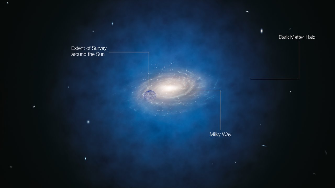
The Milky Way galaxy model looked pretty good, honestly. It seemed to be based on Robert Hurt’s now-famous image, but the volumetric treatment struck me as relatively well executed, although it’s interesting to note that Neil’s employer produced a new planetarium show that features a gorgeous data-driven galaxy model. That would probably be overkill given the 1,500 effects shots in Cosmos, so I will simply recognize a job quite well done with the Milky Way.

Nearby galaxies were shown dramatically enlarged, making intergalactic space seem far too crowded. Plenty of reputable planetarium professionals do the same, and this just happens to be a hobbyhorse of mine: probably a losing battle, but I’d rather see objects in the Universe depicted to their correct scale.

The Big Bang visuals (sunglasses, big explosion, boom) almost deserve no comment for their lack of originality, but let’s just say I’m so tired of addressing public confusions about the Big Bang that I must bemoan the lack of effort on the producers’ part to do a better job. (As one colleague texted me, “So it looks like they made the Big Bang explode from a single point into an empty universe. Unhappy.”) This kind of illustration reinforces misconceptions unnecessarily, and I wish they would have created a more compelling representation.

Without a doubt, the way they chose to show the large-scale structure of the Universe pissed me off the most. There are no shortage of beautiful visualizations from a variety of research groups—e.g., KIPAC, UCSC, NCSA—any one of whom would have offered their work for a song, I’m guessing. In fact, sitting in the Academy’s audience Tuesday night, we had a researcher whose team created visualizations for the aforementioned AMNH production, Dark Universe, and he could have created a kick-ass visualization for the large-scale structure! Instead, the Cosmos team created a procedural CG representation that, frankly, looks nothing like the large-scale structure as we know it.

A sequence depicting the first stars in the Universe troubled me, too, for the same reasons—another missed opportunity! The same audience-member researcher has created remarkable visualizations of the formation of the first stars: it would have been great to see some of those in Cosmos.

That list only captures what I can recall from Tuesday’s presentation, so there could be a lot more to talk about! But I thought I would offer up my initial reactions.

Before signing off, I have one non-visualization observation…

Giordano Bruno is not a science hero! He gets a lot of air time in the first episode of Cosmos, and he doesn’t deserve it. Yes, he supported Copernicus, and for various philosophical and non-scientific reasons, he also believed in the surprisingly modern-sounding idea of an infinite universe (although the idea didn’t originate with him, as the Cosmos episode suggests), and yes, he met a horrible fate at the hands of the Inquisition. But the latter doesn’t necessarily follow from the former! Bruno was a notoriously difficult man who held a wide variety of heretical viewpoints from the perspective of the Catholic Church at the time: to pin his execution on his cosmological ideas is ill-founded at best, deceptive at worst. My favorite book on Bruno is Michael White’s The Pope and the Heretic, but there’s also a great, lengthy article about him available from the National Library of Medicine, of all places…

At any rate, I hope everyone enjoys tonight’s episode of Cosmos. I simply encourage you to keep a critical mind tuned to everything you’re seeing. Sagan wouldn’t have wanted it any other way.

Addendum, 11 March 2014

Just a quick note that the credit sequence posted online clearly shows that my colleagues have sharp eyes: the galaxy at 0:30 is indeed rotating backward. And yes, we know of at least one spiral galaxy that rotates backward, but I still count the credit sequence as an error… In fact, I don’t understand it as an aesthetic choice either.

Also, on the history of science front, Discover blogger Corey S. Powell expresses his views on Bruno far more eloquently than I, and he offers up an alternative hero: Thomas Digges, who advocated for a Copernican system embedded in an infinite universe based on non-theistic arguments. I thought about mentioning Digges, actually, but avoided the digression. So much for not seeming like an imitator. Digges created the first known illustration of the Solar System not embedded inside a sphere of stars but rather inside a scattering of stars suggestive of an infinite universe. Beautiful!

Addendum, 14 March 2014

Powell posted a rebuttal from Steve Soter, co-writer of Cosmos and all-around bright guy. I find his arguments unpersuasive, but evidently, there’s more to come!

Bad Radiation Dosage

I’m prepping material for my “Universe Update” program at NightLife, and I wanted to talk about how the Mars Curiosity rover (a.k.a. Mars Science Laboratory or MSL) measured its radiation exposure while in transit to the Red Planet. And I came across the hideous diagram pictured above.

Oh, NASA. What what what what what are you thinking when you put together a diagram like this for public consumption?

The title of the bar graph is “Comparison of Some Radiation Exposures to Mars-Trip Level,” and evidently, the designers are trying to convey the sizable quantity of radiation to which a traveler to Mars would be exposed: according to the accompanying press release, “The findings, which are published in the May 31 edition of the journal Science, indicate radiation exposure for human explorers could exceed NASA’s career limit for astronauts if current propulsion systems are used.” But the diagram doesn’t send that message well at all.

For the uninitiated, the x-axis of the diagram above uses a logarithmic scale, so each bold horizontal line corresponds to a factor of ten change in the magnitude of radiation dosage. (To their credit, the authors of the caption describe this in the second paragraph.) Eyeballing the bar chart, the “MSL Six Month Transit to Mars” dosage looks about 100 times the “US Annual Average, All Doses.” But ratio of the areas (which our eye-brain vision system perceives more naturally) is probably closer to 2.33:1. That’s a vast disparity between what we perceive versus the message NASA is intending to send.

(I should note that the press release from the Southwest Research Institute includes links to some nice images and diagrams, but they all relate to the process by which the numbers in the bar graph were derived.)

Compare this diagram to absolutely brilliant xkcd “Radiation Dose Chart” from several months ago. It even uses the same units as the NASA bar chart: millisieverts (mSv). In his diagram, Randall Munroe has created a much more complicated but much more viscerally satisfying visualization of the variation in radiation doses—from “Sleeping next to someone (0.05 mSv)” to “Ten minutes next to the Chernobyl reactor core after explosion and meltdown (50 Sv)”! That corresponds to a factor of about a million, meaning that the Chernobyl accident would give you a million times the dosage of a one-night stand.

If you want to try understanding the NASA data using the xkcd chart, look for “Normal yearly background dose… (~4 mSv)” near the center of the chart, which corresponds to the “US Annual Average, All Doses,” and “Dose causing symptoms of radiation poisoning if received in a short time (400 mSv, but varies)” in the middle right, which is roughly equivalent to “MSL Six Month Transit to Mars” on the NASA bar graph. Now, do you find that the xkcd gives you a better feeling for the ratio? It’s not trivial to compare those two numbers, but the area-based approach still works better than the NASA image—and it could have easily been adapted to depict the Mars radiation data in an easily-understood manner.

Next time, NASA designers should take a close look at Noah Iliinsky’s “Properties and Best Uses of Visual Encodings” chart and think about how the visual elements they choose underscore—or undermine—the message they’re trying to send. (More on Noah’s spiffy chart in my next post.)

A Fine Aerosol Diagram

New results from the Cassini spacecraft reveal the chain of events (so to speak) that leads to the formation of complex aerosols in its atmosphere. Aside from the spiffy science, the NASA announcement includes the very nice diagram pictured above.

What I like about the graphic is that it tells the story very plainly and simply, yet with considerable detail and substantial visual interest: nice little PAHs and aerosols, decent image of Titan’s surface, Saturn in the background (tilted too much with respect to the ring plane, but that’s nothing new), and so on. It even includes altitude info on the right-hand side clearly indicating where specific processes take place. All in all, a lot of info packed into a single image.

And anther detail. I’m already on record as not being a fan of lens flares in the fulldome environment, and in general, I seem them as kind of cheesy. But this might be the first time I’ve seen a lens flare used as a didactic element, suggesting the flow of photons from the Sun. Nice touch!

The only thing that gives me pause is the depiction of “energetic particles” as little arrows pointing away from Saturn. The particles are trapped in Saturn’s magnetic field, so they aren’t really shooting out of the planet in straight lines, which makes that depiction a little deceptive. But then, the only real solution would be to depict Saturn’s magnetic field with particles streaming from it, and that might be a little cumbersome. So I suppose I can forgive the diagrammatic shorthand.

Another more mundane quibble. The NASA webpage for the diagram include links to smaller versions at 1600×1200, 1028×768, and 800×600, but those are all windowboxed versions of the (obviously portrait, not landscape) diagram. Thus, the only version of above image that you can download at its original aspect ratio is the full-resolution version: a whopping 2000×2776 pixels! Not the greatest for, say, linking to blog entries.

Anyway, nice work, Cassinifolk! I like the diagram. And the story it tells…

Dark Matter Observed…
In Visualizations

A new press release from the European Southern Observatory (ESO) announces a lack of observational evidence for dark matter nearby: “New measurements show that the amount of dark matter in a large region around the Sun is far smaller than predicted and have indicated that there is no significant dark matter at all in our neighbourhood.”

Pretty significant stuff, but let’s take a look at the accompanying images…

I admire their simplicity, but hey, with dark matter, what choice does a visualizer have? The depiction of the dark matter halo around the Milky Way looks a little clumpy to me, but again, what else can you do? A uniform blob of blue around a galaxy image doesn’t communicate much…

(Admittedly, at the scale of this image, simulations reveal the Milky Way’s dark matter environment to be somewhat clumpy, albeit not in the way depicted in the animation. It’d be keen to use computational data in a visualization such as this one, but I suppose limited time and resources prevent that.)

Anyway, I like the annotated version of the image above; in particular, the indication of the volume of space relevant to the survey.

The accompanying video (available in ESO’s typical plethora of formats) is also an exercise in simplicity, offering a straightforward revolution around the three-dimensional model used to produce the still above. I kinda wish they included the sphere around the Sun once again, just to convey the scale of the survey, but I can guess why they avoided it… Then you have to think about labels, and labels mean language, and it is the European Southern Observatory, after all. Gotta make good b-roll for Hungarian nightly news, I suppose.

And on a final note, not that I would ever nitpick, but… Are those actual galaxy locations in the background? I’ve flown around the Local Group quite a bit, and although adjusting the brightness of the nearby galaxies can change the appearance considerably, I don’t recognize anything in the background. Just curious.

Nice work from ESO, understated but effective. And maybe someday, these kind of press images can be more data-driven.

Hole Lotta Electron Going On!

I know it’s been a good long while since I posted anything to the blog, and my instinct suggests that I should ease into things, maybe start out with an astronomical image and a snarky comment… Keep things simple!

But I ran across this image, and I couldn’t resist. It accompanies a press release about high-powered lasers at UC Santa Barbara. And um, wow! Take a look at the caption:

“Artist’s rendition of electron-hole recollision. Near infrared (amber rods) and terahertz (yellow cones) radiation interact with a semiconductor quantum well (tiles). The near-ir radiation creates excitons (green tiles) consisting of a negative electron and a positive hole (dark blue tile at center of green tiles) bound in an atom-like state. Intense terahertz fields pull the electrons (white tiles) first away from the hole and then back towards it (electron paths represented by blue ellipses). Electrons periodically recollide with holes, creating periodic flashes of light (white disks between amber rods) that are emitted and detected as sidebands. (Credit: Peter Allen, UCSB)”

If brevity is the soul of wit, well…

I think the first thing that confuses is the poorly-conveyed temporal element. If I’m supposed to read something as a sequence in time, either follow a convention (e.g., left to right for English readers, rather than bottom to top, as in this case) or execute it as a sequence of images… Or an animation. But the static image above doesn’t convey the sense of time passing or a series of events.

The more fundamental issue, however, seems to be the presentation of diagrammatic information in what I think of as a “reified” manner. By taking a basic representational diagram and adding elements that suggest a photoreal environment, the image ends up confusing the issues: it takes an abstract representation and describes it with a visual language that suggests real, physical objects. Instead of color-coded dashed lines, for example, we get sparkly little cylinders that look like beads you’d pick up on West 37th Street in Manhattan.

I can only imagine that some grad student got their hands on Blender and went a little wild… “Ooh, I can make these transparent and shiny!” Which is all well and good, but it gets in the way of communicating he fundamental concepts: the gloss may attract attention, but it obscures the underlying content.

(Just as an aside, when I went in search of the Wikipedia article on excitons, in order to provide a helpful link, I ran across an even more psychedelic image! But my little brain just couldn’t deal with writing about both that one and the one above…)

Honestly, I don’t know how to illustrate the remarkably complicated subject of the press release. But the above illustration does not seem to help.

And unfortunately, this kind of thing happens quite a bit in the world of press release images… Because the main interest lies in choosing the flashiest possible image(s), the clarity of the message often becomes obfuscated.

O’er ample Nature I extend my views…

After a long dry spell (what’s three and a half years between friends), I finally migrated this blog off of LiveJournal and onto my own server… And I think I’m going to try posting again! Maybe not as aggressively as I once did, but, you know, baby steps.

So for all half-dozen or so of my avid readers out there, you don’t have to wait to get me seated in a bar at the next conference to know what I’m thinking about some ol’ scientific image or other. Just stop on my by! I’ll also keep y’all updated via Twitter (and by extension, Facebook) whenever I get around to posting something new here.

I’m also going to go back into older posts to clean up some broken links and inconsistent tags. So all in all, welcome to a new and improved “Visualizing Science: Seeing Science in Everyday Life.”

Kant and Kitties

I stumbled across a site called “The Desk of One Astronomer” recently, and it’s… Cute.

I like the overall design of the site, although it reminds me a bit of a mid-90s CD-ROM, and the videos featured (one on “Island Universes” and another on “The Cepheids”) charmed me in spite of their rudimentary design. The content strikes me as rather ambitious, but I admire the way it’s organized: you can locate the same information via multiple entry points, and the interface is consistently visual and inviting.

And I must admit that I’ve never seen a cat used to explain parallax. Adorable.

Evidently, the website sprung from work out of the SciVi group at California State University Los Angeles, which “trains undergraduate and graduate students from three different disciplines—Art, Physics and Astronomy, and Computer Science—to develop accurate and effective scientific visualizations of topics in Cosmology and implement their public dissemination.” Interesting. Should be worth watching in the future.

MyArtinScience

No, not “Martian Science.” ”My Art in Science,” new website that presents scientific imagery from an aesthetic perspective.

The stated goals of the website have a high-falootin’ tone, but I generally find myself nodding in agreement as I read the page. It seems like a good idea to provide a forum for researchers to share work they find visually compelling, and who knows what interest it might spark. I have to admit that I stumble over sentences such as, “This beauty is not manufactured by the scientists or the engineers directly, but appears and shows up in their work, as a side effect of their work,” since I think there is some manufacturing going on, but… More power to ’em!

A representative image appears above. Its caption reads: “This is an image of a comprehensive two-dimensional gas chromatogram of crude oil. The image shows peaks representing the heavy alkane, sterane, and hopane molecules in the oil.” Um, okay. I know as much about gas chromatography as I know about animal husbandry, but basically, I think we’re looking at a false-color image that depicts concentrations of various molecules (I think one dimension is spatial and the other temporal, but I don’t get where the repetitive structures come from). It’s a rather pretty image.

Why is it pretty? Well, the physical results of the experiment provide a certain structure to the image. And the colors are rather pleasant, but of course, the scientist had to choose the color scheme, unless it was some default setting on the software used for analysis. So the “art” in the image results, I believe, from the combination of the natural world and the human touch. A side effect of the work? I guess so.

Anyway, go take a look at the site. In theory, scientists will be adding new images on a regular basis.