Candy’s Bad for You

The image above was released as part of a press release entitled, “Why This Martian Full Moon Looks Like Candy.” Geez, what a great question, let me think a minute…

Maybe because you color-coded it to look “like a rainbow-colored jawbreaker” (to quote the press release)? It’s not as if Phobos is actually radiating the ugly rainbow color palette! It was a choice—likely on the part of an ill-informed scientist who created the image and certainly on the part of a lazy press officer who decided to roll with it and compose an insipid headline rather than trying to create an intelligible message for public audiences.

(Sigh. Deep breath…)

To their credit, they at least released a captioned image, too, with accompanying color bar and added information.

And I will note that, what with our possibly intuitive mapping of red to hot and blue to cold—reinforced by water taps and weather maps having long employed red and blue for temperature—there are worse applications of the rainbow palette (for anything other than temperature, basically).

Once upon a time, I wrote thoughtful, nuanced posts for this blog. Now I’m just railing about ending the rainbow! But desperate times call for desperate measures, I suppose, so I’ll just mention that there’s oodles of research out there that demonstrates how the rainbow color palette works against our natural visual perception—an open letter to the climate science community outlines the most egregious issues. I’ll put some more on my resources page soon. “End of the rainbow” even has its own hastag on Twitter!

My real issue with this, at the end of the day, is not even so much the poor (a.k.a. default) choice of color palette as the choice of how to reify the choice by suggesting that the moon of Mars actually looks like candy.

All I can say is, NASA, please don’t give us candy! Give us something nutritious instead.

And maybe next time, I can write about something more substantive, too.

MyArtinScience

No, not “Martian Science.” ”My Art in Science,” new website that presents scientific imagery from an aesthetic perspective.

The stated goals of the website have a high-falootin’ tone, but I generally find myself nodding in agreement as I read the page. It seems like a good idea to provide a forum for researchers to share work they find visually compelling, and who knows what interest it might spark. I have to admit that I stumble over sentences such as, “This beauty is not manufactured by the scientists or the engineers directly, but appears and shows up in their work, as a side effect of their work,” since I think there is some manufacturing going on, but… More power to ’em!

A representative image appears above. Its caption reads: “This is an image of a comprehensive two-dimensional gas chromatogram of crude oil. The image shows peaks representing the heavy alkane, sterane, and hopane molecules in the oil.” Um, okay. I know as much about gas chromatography as I know about animal husbandry, but basically, I think we’re looking at a false-color image that depicts concentrations of various molecules (I think one dimension is spatial and the other temporal, but I don’t get where the repetitive structures come from). It’s a rather pretty image.

Why is it pretty? Well, the physical results of the experiment provide a certain structure to the image. And the colors are rather pleasant, but of course, the scientist had to choose the color scheme, unless it was some default setting on the software used for analysis. So the “art” in the image results, I believe, from the combination of the natural world and the human touch. A side effect of the work? I guess so.

Anyway, go take a look at the site. In theory, scientists will be adding new images on a regular basis.

Earth Tones

Great, simple, clear image. Kudos to the NASA Earth Observatory! Here’s the caption:

“This image, created from data collected by the Moderate Resolution Imaging Spectroradiometer (MODIS) on NASA’s Terra satellite from June 26 though July 3, 2007, shows land surface temperatures compared to average temperatures observed during the same period in 2000, 2001, and 2002. Deep red across the Southwest and the Intermountain West indicate that temperatures were much higher than they were in 2000-2002. The Southeast also experienced warmer temperatures. Northern California, Oregon, and Washington appear to be cooler than in previous years, as indicated by the blue tones. The heat wave started mid-way through the week-long period shown in this image. While temperatures may have soared at the end of the period, cooler temperatures earlier in the week dominate the signal.

“The Southern Plains are dark blue where temperatures were much cooler than they had been in previous years. During this period, torrential rains drenched the region, causing wide-spread flooding in Texas and Oklahoma and in Kansas and Missouri. The gray region over Kansas and Oklahoma is an area in which MODIS could not record the land’s temperature because of perpetual cloud cover during the week-long period.”

My only quibble is that “anomaly” might not be best phrase to communicate with broad audiences. “Variation from 2000-02 Average Temperature” maybe? Something like that?

The full-size, 4.8MB image shows the entire surface of the Earth, BTW. And the uniform grey oceans mean that you could easily add an alpha channel… Hmmm.

Poor Label Placement

Image taken from an ESO press release about targeting dim objects near bright ones.

I was going to make just one snarky comment: namely, that one should be cautious where one places text in a contour plot… Or else one ends up with a small, circled “A” that misleadingly suggests the wrong location for an object.

Then I looked at the image and asked myself why the heck the contour lines were there at all (except to add visual confusion). As far as I can tell, they simply represent the same data shown by the pseudocolor image underneath. In other words, we’re being redundant on top of placing text poorly and haphazardly on the image.

Why do people insist on the entire freakin’ rainbow for their pseudocolor images? Is it because they’re trying to use up ink in their printer cartridges at an even rate? Is it because they can’t walk to their nearest public library and pick up an Edward Tufte book that will help set them straight?

Sigh. It’s been a long day. Time to go to another meeting…

Colorbar Confusion

A press release from Purdue University describes the effect of greenhouse gas emissions on “heat stress,” using the diagram above to illustrate the difference in effect between accelerated emissions (top) and decelerated emissions (bottom). A description from the web page:

“This image illustrates heat stress in the 21st century for two greenhouse gas emissions scenarios. The top panel shows the expected intensification of the severity of extreme hot days given accelerating increases in greenhouse gas concentrations. The bottom panel shows the expected decrease in intensification associated with decelerated increases in greenhouse gas concentrations.”

(I apologize for the nearly illegible size… The Purdue website offers up the diagram in the teeny-tiny size above, or print quality, which I assumed would be excessive.)

There are a couple of things I find odd (and counterintuitive and frankly counterproductive) about the diagram…

Firstly, the color spectrum used in this false-color representation of the data feels wrong to me, since it ranges from cool blues through warm oranges and reds and thence to… The beginnings of a cool violet? Particularly since we’re talking about temperature (well, sort of) here, and most people have grown accustomed to weather maps colored by temperature. Stopping at red gives you plenty of color resolution. (And maybe next time, you can choose something other than the garish rainbow colors?)

A more egregious error permeates the diagram, however. Perhaps we can simply call this the “apples and oranges&rduo; issue: two images, side-by-side, offered up for comparison, need to share enough to allow for easy comparison. I last blogged about this in relation to an NCAR visualization of Hurricane Katrina, but the idea is simple enough: don’t ask the viewer to do unnecessary work in interpreting your imagery, because unnecessary work leads to unnecessary risk of miscommunication. In the case of the two images above, the color bars are flipped for no apparent reason, so increasing values get warmer (in hue) on the top and cooler (in hue) on the bottom. Why? Also, the scale of the two color bars changes, running from 3 to 8 on top and from –3 to 0 on the bottom. Why? Why? Why?

(Well, okay, I can acknowledge one drawback in this particular case. Since the two datasets do not overlap, coming up with a single colorbar would be a little tricky; indeed, you’d almost need to insert an intermediate model showing, say, no change in greenhouse admissions, which would presumably result in values in between. But the issue of inverting the colorbar still stands: “red on top bad, red on bottom goooood” simply leads to confusion.)

I find behavior of this sort annoying when watching a scientist presenting data in a talk, but as part of a press release, it just saddens me. My fear is that the folks in the university press offices don’t even try to fix these problems… Perhaps because they don’t care, but perhaps because they don’t even think the data should be easily understood.

Hmmm. Maybe it’s time for a Tufte-like “Graphics 101” for science types? I looked for such a thing just now, but I didn’t find anything. Anyone reading know of such a thing?

A Decade Apart, But…

Having returned to New York from the American Astronomical Society meeting in Seattle, I thought I might blog about a non-astronomical topic. But then I saw the latest image from the Mars Reconnaissance Orbiter HiRISE camera. Astronomy it is!

The above image (listed under “Topographic Map of Landing Site Region” on the aforementioned HiRISE page) shows the location of the Mars Pathfinder: the HiRISE image forms the background, while the color-coding (in addition to contour lines visible in higher-resolution images than the one above) represents the same topography as reconstructed from the stereo imagery from the Pathfinder itself. So we’re comparing two very different data sets here, collected nearly a decade apart. Normally, false-color imagery makes me wince, but I have to admit that the picture above makes good use of the technique.

You may also recall the famous panoramic image taken by the Mars Pathfinder, and the new HiRISE page offers a variation that shows the Sojourner rover at various points in its exploration of the site. The latter image has labels that match the false-color image above, so you can try to imagine the site from two very different perspectives, in much the same way that an earlier HiRISE image was coupled with Opportunity data.

Subjective Lakes

A Cassini press release describes the identification of lakes on the surface of Titan, the large moon of Saturn’s visited by the Huygens probe a couple years back.

The image above shows a false-color representation of radar data, with low backscatter color-coded black-to-blue. I recently blogged about so-so use of false color, but I think the above image does a pretty good job. N.B., however, what the choice of color stretch is doing here. The transition from the warmish colors to the cool blue and black guides one’s eye to “read” the transition as being from solid land to liquid lakes. But we’re trusting the visualizer of the data to have performed that stretch correctly (or I should say, honestly).

This is an excellent example of how images—even those based on data—incorporate subjective elements. The eye perceives the color difference as stark and distinct, but the actual difference in pixel values might be quite small, so the color choice communicates a lot of information in this case. I’m not saying the image is lying or anything; I’m just saying that the image does not give anything near an objective sense of the data.

(There is no such thing as an objective image!)

The results are also reported in the current issue of Nature.

Cosmic Color Schemes

I was really asleep at the wheel for this one. A Spitzer Space Telescope press release from 18 December describes the detection of light from “the Universe’s First Objects”—a version of the above image appears as today’s Astronomy Picture of the Day (APOD), which is what tipped me off (sorry to say).

Anyway, the image in question shows light “from a period of time when the universe was less than one billion years old, and most likely originated from the universe’s very first groups of objects—either huge stars or voracious black holes.” In the research paper, this light is referred to as “cosmic infrared background (CIB)” radiation, as opposed to the more familiar cosmic microwave background (CMB)” radiation.

Verbiage aside, what I find odd about this image is the choice to color-code intensity as color. A perusal of the aforementioned research article indicates that color information (i.e., the color of the background signal in infrared light) is minimal, but the blobby fluctuations that range from black to purple to pinkish-red to yellowy-white. To my eye, the color range (I hesitate to use the word “spectrum”) seems forced and unnatural—at least as a way of representing intensity—but I dunno. Honestly, however, I admire the choice to show blocked-out regions, which correspond to areas obscured by nearby stars and galaxies—as grey zones. Truth in advertising, as it were.

An associated image related to the press release confuses me even more. For some reason, data from the Cosmic Background Explorer (COBE) is used instead of data from the much more recent Wilkinson Microwave Anisotropy Probe (WMAP). Why? Perhaps becuse WMAP has better resolution…? I can’t say for sure because there are no units presented with the press images, making comparison difficult—i.e., I’d need to go back to the research article and the WMAP and COBE data to compare the two, which is something I haven’t time to do for a blog that is, in fact, not my day job.

So… I have mixed feelings. It’s a complicated concept to introduce to a lay public, but the variety of false color schemes—from COBE to WMAP to the above—muddy the waters. And it’s garish muddying at that.

Stunningly Incomprehensible

Words fail me on this one (well, not really). How incomprehensible is it? Let me count the ways.

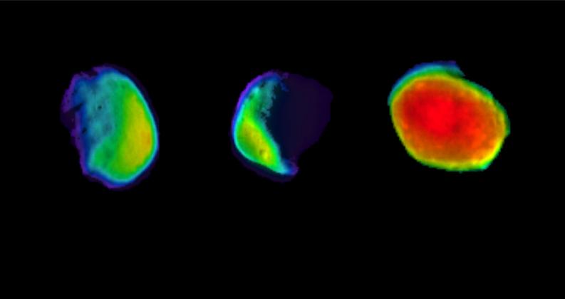
First off, we’re confronted with the somewhat cryptic information that we’re seeing the “cosmos” at a distance of 450 million light years. Mmmm hmmm. Then we have a color bar at the bottom, sans units, that tells us that the values range from –1.0 something to 4.3 something. Other labels appear scattered pell-mell across the image… “Fur-For”? “Per-Peg”? What is an Average Jane to make of these? (They’re short for “Further Fornax” and “Perseus-Pegasus,” BTW. I’ll even make the obnoxious grammarian observation that it should be “Farther Fornax” if anything.) And to add insult to injury, the red typeface blends right into the color scheme of the plot!

What saddens me most about this image is that it represents a spectacular result poorly communicated. What you’re looking at, FYI, is a color-coded representation of matter density within a thin sliver of the Universe at an approximate distance of (you guessed it) 450 million light years. The press release correctly identifies this as “the largest full-sky, three-dimensional survey of galaxies ever conducted” (based on 2MASS data, just so you know). How kewl is that? You wouldn’t know from this picture.

(If I were petty, I would note that the headings on the images don’t even match the captions provided in the press release from the Royal Astronomical Society, at least as it was emailed to me. For example, the caption for the image above reads, “The reconstructed density field, evaluated on a thin shell… at 45 million light years. The main overdensity, Shapley, is shown in red and green. Other overdensities are Rixos F231\526 (RIX), SC44, C19, Pisces (Pis), Perseus-Pegasus (Per-Peg), C25, C26, Hercules (Her), Abell S0757, C28, C29, C30, SC 43, Leo, Abell 3376, C27 and C21. The voids (blue) are V4, Further-Fornax (Fur-For) and V15.” Emphasis mine. But I’m not petty. Oh, and the picture is correctly labelled; the caption is wrong.)

The academic paper presents the same images as black-and-white contour plots, so I can only assume that the researchers believed themselves to be translating their results into user-friendly format simply by adding garish color.

Allow to digress for a moment to explain why I see this as such an egregious mistake. My two-bit definition of science visualization goes something like this… We make images from data (i.e., ones and zeros) for essentially one of three purposes: 1) communication to oneself in the form of data analysis, 2) communication to peers, often in the form of a graph or contour plot, and 3) communication to a general audience. The first two purposes depend heavily on well-developed visual language—for example, knowing what variables you’re plotting against one another, knowing what color-coding means, etc.—that often tend to be very specialized. Those of us who have been reading cartesian coordinates for most of our lives forget what it’s like not to be exposed to that visual vocabulary on a day-to-day basis. Needless to say, scientists tend to communicate via an extremely sophisticated visual language (that furthermore varies from discipline to discipline). The biggest problem occurs when scientists try to make the leap to the third form of visualization—communicating to the general public. It’s difficult to translate their complex visual language into a visual vernacular. (More details on my “personal paradigm” are available as part of my “What Is Viz?” PowerPoint, but be warned that you need to read the comments for each slide; otherwise, it’s just a bunch of pictures.)

Thus, the fundamental issue I see here can be likened to a mistranslation. The image above uses a very specific vocabulary (e.g., false color, Aitoff projection of a sphere onto a plane) to describe a small part of the Universe. Without attempting to translate the truly challenging aspects of the image, the presentation of candy-colored data sans specific quantifying information in fact results in a terribly confusing message.

Oddly enough, we have played with an earlier version of the 2MASS data as part of the Hayden Planetarium Digital Universe, so I’ve seen (in 3-D) the galaxy data upon which this is based. The data certainly lend themselves to a 3-D representation, and I can image a fly-through in which the matter distribution is represented by 3-D isosurfaces, or if a lot of rendering time were at one’s disposal, by volumetric rendering (similar to the manner in which some dark matter simulations are depicted.