Ball and Stick, Apple and Orange

Today,
Science Daily reported on research from Rice University that had actually appeared in a press release from Rice last week. Go figure. The new article includes the above image, however, which could be perceived as an improvement (or not) over the text-only copy from Rice.

A quick glance at the image caused a sudden nag, and I started to browse on before I figured out what was bothering me.

The nanotube should be made of atoms, right? Presumably those little grey shiny balls in the molecular model above. But interior to the nanotube, we see brightly-colored (one might be tempted to call them radioactive-looking) blobs that look like a scanning-electron micrograph of something-or-other. But these are supposed to be atoms! Specifically, astatine atoms, which should be a fair bit bigger than shown here.

This isn’t a big deal, I suppose, but it’s oddly distracting. First off, they use different visual vocabulary to represent the same kind of thing: atoms are shown in two distinctly different ways in the above image. Secondly (and I know I’m going out on a limb here), the image they choose perhaps even vaguely suggests cancerous cells… And given that the press release concerns using nanotubes to treat cancer, that’s potentially problematic.

Holy CMB, Batman!

A press release from NRAO announces, “Astronomers Find Enormous Hole in the Universe.” Hmmm. I’ll refrain from commenting on the overzealous word choice (except insofar as I just did) and focus on the image above.

I have to admit that the first thing I thought of when I saw the diagram was a poorly-rendered traffic cone—with a circular base, executed with an acute lack of graphical perspective.

The caption reads: “Illustration of the effect of intervening matter in the cosmos on the cosmic microwave background (CMB). On the right, the CMB is released shortly after the Big Bang, with tiny ripples in temperature due to fluctuations in the early Universe. As this radiation traverses the Universe, filled with a web of galaxies, clusters, superclusters and voids, it experiences slight perturbations. In the direction of the giant newly-discovered void, the WMAP satellite (top left) sees a cold spot, while the VLA (bottom left) sees fewer radio galaxies.”

The viewer (i.e., astronomers with their WMAP satellite and radio telescopes) is off to the left of the image, and it would probably be worth continuing the sides of the traffic cone until they meet—at Earth! Otherwise, it really doesn’t make much sense. Given its opacity and apparent solidity, the traffic cone looks like a structure, and truncating it simply exacerbates the problem.

Plus, the pictures of the two telescopes distract from what’s going on and further confuse things. They hover there by the tip of the cone, as if they belong there. But the radio telescope wasn’t even part of the observation depicted by the diagram: radio observations supplied confirming evidence.

I admit that I don’t have an immedite solution on how to depict the observations better, although the above image could be improved by making the cone appear more transparent, more a part of some continuous medium affecting the observations, and more connected to an observation point to the left of the image. Oh, and more appropriate in its perspective.

Curiously, the image is offered as a 73KB JPEG, a 278KB JPEG, and… a 34.3 MB TIFF! Now, I’m all about lossless compression of images, and I noticed that the giant TIFF had no compression whatsoever. So, just for kicks, I saved it out with LZW compression and it shrunk to 9.1MB. Yeah, disk space is cheap, but c’mon, let’s be sensible.

Antagonistic

And if I see it crescent, what does that make me?

I know I’ve commented on comics before, as well as on incorrectly rendered moons. But the Family Circus above represents a classic astronomical faux pas—a couple, actually. With a bit of plain stupidity mixed in.

The plain stupidity I’ve already made reference to: it’s a crescent moon, duh. But also, if the moon were seen as a crescent as depicted, the sun would also be up in the sky—i.e., it would be daylight! And a more subtle point can be extrapolated from the orientation of the crescent: either Grandma’s getting Dolly and Billy up very early in the morning wherever they live in Middle America, or they’re staying up after dark in the Southern Hemisphere.

Anyway, it’s like shooting fish in a barrel. I couldn’t resist, as a way of breaking my week-long silence.

Earth Tones

Great, simple, clear image. Kudos to the NASA Earth Observatory! Here’s the caption:

“This image, created from data collected by the Moderate Resolution Imaging Spectroradiometer (MODIS) on NASA’s Terra satellite from June 26 though July 3, 2007, shows land surface temperatures compared to average temperatures observed during the same period in 2000, 2001, and 2002. Deep red across the Southwest and the Intermountain West indicate that temperatures were much higher than they were in 2000-2002. The Southeast also experienced warmer temperatures. Northern California, Oregon, and Washington appear to be cooler than in previous years, as indicated by the blue tones. The heat wave started mid-way through the week-long period shown in this image. While temperatures may have soared at the end of the period, cooler temperatures earlier in the week dominate the signal.

“The Southern Plains are dark blue where temperatures were much cooler than they had been in previous years. During this period, torrential rains drenched the region, causing wide-spread flooding in Texas and Oklahoma and in Kansas and Missouri. The gray region over Kansas and Oklahoma is an area in which MODIS could not record the land’s temperature because of perpetual cloud cover during the week-long period.”

My only quibble is that “anomaly” might not be best phrase to communicate with broad audiences. “Variation from 2000-02 Average Temperature” maybe? Something like that?

The full-size, 4.8MB image shows the entire surface of the Earth, BTW. And the uniform grey oceans mean that you could easily add an alpha channel… Hmmm.

Stellar Tiramisu?

The press release from ESO compares a red giant to tiramisu—because, as Luca Pasquini puts it, “There is cocoa powder only on the top!” Hmmm.

(The cocoa powder analogy has to do with the distribution of heavy elements in stars with planets. We know that extrasolar planets are preferentially seen around stars with high iron content, but do the planets form around stars with a lot of iron distributed throughout, or do planets sprinkle iron, cocoa-like, on the stars’ surfaces?)

The image above does a bang-up job, I must say. It possesses clarity, first and foremost, comparing apples to apples and balancing the diagrammatic and the photorealistic with aplomb. I like the clear labels (with caveats to be addressed below), and the two stars even show limb darkening. Most especially, I must express my deepest appreciation for the inclusion of a small figure (in the lower right) to communicate scale! Yes! Fantastic! Super! Well done!

I would not go so far as to suggest that the diagram is flawless in its execution, however. Aside from a slight irrelevance to the topic at hand, the main liability I can detect is the inconsistency between the left- and right-hand images: “radiative zone” gets labelled only on the left, while ”burning shell” appears on the right. Something of a fumble in the home stretch…

And the Tiger Shall Lie Down with the Piglet

The inspiration for the above picture (taken, BTW, from a random blog page that at least gets most of the facts right) came while waiting in line at a restaurant here in Provincetown. They had several images posted, including the one above, showing mucho interspecies friendliness. I guess it fits with the love-everybody aesthetic of this place…

Anyway, the general story posted with the picture went something like the following:

“In a zoo in California, a mother tiger gave birth to a rare set of triplet tiger cubs. Unfortunately, due to complications in the pregnancy, the cubs were born prematurely and due to their tiny size, they died shortly after birth.

“The mother tiger after recovering from the delivery, suddenly started to decline in health, although physically she was fine. The veterinarians felt that the loss of her litter had caused the tigress to fall into a depression. The doctors decided that if the tigress could surrogate another mother’s cubs, perhaps she would improve.

“After checking with many other zoos across the country, the depressing news was that there were no tiger cubs of the right age to introduce to the mourning mother. The veterinarians decided to try something that had never been tried in a zoo environment. Sometimes a mother of one species will take on the care of a different species. The only ‘orphans’ that could be found quickly, were a litter of weaner pigs. The zoo keepers and vets wrapped the piglets in tiger skin and placed the babies around the mother tiger.

“Would they become cubs or pork chops?”

Of course it takes place in California! Always California… Anyway, I’d never seen the email with these images before, but evidently, it’s been around a while. And as with anything that looks mildly suspicious like this, it pays to check with Snopes. Turns out the pigs and tigers are real, but the whole thing has a more mundane aspect: the photos come from the Shriracha Tiger Zoo just outside Bangkok, where the piglet-tiger combos serve a sideshow niche. The Snopes page goes on to list a darker side to the whole venture, however.

So, at the level of interspecies relations, the pictures aren’t a hoax, and as such, I offer them up for your enjoyment and edification. “The wolf also shall dwell with the lamb, and the tiger shall lie down with the piglet; and the calf and the young lion and the fatling together; and a little child shall lead them.” Or something like that. Great. Where’s our peace?

BTW, I’ve had terrible connectivity here in P-Town, which is why I haven’t been posting. Yeah, right. Back in the Bay Area on Monday!

Tinkering with Polyhedra

Another terribly brief report from the Gordon Conference on Visualization. The chemistry bias comes to the fore again, with this spiffy look at polyhedral models of molecular structures. This is just one of several types of molecular model kicking around, but in the words of the supporting web documentation… “The polyhedral model, where a cation surrounded by its anions is represented by a single polyhedron, is useful for visualizing how structural components fit together. Only atoms belonging to complete polyhedra are shown.”

Hmm, well, maybe, two things won me over: first, there’s a model kit (that uses pompoms), but that’s complemented by a webpage full of links to virtual interactive structures (e.g., sodium chloride, as above).

I’ve been thinking a fair bit about these kind of complementary experiences lately (not just because of the conference). Being able to manipulate a physical model, tinker around, and assemble things with your hands stimulates the brain in one way; fiddling with an electronic model, tinkering around, and assembling things with your mind’s eye stimulates it in another. Taken together, the experiences can be powerfully reinforcing.

Just a thought, anyway.

Oh, and I like the way you can make the polyhedral surfaces partially transparent in the interactive, virtual version.

How Low Will I Stroop?

Okay, I admit that this is a somewhat lazy post. I’m still farily wrapped up in the Gordon Conference on Visualization, so you could interpret this as a less than stellar edition. My apologies. But after a day of more organic chemistry than I thought I could bear, I need to take a break!

So today’s post concerns a perennial favorite, the Stroop Effect, which is the cognitive delay that occurs when you try to read a color name printed in a different color—e.g., green or blue. (The above image comes from a Taiwanese web page about the effect, and I just found it rather amusing compared to the more obvious choice of listing words in English. “Look, ma, no stroop!”) Anyway, one of my fellow attendees pointed out that the Neuroscience For Kids site hosts a spiffy Stroop Effect Java Interactive that allows you to time yourself in reading off color names. Great stuff!

BTW, you can read Stroop’s original paper, if you’re interested, too.

And I’ll end with a shout out to the folks at GalaxyGoo! I show up in Kristin’s blog for today, so y’all can consider this just a wee bit of blogrolling…

Oh, and you can also listen to my podcast from the conference, hosted on the CalAcademy website.

Biochemical Art

I’m attending the Gordon Conference on Visualization in Science and Education, and this morning, we had a chance to hear (and see) David Goodsell from the Scripps Institute. Goodsell complements his research work with significant and influential dabbling in artwork. Above, you can see an image of blood serum taken from a collection of images he created for Biosite. His website describes the image as follows:

“Blood serum is shown in the picture, with many Y-shaped antibodies, large circular low density lipoproteins, and lots of small albumin molecules. The large fibrous structure at lower left is von Willebrand factor and the long molecules in red are fibrinogen, both of which are involved in blood clotting. The blue object is poliovirus.”

Goodsell preserves the shapes and relative sizes of the molecules while flattening the typical three-dimensional representations of molecules. He also represents the structures in cross section, using orthographic rendering to allow depicting large areas (large, that is, relative to the size of the molecules).

All of Goodsell’s images make good use of color, and I find the above image a particularly striking example. The poliovirus sticks out like a sore thumb (attractively composed asymmetrically within the frame), as of course it should. And it’s exceedingly pleasant to see depictions of molecules freed from the garish pseudocolor rainbow that seems to dominate the medium. Goodsell’s galleries include many more examples…

Evidently, Goodsell is also responsible for the “Molecule of the Month” at the RCSB Protein Data Bank (PDB). I haven’t taken a close look yet, but I plan to!

BTW, my home institution just started including me in a new category for the “Science in Action” podcast. Take a listen! I’ll have two more podcasts this week, mostly talking about the conference.

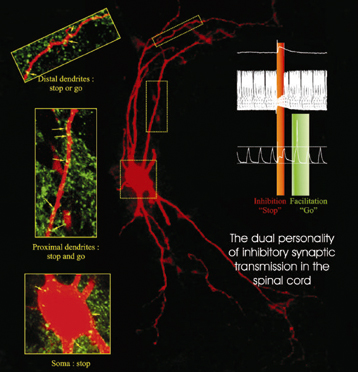
Stop and Go

The above image comes from a CNRS press release about the “double personality” of inhibitor neurons. Oh, and yes, the press release is in French. Sorry ’bout that. CNRS maintains an English site as well, but it lags several weeks behind the French site (shocking, I know).

Basically, researchers have discovered a chemical basis for the function of inhibitor neurons—neurons that seem to play a role in disorders such as paralysis and epilepsy. According to the new findings, the firing of a neuron (“stop” and “go,” as it’s described in the figure above) depends on the concentration of chloride ions, which is in turn controlled by proteins in the surface of the neuron.

To my eye, the visualization (presumably of actual data) communicates its message quite clearly. First off, it capitalizes on existing color associations with “stop” (red) and “go” (green), but it also does a nice job of highlighting specific regions of the neuron (n.b. “stop or go” and “stop or go”). A lot of information in a small space. The little diagram on the upper left is far too small for me to make out, but I’m guessing that it contains information that I would find interesting were I able to read it.

The red-green color scheme also seems to correlate with the use of bioluminescent tags in various samples. The book Aglow in the Dark: The Revolutionary Science of Biofluorescence taught me a wee bit about this field. Fascinating stuff.