MyArtinScience

No, not “Martian Science.” ”My Art in Science,” new website that presents scientific imagery from an aesthetic perspective.

The stated goals of the website have a high-falootin’ tone, but I generally find myself nodding in agreement as I read the page. It seems like a good idea to provide a forum for researchers to share work they find visually compelling, and who knows what interest it might spark. I have to admit that I stumble over sentences such as, “This beauty is not manufactured by the scientists or the engineers directly, but appears and shows up in their work, as a side effect of their work,” since I think there is some manufacturing going on, but… More power to ’em!

A representative image appears above. Its caption reads: “This is an image of a comprehensive two-dimensional gas chromatogram of crude oil. The image shows peaks representing the heavy alkane, sterane, and hopane molecules in the oil.” Um, okay. I know as much about gas chromatography as I know about animal husbandry, but basically, I think we’re looking at a false-color image that depicts concentrations of various molecules (I think one dimension is spatial and the other temporal, but I don’t get where the repetitive structures come from). It’s a rather pretty image.

Why is it pretty? Well, the physical results of the experiment provide a certain structure to the image. And the colors are rather pleasant, but of course, the scientist had to choose the color scheme, unless it was some default setting on the software used for analysis. So the “art” in the image results, I believe, from the combination of the natural world and the human touch. A side effect of the work? I guess so.

Anyway, go take a look at the site. In theory, scientists will be adding new images on a regular basis.

Quarks of Many Colors

I have to say, I’m kinda floored by this one.

The above image is associated with a December 2004 press release entitled “Jefferson Lab’s journey into the nucleus” that I ran across completely by accident. The non-animated version caught my eye, in part because of the caption: “An artist’s impression of a quark being struck by a virtual photon (a). As the quark propagates through nuclear matter, it loses energy by emitting gluons (b) and creating pairs of quarks and anti-quarks (c). As the system begins to return to equilibrium, two-quark systems (pions) are formed (d).” Admirably, it starts right off with the phrase “artist’s impression.” And quite an impressionistic impression at that!

The caption that appears with the above, animated image (and, inexplicably, the title “Simple Experimental Simulation”) could use a similar qualification, in my opinion: “This movie illustrates the action inside the nucleus of a deuterium atom containing a proton and a neutron, each with three quarks. An electron strikes a quark inside a proton, passing energy to the quark before the electron bounces back. The quark now has so much energy ‘stuffed’ into it, it creates a cascade of new particles as it flies out of the proton. The result is two new, two-quark particles.”

First off, I have to note that having the GIF loop creates a problem, namely that the linear process of the reaction is shown blending back into itself. Awkward to say the least. Initially, I was inclined to blame my browser, but then I took a closer look at the file and noted that it seemed to be designed to loop, and indeed, a quick check with Adobe ImageReady revealed it to indeed be designed as a loop. Yikes! Ideally, there would at least be a few frames of black between the end and the beginning of the sequence, but to design it to loop continuously is highly misleading.

Of course, there’s plenty of misleading aspects to this representation. Basically, what we’re looking at is a Feynmann diagram, which is normally shown as a tinkertoy-type diagram of lines and squiggles (tinkertoys and springs, I guess). The imagery above includes a lot more information—colors represent different types of quarks, for example—which strikes me as rather clever and quite aesthetically pleasing, but…

What troubles me about the image is that it’s using a somewhat representational style to illustrate a fundamentally abstract concept. The almost biological quality of the pions slithering off toward the end may be rather striking, but what does it mean? In terms of communicating the underlying concepts, well, I hate to sound boring, but a more straightforward approach may be better suited. I admire Jefferson Lab for trying something different, but caution is required—or at least a cautionary note!

The initial caption, clearly indicating “artist’s impression” from the get-go, addresses my cautionary concerns, but it’d be even better if there were a brief essay by the artist involved. What choices did he or she make in creating the image? What do the colors mean? What motivated the somewhat biological look of the illustration?

In a medium better known for its objectivity than its artistry, a diagram may deserve a colorful interpretation, but as always, the subjective layer may add unintended meanings.

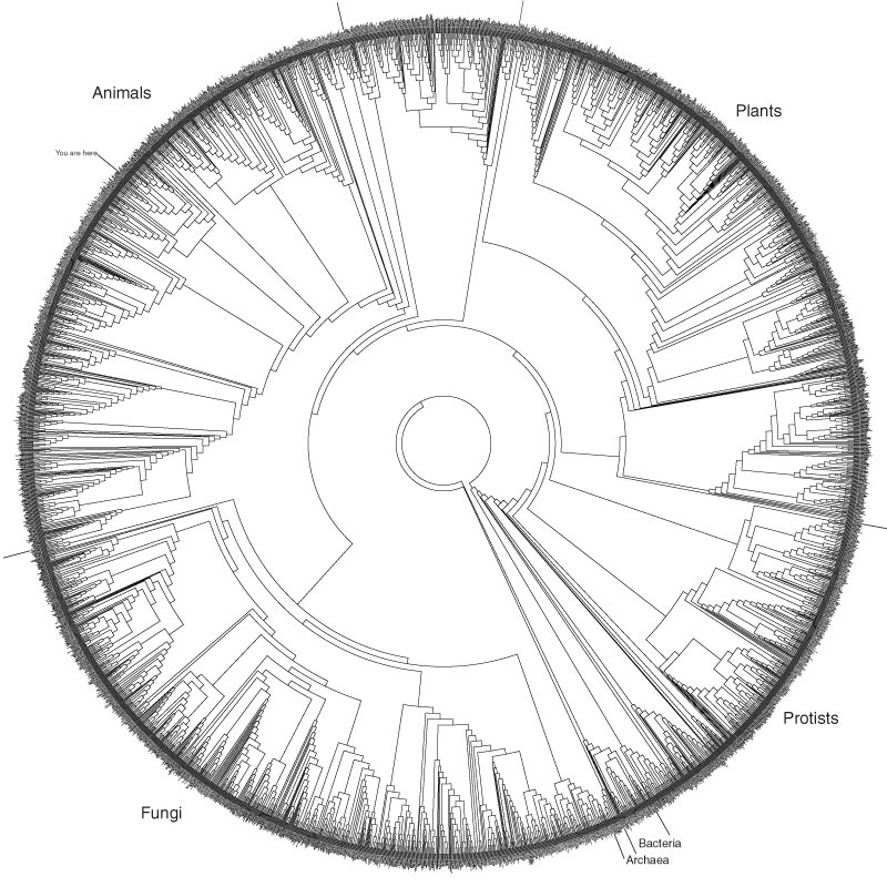
Circle—Er, Tree of Life

I just ran across the above image, although it has evidently been around for a while. It shows about 3,000 species, arranged in a circle and linked by relationships revealed through analysis of subunit rRNA sequences. A fuller description on the Hills/Bull Laboratory website gives more details, as well as a PDF that allows for either large printing or significant zooming.

What I find absolutely intriguing about this is that the diagram really only offers aesthetics over other illustrations of the Tree of Life, perhaps linking as it does to the “Circle of Life” concept (insert cheesy Elton John ballad here). Siyo Nqoba! But really, the circular representation has no meaning; it just looks good. And there’s absolutely nothing wrong with that, particularly since it evidently continues to inspire people to blog about it. Let’s hear it for aesthetics!

Anyway, for kicks, compare the above to Darwin’s 1837 sketch of branching species, as he was beginning to work out the concepts we now know as Darwinian.

To digress further… Does everyone know about the Darwin Correspondence Online Database? Hours of fun! But sadly, the database privileges the written word over the drawn image, as in this letter to Huxley, which ends with an annoying “DIAGRAM HERE.” Grrr.