Long time, no write, except for that silly link last week. I’m still working on that little project in San Francisco, which consumes an extraordinary amount of time.
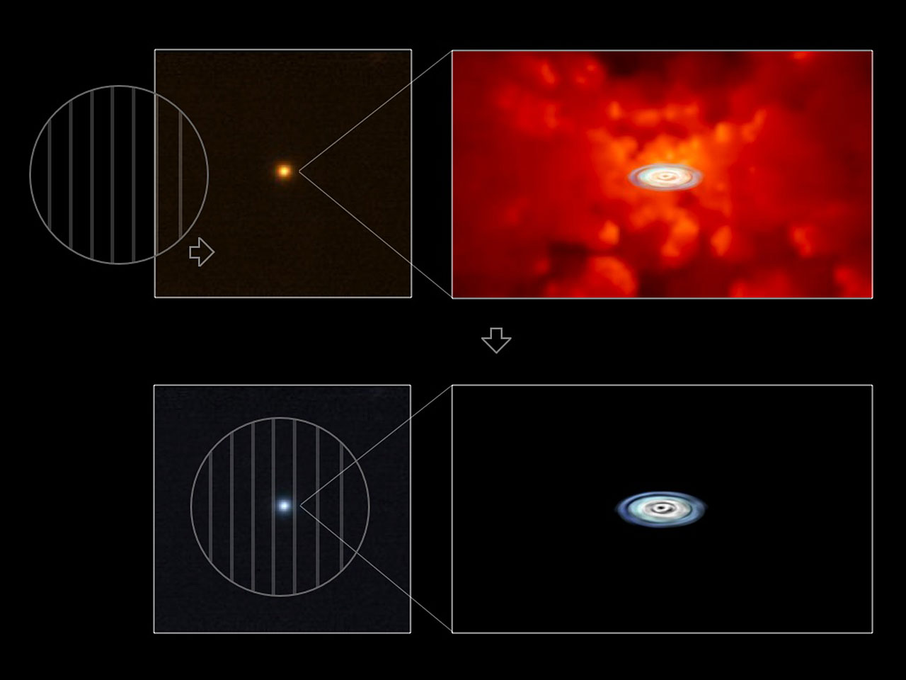
At any rate, I saw the above image, which accompanies a press release from the European Southern Observatory (ESO), and I figured I could express my thoughts quickly enough not to feel too guilty about taking the time to write.
The press release bears the title “Accretion Discs Show Their True Colours,” which describes the different appearance of quasars in polarized light. The press release describes the research well: “‘The crucial observational difficulty here has been that the disc is surrounded by a much larger torus containing hot dust, whose light partly outshines that of the disc,’ says Kishimoto. ‘Because the light coming from the disc is scattered in the disc vicinity and thus polarised, by observing only polarised light from the quasars, one can uncover the buried light from the disc.’”
The image does pretty well, too, except I have some nagging issues with it. Of course, the little circles with vertical lines suggest polarization to the initiated (although they also remind me of those glasses Chris Lowe wore back in the late 80s that I wanted so much), but I fear that visual shorthand is lost on a large percentage of the audience. And even if you get it, why does the little circle moving over the image change the color of the entire image? It would be much better if only the part inside the circle changed color. A little Photoshop work would make this image much, much clearer.
So how’s that for succinct?
(BTW, in nosing around for a link to “polarized light,” I ran across Polarization.com, which suggests to me that there really is a website for just about everything.)
