Kant and Kitties

I stumbled across a site called “The Desk of One Astronomer” recently, and it’s… Cute.

I like the overall design of the site, although it reminds me a bit of a mid-90s CD-ROM, and the videos featured (one on “Island Universes” and another on “The Cepheids”) charmed me in spite of their rudimentary design. The content strikes me as rather ambitious, but I admire the way it’s organized: you can locate the same information via multiple entry points, and the interface is consistently visual and inviting.

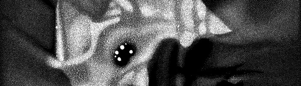
And I must admit that I’ve never seen a cat used to explain parallax. Adorable.

Evidently, the website sprung from work out of the SciVi group at California State University Los Angeles, which “trains undergraduate and graduate students from three different disciplines—Art, Physics and Astronomy, and Computer Science—to develop accurate and effective scientific visualizations of topics in Cosmology and implement their public dissemination.” Interesting. Should be worth watching in the future.

MyArtinScience

No, not “Martian Science.” ”My Art in Science,” new website that presents scientific imagery from an aesthetic perspective.

The stated goals of the website have a high-falootin’ tone, but I generally find myself nodding in agreement as I read the page. It seems like a good idea to provide a forum for researchers to share work they find visually compelling, and who knows what interest it might spark. I have to admit that I stumble over sentences such as, “This beauty is not manufactured by the scientists or the engineers directly, but appears and shows up in their work, as a side effect of their work,” since I think there is some manufacturing going on, but… More power to ’em!

A representative image appears above. Its caption reads: “This is an image of a comprehensive two-dimensional gas chromatogram of crude oil. The image shows peaks representing the heavy alkane, sterane, and hopane molecules in the oil.” Um, okay. I know as much about gas chromatography as I know about animal husbandry, but basically, I think we’re looking at a false-color image that depicts concentrations of various molecules (I think one dimension is spatial and the other temporal, but I don’t get where the repetitive structures come from). It’s a rather pretty image.

Why is it pretty? Well, the physical results of the experiment provide a certain structure to the image. And the colors are rather pleasant, but of course, the scientist had to choose the color scheme, unless it was some default setting on the software used for analysis. So the “art” in the image results, I believe, from the combination of the natural world and the human touch. A side effect of the work? I guess so.

Anyway, go take a look at the site. In theory, scientists will be adding new images on a regular basis.

NSF Visualization Challenge 2008

Another year, another NSF/AAAS Science and Engineering Visualization Challenge. With the opening of my institution mere days away (tonight’s the gala), I’ll limit my comments to short and snarky.

As usual, the quick and dirty way of catching up on the challenge winners is to enjoy the Science magazine interactive thingie: you can browse the images, listen to the podcast, etc. The one thing you can’t do unless you subscribe to the magazine is actually read the article. Bummer. The NSF provides a fairly thorough description of the winners with plenty of links, so you can still get a good sense of who did what.

Most of the winners are truly impressive, and thus unworthy of comment (except I’ll note that I quite enjoyed the “Smarter than the Worm” video). Instead, I’ll of course mention the one I didn’t much care for… The “squidsuckers” image above. We’re looking at tiny suction cups (each less than half a millimeter in diameter, with chitin “fangs”) on the arm of a Loligo pealei squid.

First off, I find the garish colors a bit of a turn-off, and the mediocre alignment of the color to the underlying image doesn’t help. Jessica Schiffman, the doctoral student at Drexel University who created the picture, claims that the film Little Shop of Horrors inspired the color scheme (presumably the Frank Oz version, not the original black-and-white movie). That’s cute and all, but I wonder if a novice viewer would interpret these tiny little maws as individual Audrey Juniors, waiting to consume the squid’s prey rather than simply latch onto it.

Polarized Colo(u)r

Long time, no write, except for that silly link last week. I’m still working on that little project in San Francisco, which consumes an extraordinary amount of time.

At any rate, I saw the above image, which accompanies a press release from the European Southern Observatory (ESO), and I figured I could express my thoughts quickly enough not to feel too guilty about taking the time to write.

The press release bears the title “Accretion Discs Show Their True Colours,” which describes the different appearance of quasars in polarized light. The press release describes the research well: “‘The crucial observational difficulty here has been that the disc is surrounded by a much larger torus containing hot dust, whose light partly outshines that of the disc,’ says Kishimoto. ‘Because the light coming from the disc is scattered in the disc vicinity and thus polarised, by observing only polarised light from the quasars, one can uncover the buried light from the disc.’”

The image does pretty well, too, except I have some nagging issues with it. Of course, the little circles with vertical lines suggest polarization to the initiated (although they also remind me of those glasses Chris Lowe wore back in the late 80s that I wanted so much), but I fear that visual shorthand is lost on a large percentage of the audience. And even if you get it, why does the little circle moving over the image change the color of the entire image? It would be much better if only the part inside the circle changed color. A little Photoshop work would make this image much, much clearer.

So how’s that for succinct?

(BTW, in nosing around for a link to “polarized light,” I ran across Polarization.com, which suggests to me that there really is a website for just about everything.)


Hubble Space Kaleidoscope

I’ll break my silence with a simple link… To The Onion article “Hubble Kaleidoscope Finds Evidence Of Space Looking All Crazy” that appears in this week’s issue. I don’t know how long that link will stay active but bwa-ha-ha-ha! Dang funny.

And there’s some truth to it, too. I’m inspired to round out my next column for the Communicating Astronomy with the Public Journal.

La viande robotique

Just an unusual image I ran across in the Journal of the Centre Nationale de Recherche Scientifique (CNRS), in an article entitled “The Robot Butcher” (I can’t make these things up).

Why have a robot cut meat? Efficiency, it seems: the do-dad above can prep 250 kilograms of meat per hour versus the 100 kilograms per hour by its human competitor. And it does so with a smaller margin of error. No way to get a little extra from the butcher anymore. No special cut. And no one to flirt with, either (I’m thinking of Alice on the Brady Bunch here).

The oddness of the image, however, lies in the striking contrast between the mechanized butcher and the all-too fleshy substance of the meat. Somehow, it seems unfair to the cow, and moreover, seems like an intrusion of the mechanical into an utterly animalistic behavior—namely the consumption of one critter by another.

Hrm. Anyway…

There’s a kinda interesting diagram of the Sun, too, but I found the robot butcher more engaging, for whatever reason.

Clan Apis

I just ran across Jay Hosler’s Clan Apis comic book. I’m not a bio kind of guy, so I can’t comment on the accuracy of either the drawings or the science embedded in the story, but both seem spot on. Hosler’s artwork treats the bees with loving detail, while maintaining a pleasant and readable style that hints at manga. The book follows the life of a single bee, Nyuki, touching on her life cycle and the structure of the hive as a whole. A story brilliantly told, with an admirable blend of science and humor.

Clan Apis also receives extensive treatment on Hosler’s website, including a section-by section treatment of the story and the science. Really nice stuff.

This also reminds me of the nascent work of the Small Science Collective, a group of folks (some of whom I happen to know) who create downloadable “mini-zines” with science stories. The idea here is much more of a guerilla tactic: make the comics available for free! (Much like the reprehensible Chick tracts that litter far too many of our nation’s public transportation systems.

As a long-time reader of comics and comic books, I love seeing them used like this!

Ionosphere in 4D

Space Environment Technologies’ Communication Alert and Prediction System has announced Earth Space 4-D, a collection of layers in Google Earth.

Unfortunately, the ES4D site offers basically no information about the layers themselves. For that, you need to go to the press release from which I learned about the whole thing: “ ‘Colors represent electron content,’ Tobiska explains. “Bright red is high density; that’s where radio communications are restricted to few or no frequencies. Blue is low density; no problem there.’ ” Okay, not bad, but why can’t we link to come kind of explanatory text on the page that serves up the data layers?

Another gripe. The ionosphere extends up to about 200 kilometers, but the KML layer seems to hover above that. It just seems like you could represent the electron density and such at its actual altitude.

And another. Unfortunately, you evidently need to download new KML files from the aforementioned site every time you want to take a look at the data. Hrm. Less than elegant. Isn’t there a way to offer KML layer that update automatically…?

So, I dunno. I guess this is a good start, but I think the offering could make better use of the available tools and technologies, the data should be represented to scale, and for heaven’s sake, we should be told what we’re looking at.

Seeing Red

A personal post today… I’m color blind, and admitting to that often results in people asking how a color blind person can be a “science visualizer” or (as is the case now) a “director of science visualization.” My reply usually has to do with experiencing the subjectivity of seeing early on and blah, blah, blah. I won’t subject you to that right now.

Instead I simply want to quote a couple of sentences from an interview with Arno Motulsky that appears in today’s Science Times: “Our laboratory found that one-half of males with normal color vision had the amino acid alanine in their red pigment, while the other half all carried the amino acid serine, at the same site. This finding means that the same exact red color is perceived as a different type of red, depending on a person’s genetic makeup.”

Ha! So there, you “color seeing” people! You “normal color vision” types! You don’t see an absolute “red” any more than I do.

(Thanks, BTW, to Declan McCullagh, who doesn’t know I cribbed his image above. I need to write and ask him for permission…)

Phobos in Stereo

Sometimes I just want to post a kewl image, and this qualifies! The above image of Mars’s moon Phobos stopped me in my tracks this morning, for a multitude of reasons’

First off, it’s color. I don’t recall any earlier color images of Phobos, although I’m too lazy to go check.

Secondly, it’s available in stereo! Which is to say, stereoscopic, not stereophonic. What the rest of the world calls “3D.” This happens to be on my mind, since I’m involved with this crazy construction project, which will eventually house a gorgeous planetarium (of course) as well as a stereoscopic theater. I’m keenly interested in finding content for it, particularly real-world content that isn’t computer-generated. (If you want to watch a video of me from the recent CineGrid conference, you can learn more about my vision for media in the new California Academy of Sciences.)

But lastly, I was especially surprised because the image was taken by the HiRISE camera aboard NASA’s Mars Reconnaissance Orbiter (MRO). HiRISE has taken all kinds of spiffy images of the surface of Mars, but I can only attribute it to a lack of imagination on my part that HiRISE snapping a picture of one of Mars’s moons never occurred to me.