Clan Apis

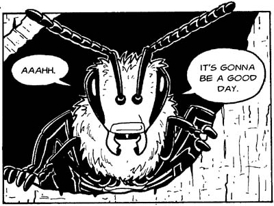
I just ran across Jay Hosler’s Clan Apis comic book. I’m not a bio kind of guy, so I can’t comment on the accuracy of either the drawings or the science embedded in the story, but both seem spot on. Hosler’s artwork treats the bees with loving detail, while maintaining a pleasant and readable style that hints at manga. The book follows the life of a single bee, Nyuki, touching on her life cycle and the structure of the hive as a whole. A story brilliantly told, with an admirable blend of science and humor.

Clan Apis also receives extensive treatment on Hosler’s website, including a section-by section treatment of the story and the science. Really nice stuff.

This also reminds me of the nascent work of the Small Science Collective, a group of folks (some of whom I happen to know) who create downloadable “mini-zines” with science stories. The idea here is much more of a guerilla tactic: make the comics available for free! (Much like the reprehensible Chick tracts that litter far too many of our nation’s public transportation systems.

As a long-time reader of comics and comic books, I love seeing them used like this!

Moon and Pen

Above, we have Ewen Whitaker’s 1954 map of the lunar south pole, which shows up as today’s Lunar Photo of the Day (LPOD), although of course, it’s not a photo… Well, why be picky? It’s a gorgeous drawing described as follows in the LPOD entry: “Despite a fleet of lunar probes and modern high resolution imaging, the best observer’s map of the south polar region of the Moon remains one drawn a half century ago.”

What strikes me as utterly compelling about the above image is what I read as simplicity and clarity in it: the bold lines that delineate craters and ridges, the dotted lines offering a sense of depth, the multiple but surprisingly unobtrusive names and labels. At the same time, these are conventions that I recognize and understand (as well as the general depiction of perspective), and I’m curious to know how a novice would read this image.

Perhaps because I draw, I find such illustrations very compelling. But I think it’s simply the human touch… Utterly apparent in the handwritten words (right down to the question marks) and the quality of the lines on the page (or computer screen). These elements pull me into the image in a way that almost no Adobe Illustrator images can.

But LPOD author Chuck Wood makes an interesting point: there is a clarity and interpretive value lent by the human touch. “The best observer’s map of the south polar region” issues from an artist’s pen, not a digital camera.

Yesterday’s LPOD tells a related but somewhat different story, comparing a drawing and a photo of the same region of the Moon. As the post says, “Sally, an experienced observer and skilled artist, captured the essence, the feeling of this area, and Simon captured the reality. ” The drawing and photo, side by side, reveal something unsurprising yet somewhat poignant. The eye and hand versus the CCD.

Of Nebulae and Drawings

I noticed a slight error that seems to be floating around out there on the net. Several “this day in history” sites, including the Wikipedia page on 4 March list today as the “first sighting of Orion Nebula by William Herschel” in 1774. Strictly speaking that’s not untrue—Herschel seems to have made his first observations of the Orion Nebula on 4 March 1774, but in fact, telescope observations of the nebula had originally been described by Peiresc back in 1610 (cf. a lengthy list of early observations of deep-sky objects).

What’s important about Herschel observing Orion is that it got him started on a massive cataloging campaign that resulted in a list of thousands of deep-sky objects. And a numbering system that’s still in use today!

All this thinking about the Orion Nebula reminded me of the image shown above—a sketch by William Herschel’s son John. I link to a fine-art print offered by David Malin of the same, and in a continuing cascade of connections, I also wanted to point out a marvellous essay by Malin in which he compares Herschel the Younger’s drawing to (a somewhat more psychedelic) one created by William Parsons. As he points out, differences between the two images “result not from changes in the nebula or in telescopic power, but from subjective differences in the way their creators saw, remembered, and sketched what was essentially the same subject.” I’ve blogged about related issues before, but Mailin is both nicer and more eloquent than I.

Anyway, I hope you appreciate a random stroll down this-day-in-history lane.

How Do You See Invisible Germs?

Sorry for the gap in posts, but the last few days have been a little hectic. And I suppose it’s appropriate that I seem to be coming down with a bit of a cold as I decide to write about The Gospel of Germs by Nancy Tomes. I just finished Tomes’s book last week, and it inspired me to think about how the invisible is visualized in a popular context. Her perceptive and illuminating book describes the acceptance and interpretation of the germ theory of disease around the turn of the last century—from advertising to anti-tuberculosis societies, from labor unions to Listerine. Fascinating stuff.

Because 19th-century microscopes didn’t really allow for photography (I tried searching for when the first photographs were taken through a microscope, to no avail, but I’ll update you if I learn anything), drawings of microbeasties had to stand in for actual photos. Of course, the same was true of most imagery that appeared in a newspaper or magazine of the day—it all had to be represented in etchings or lithographs (the first newspaper photograph appeared in 1880, although I admit that my source is a little off the beaten track). Unfortunately, I couldn’t find images online to help me illustrate the concept in the context of that time period. But the above drawing, which comes from a web page about “Infectious and Epidemic Disease in History” from the University of Califoria Irvine, underscores the basic idea.

I have previously commented on the unreliability of drawings compared to less subjective means of recording data, but Tomes’s book and the drawing above raise another issu: when the subjective role of illustration actually takes precedence over its objective goals. The point of the cartoon is not to communicate what a germ looks like—instead, it simply stands in for an unseen critter that obviously poses some kind of threat to us. It looks like a nasty bug. Indeed, some of the illustrations that appear in Tomes’s book use the same visual vocabulary—the insect-like features, the hairiness—to communicate the same thing (albeit not in such a cartoonish manner). Look at the iconography that surrounds the ever-popular Airborne® health formula, with its colorful, slightly creepy but mostly effete and harmless “bugs.” A little bit of the 19th-century threat remains, but the slightly bowdlerized images allow us to view the microscopic world as something fundamentally under our control.

Nowadays, when the variety of imagery available to us via microscopy, we can think of the microscopic world as incredibly detailed, fluorescently colored, or perhaps confusingly abstract, a cartoon like the one above is easily interpreted for what it is. But when an image represents a new concept, it’s all too easy for it to become literalized. I don’t know how many people at the end oft he 19th century perceived newspaper and magazine ad illustrations as true depictions of the (quite threatening) microscopic world, but surely the less cartoonish, albeit similarly demonizing, illustrations had an effect.