Ball and Stick, Apple and Orange

Today,
Science Daily reported on research from Rice University that had actually appeared in a press release from Rice last week. Go figure. The new article includes the above image, however, which could be perceived as an improvement (or not) over the text-only copy from Rice.

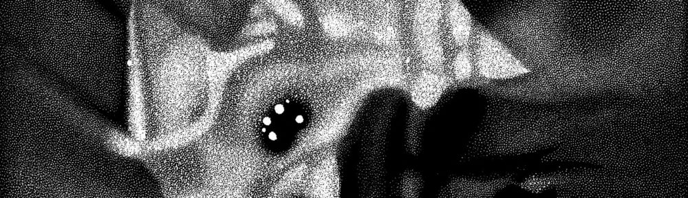
A quick glance at the image caused a sudden nag, and I started to browse on before I figured out what was bothering me.

The nanotube should be made of atoms, right? Presumably those little grey shiny balls in the molecular model above. But interior to the nanotube, we see brightly-colored (one might be tempted to call them radioactive-looking) blobs that look like a scanning-electron micrograph of something-or-other. But these are supposed to be atoms! Specifically, astatine atoms, which should be a fair bit bigger than shown here.

This isn’t a big deal, I suppose, but it’s oddly distracting. First off, they use different visual vocabulary to represent the same kind of thing: atoms are shown in two distinctly different ways in the above image. Secondly (and I know I’m going out on a limb here), the image they choose perhaps even vaguely suggests cancerous cells… And given that the press release concerns using nanotubes to treat cancer, that’s potentially problematic.

Holy CMB, Batman!

A press release from NRAO announces, “Astronomers Find Enormous Hole in the Universe.” Hmmm. I’ll refrain from commenting on the overzealous word choice (except insofar as I just did) and focus on the image above.

I have to admit that the first thing I thought of when I saw the diagram was a poorly-rendered traffic cone—with a circular base, executed with an acute lack of graphical perspective.

The caption reads: “Illustration of the effect of intervening matter in the cosmos on the cosmic microwave background (CMB). On the right, the CMB is released shortly after the Big Bang, with tiny ripples in temperature due to fluctuations in the early Universe. As this radiation traverses the Universe, filled with a web of galaxies, clusters, superclusters and voids, it experiences slight perturbations. In the direction of the giant newly-discovered void, the WMAP satellite (top left) sees a cold spot, while the VLA (bottom left) sees fewer radio galaxies.”

The viewer (i.e., astronomers with their WMAP satellite and radio telescopes) is off to the left of the image, and it would probably be worth continuing the sides of the traffic cone until they meet—at Earth! Otherwise, it really doesn’t make much sense. Given its opacity and apparent solidity, the traffic cone looks like a structure, and truncating it simply exacerbates the problem.

Plus, the pictures of the two telescopes distract from what’s going on and further confuse things. They hover there by the tip of the cone, as if they belong there. But the radio telescope wasn’t even part of the observation depicted by the diagram: radio observations supplied confirming evidence.

I admit that I don’t have an immedite solution on how to depict the observations better, although the above image could be improved by making the cone appear more transparent, more a part of some continuous medium affecting the observations, and more connected to an observation point to the left of the image. Oh, and more appropriate in its perspective.

Curiously, the image is offered as a 73KB JPEG, a 278KB JPEG, and… a 34.3 MB TIFF! Now, I’m all about lossless compression of images, and I noticed that the giant TIFF had no compression whatsoever. So, just for kicks, I saved it out with LZW compression and it shrunk to 9.1MB. Yeah, disk space is cheap, but c’mon, let’s be sensible.