This Is Your Brain on Icons

I stole the above image from an article in the Arts section of today’s New York Times. The print version included a spread of even more magnetic resonance imaging (MRI) pictures arranged in a grid. The article profiles the work of Daniel Levitin, former punk musician and producer, who has gone on to get a Ph.D. and do research in neuroscience—namely, on how our brains process music.

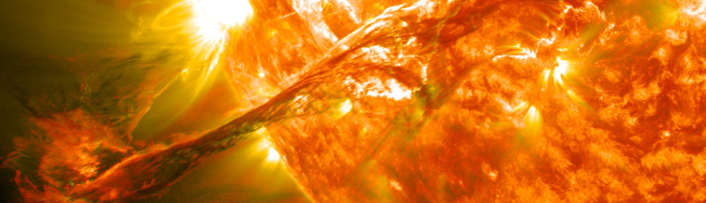
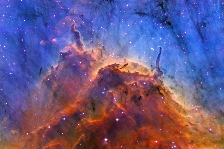
I find the work fascinating, but as usual, I’m here to talk about the image. How interesting that a grid of images says “neuroscience” clearly enough to be used on the front page of the Arts section! These abstract, cauliflower-looking photos have become a conceptual stand-in for brain studies. The Times captions make no attempt to explain or describe the pictures; instead, the reader is simply expected to make the connection (and my guess is that most Times readers will), but what’s happening here is that the images are beginning to act purely as icons. So, much in the same way that a Hubble image says “astronomy” or a bubble chamber image says “physics,” the MRIs simply communicate the idea “brain study.”

Levitin is also the author of the book This Is Your Brain on Music, which has an accompanying, entertaining website. Links to a few of his academic papers can be found on a page at the Stanford Cognitive and Systems Neuroscience Laboratory.

The image, BTW, is credited to Vinod Menon at Standford University’s Department of Psychiatry and Behavioral Sciences.

Electronic Flu

More electron microscopy! Except it’s only used as a background this time. A press release from the National Institutes of Health (NIH) describes work done by the National Institute of Arthritis and Musculoskeletal and Skin Diseases (NIAMS) to visualize the influenza virus. The image above, in all its 30,625 pixels of glory, is the only one that appears with the press release, which I find surprising for such a visual result.

The image itself does a pretty good job. The two-dimensional, black-and-white background image stands in relief to the brightly-colored, three dimensional model of the virus. But gosh, it’s a tiny picture! And for such a spiffy result.

Also, the press release states: “The research team used electron tomography (ET) to make its discovery. ET is a novel, three-dimensional imaging method based on the same principle as the well-known clinical imaging technique called computerized axial tomography, but it is performed in an electron microscope on a microminiaturized scale.” It’s probably worth saying that computerized axial tomography is more familiarly known as a CAT scan. Just sayin’…

Unseam’d from the Nave to the Chaps

A press release from the European Molecular Biology Laboratory (EMBL) uses the above image to illustrate what happens when a particular protein is absent from the molecular mix in a cell: microtubules come unseam’d. A protein called “Mal3p” binds two sides of a protein sheet curled into a tube, so without it, you see the unzippered effect above. A succinct visual punch line to the press release.

Methinks the caption is not written by a native speaker of English, however: “In the absence on Mal3p microtubules are unstable and can open at the seam. The image shows a microtubule with opening seam [bottom left], seen through the electron microscope.” Aside from “on” instead of “of,” it sounds like there’s only one electron microscope making images out there.

Mouseover Brilliance

Kudos to the Astronomy Picture of the Day (APOD) for the inventive use of HTML in today’s image. I could spend quite a bit of time—well, I have already spent quite a bit of time—mousing over the image to compare the “true color” (my words) to the “mapped color” (their words) version. An impressively economical way to allow for comparison between two coregistered images. I haven’t seen APOD do this before, but I like it.

(I tried copying the HTML on this page, so you could see the same effect here, but it didn’t work.)

Of course, the shortcomings of APOD also become apparent in the page above. The caption gives tantalizingly little information about the object, and because the hypertext relies almost exclusively on internal APOD links, one is left with oddly tangential references to topics such as “atomic hydrogen” and the aforementioned “mapped color.” (Although I have to give APOD credit for linking to one of my favorite Hubble web pages. I usually link to the top “Behind the Pictures” page, but to each their own.)

What works, however, is the ability to make a direct comparison between the two types of images—one of which reveals much greater contrast in the detailed structure of the nebula. It helps one understand why astronomers tend to work in narrowband imagery.

Things to note in comparing the two images… The stars appear relatively dimmer in the narrowband imagery, because we’re throwing out much of the light they emit, zeroing in on wavelengths tuned to sulfur and oxygen emission from the nebula. The contrast between the higher-energy oxygen line and the lower-energy sulfur line (in the “mapped color,” narrowband image) reveals the fine structure of the nebula more clearly than the hydrogen emission alone (in what approximates a “true color” image). Also, you see much greater contrast between the dusty regions (which appear black) and the glowing gas.

Apologies, BTW, for my continuing terseness in my posts. I continue to have limited access to the net, so my commentary is tracking my bandwidth. Sorry ’bout that.

A Grain of Sociology

Today’s “Blog around the Clock” links to a Flash visualization of the spread of world religions over the lat 5,000 years. On a slow science day (coinciding with the day before a major religious holiday), it seemed reasonable to draw attention to this viz. As the Maps of War site says, “See 5,000 years of religion in 90 seconds…” The snapshot above simply shows the last frame of the animation.

Interesting. Of course, any visualization of sociological data should be taken with a grain of salt, but the graphics are ultimately quite comprehensible and clear. Good color-coding, good keying, good idea. Now if they could just add little flashes when battles erupted, along with a tally of the number of people who died in the name of their respective religions, I’d be a real fan of the site.

(As an aside, I just checked, having used the phrase “grain of salt,” and apparently, its origins remain ambiguous. Hmmm.)

Overdramatizing

The above image comes from ESA’s website for the COROT (which supposedly stands for “COnvection ROtation and planetary Transits) mission, which will look for potentially terrestrial-sized planets orbiting other stars as well as “starquakes” as small as a few meters. The mission is scheduled to launch into orbit this week.

Without going into any details about the astronomy, I would like to rage, rage against the dying of the science in illustrations such as this. I understand what the artist is attempting to do in the image—the shadowed planet on the right is a rocky world orbiting the blindingly bright star in the middle, exactly the kind of planetary system that COROT (shown shockingly close to the system in near foreground) might be able to find. But the artistic license in the image presents such a Star Trek-ized version of the cosmos that I fear it does more harm than good. People are confused enough about the scale of the Universe, must we muddy the celestial waters with imagery that values drama over content?

I don’t have a solution for the conundrum. I understand the need for creating compelling imagery, but when we distance ourselves from what we can truly provide—namely, an understanding of scientific processes and results—we undercut its true significance. Art is great; I love art and occasionally attempt to create it. But I honestly think we hurt ourselves with images such as the one above.

(In case you’re curious about COROT, you can check out the ESA site, or take a look at a Nature article that describes the mission and the impending lift-off.)

Breathing Earth

A frequent reader of this blog just pointed me to the “Breathing Earth” website, from which I took the snapshot pasted above. The site takes data about countries’ birth and death rates as well as carbon dioxide emissions and incorporates them into a single, interactive map of the world. Births and deaths show up as flashes on the world map, while the color of a country represents its carbon dioxide emissions.

What the snapshot above doesn’t show is the interactive bit of the site, which allows you to mouse over a country to learn about its particular birth and death rate as well as its carbon dioxide emissions. Plus, it features a running tally in the lower left-hand corner that shows how many people have been born, how many died, and how much carbon dioxide has been emitted since you personally opened the web page.

Overall, this strikes me as a spiffy visualization, and my initial inclination is to see more data represented—perhaps not all at the same time, since I would hate to see the pleasant design marred by overcrowding, but maybe as options. In other words, it seems like a good template. One of the challenges of presenting only a few data elements is that it suggests a causal connection between them, whereas having a more generous set of options would allow the user to explore more on her own. In terms of the content actually presented, I’m a little confused by what the color of the country really means, since the caption reads variously “country has emitted over/less than 1000 tonnes of CO2” and “is currently emitting more than 1000 tonnes of CO2.” The last statement is meaningless, since “currently” would require some rate of emission, not simply a quantity. So it seems that it could use a little more detail in the captioning.

(Then, on an utterly nitpicky note, the regular gridlines of the above image suggest a Mercator projection, but the layout of the geography looks more like the traditional Robinson projection. That annoys me, but I’m easily annoyed that way. For more on map projections, BTW, you can take a look at the “Geographer’s Craft” page or the more detailed but less complete page at USGS. For the truly anal-retentive, check out Hans Havlicek’s page for more information than most of us ever need on the topic.)

I actually took a very different approach to visualizing socio-economic data in an “art” piece I created as an interactive and for fulldome video. I dropped the map and put elements into a very abstract space, hoping to see patterns that could work on both an aesthetic and an intellectual level. Dunno if I succeeded, but I entitled it “Numerology 0.1,” if that gives any sense of how I feel about it.

Visualizing Dark Matter

So I’d just finished writing my previous post, and lo and behold, a press release from Hawaii arrives in my email inbox. The image above shows gravitational lensing in a group of galaxies—which is to say, not a cluster of galaxies but a structure much smaller and less massive. This is the first time lensing has been observed resulting from such low-mass collections of galaxies.

Coincidentally, the discovery of the first gravitational lens was published exactly twenty years previous—in January 1987—also by the Canada-France-Hawaii Telescope (CFHT). The original image can be found on the page of images that accompanies the new announcement.

The image lacks much meaning for the uninitiated, although an accompanying image that shows how lensing works can clarify the concept greatly. (Unfortunately, those vary widely in quality and ability to induce or reduce confusion, but that’s a subject for a lengthier post.) Even better, you can connect research images with, say, an animation (with appropriate descriptive elements) that shows lensing, along the lines of one available on the Wikipedia site.

As an aside, I should mention that the light gets bent more by dark matter than the luminous matter in the galaxies. So in a sense, gravitational lenses allow us to visualize dark matter… (That’s my excuse for the subject of this post.)

Colliding Lasers

A EurekAlert about lasers mimicking the properties of superfluids uses the above image to illustrate its message. The caption reads, simply enough, “Princeton University researchers used lasers to model colliding shock waves in superfluids.” And somehow, the image communicates enough (not much, but enough) to make me appreciate that, get the punchline, and move on. I get the idea that the image was made using lasers, and it looks like something is colliding, so… Okay, I’m with you.

Or maybe it’s just the colors. I like the colors.