Toppling the Pillars

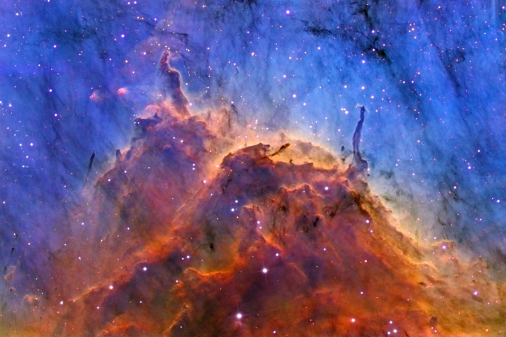
Today’s press release from the Spitzer Space Telescope shows the Eagle Nebula in a new light. (You can also listen to a podcast about the result.) The Eagle was made famous by the 1995 “Pillars of Creation” Hubble image and perhaps also by the Hubble’s 15th Anniversary image release.

Spitzer is getting into the act now with the gorgeous images above, in addition to an image that came out with the aforementioned press release. The challenge for visualizing the data is that six different filters were used to look at the nebula—3.6-, 4.5-, 5.8-, 8.0-, 24-, and 70-micron filters, to be exact. Since most such pictures are created by assigning three filters to each of the red, green, and blue channels of a digital image, it gets tricky to condense an even greater amount of information into a single snapshot.

The side-by-side presentation of the data helps us piece together the story—namely that the longer-wavelength emission suggests a shockwave of material (most likely from a supervova) coming in from the upper right. It would be interesting to include a tool similar to one on the Hubble education site that would allow a user to turn on or off certain filters and combine them into a single image.

Alternatively, you could take the individual filters’ images from Spitzer and use a tool such as FITS Liberator to constrcut your own color image. (The European Hubble site offers a gallery of images created by users using said tool.)

However it happens, it would be fantastic to experience the images in a more flexible and interactive fashion.

Mouseover Brilliance

Kudos to the Astronomy Picture of the Day (APOD) for the inventive use of HTML in today’s image. I could spend quite a bit of time—well, I have already spent quite a bit of time—mousing over the image to compare the “true color” (my words) to the “mapped color” (their words) version. An impressively economical way to allow for comparison between two coregistered images. I haven’t seen APOD do this before, but I like it.

(I tried copying the HTML on this page, so you could see the same effect here, but it didn’t work.)

Of course, the shortcomings of APOD also become apparent in the page above. The caption gives tantalizingly little information about the object, and because the hypertext relies almost exclusively on internal APOD links, one is left with oddly tangential references to topics such as “atomic hydrogen” and the aforementioned “mapped color.” (Although I have to give APOD credit for linking to one of my favorite Hubble web pages. I usually link to the top “Behind the Pictures” page, but to each their own.)

What works, however, is the ability to make a direct comparison between the two types of images—one of which reveals much greater contrast in the detailed structure of the nebula. It helps one understand why astronomers tend to work in narrowband imagery.

Things to note in comparing the two images… The stars appear relatively dimmer in the narrowband imagery, because we’re throwing out much of the light they emit, zeroing in on wavelengths tuned to sulfur and oxygen emission from the nebula. The contrast between the higher-energy oxygen line and the lower-energy sulfur line (in the “mapped color,” narrowband image) reveals the fine structure of the nebula more clearly than the hydrogen emission alone (in what approximates a “true color” image). Also, you see much greater contrast between the dusty regions (which appear black) and the glowing gas.

Apologies, BTW, for my continuing terseness in my posts. I continue to have limited access to the net, so my commentary is tracking my bandwidth. Sorry ’bout that.