Visualizing Science Education

Funny. I just got out of a meeting in which we were discussing public perceptions of science and the role of formal education. Then I see this comic: bored students learning (sans even rudimentary visuals) one of the most exciting results of modern cosmology. And made to feel small to boot!

Oddly enough, the kids’ science class is apparently taught by the brunet half of Hall and Oates, which would have made him no cooler in my generation than he is in this.

A Pup out of Water

A brief thought for the day. How does it make you feel, knowing that the image above represents fully seven percent of the world’s population of Devil’s Hole pupfish?

Interesting how knowledge changes context. A San Francisco Chronicle article from today discusses the fate of the pupfish, and it’s not exactly rosy. Forty-two of the fish remain, and the population doesn’t appear to be on the rise. But above, you see a picture of a few—a few members of a species about to disappear forever. How does knowing that change the image?

Periodic Spirals—and the Third Dimension

I ran across an image similar to the above on page 86 of Philip Ball’s marvelous little The Elements: A Very Short Introduction, part of an impressive series from Oxford University Press. (I highly recommend these wee volumes, which offer a lot of bang for the buck, at least in the limited selection of titles I’ve perused.)

Anyway, the image. It shows the “lemniscate spiral” of a certain William Crookes (not exactly a household name, but an interesting fellow nonetheless). I have previously blogged about the periodic table, but I find this attempt particularly intriguing. Crookes was trying to visualize the relationship between various elements in three dimensions, which is the kind of thing we do without thinking nowadays, but in the late 19th Century… Of course you’d have to try constructing a convoluted contraption to convey your idea!

That’s what I find interesting about the image: a 19th-century scientist would use an image depicting the hypothetical three-dimensional object in physical terms. Because the abstraction of three dimensions could not (easily) be conveyed pictorally without reliance on real-world elements to suggest the construct extending outside the plane of the printed page. Honestly, I have no idea whether Crookes physically constructed his “lemniscate spiral” or not, but I’m guessing not. Which is what makes me think this the image is a way of communicating the idea.

Whereas modern tools allow us to visualize data in three dimensions and, at some level, conceive of things in three dimensions, such virtual luxuries were unavailable to Crookes and his contemporaries. Thus the conceit of the physical object.

Interestingly, I know of no modern three-dimensional visualizations of the periodic table. Perhaps someone can point me to something…? But if they exist, I bet they aren’t depicted as physical objects.

Inscrutible Ice Cube

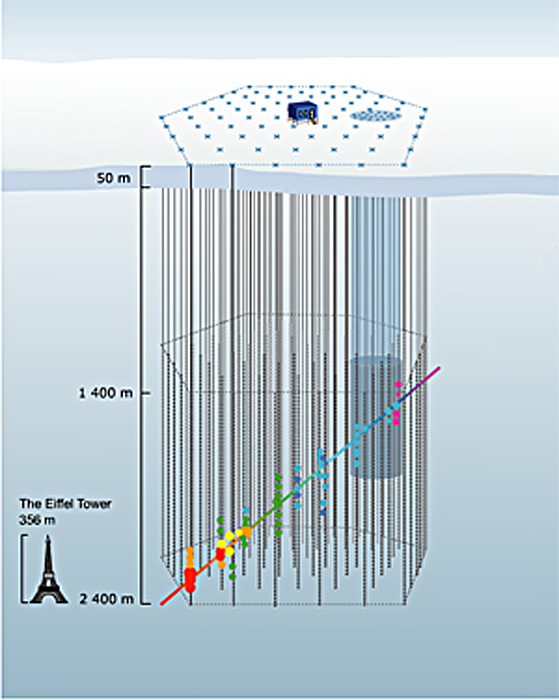
A press release from the University of Delaware uses the above image as a stand-in for a Flash animation (provided without explanation) elsewhere on their site. The caption (surprise, surprise) is utterly useless: “How does the IceCube telescope work? Click here to launch the animation, courtesy of the University of Wisconsin-Madison.” Um, thanks.

The thing is, it’s actually a nice enough animation. I like the little Eiffel Tower for scale, and the iconography is relatively clear, except for the color of the dots changing along the path… But it could certainly use some added text or something. And ironically, if you browse down the animations page and look at the very next option, you find a nicely-annotated Flash animation that actually clears up most of the confusion of the previous animation. The colors of the dots remain unexplained, but otherwise, it’s rather spiffy! (If you prefer, you can take a look at the annotated Flash in Swedish, too.)

So what gives? I hope it wasn’t a conscious decision to eschew the animation with text and supporting verbiage! “Oooh, it looks so cluttered that way.”) But the alternative explanation is plain sloppiness. Hmmm.

Nada y Nada y Nada

Today’s image comes to us from a University of Delaware press release about spintronics; you can also take a look at an associated animation that shows something similarly incomprehensible.

So, first off, you should know that “spintronics” refers to a flavor of electronics that relies on an electron’s spin (as well as its charge) to communicate information. It holds great promise for computation, blah blah blah, and indeed, the advances reported in the aforementioned press release sound significant. But the image…

For those who have studied quantum mechanics, the idea of spin being represented by an arrow will be familiar, but certainly the word “spin” does not connote such a mental image, and incorporating the 3-D arrow icon into the visuals (sans explanation) isn’t exactly a compelling starting point. Then, what exactly is going on, with an electron apparently splitting in two before one (half?) tumbles down a silicon ramp toward… What exactly? The whole sequence of images really, truly communicates nothing. Nada. Nada y nada y nada. Makes me feel like a nihilist.

Also, is it trying to look patriotic, with red electrons, blue silicon, and white “Al,” “CoFe,” and “NiFe” (which, taken together, look more like misspellings than chemical formulae)? The research group did get funding from the U.S. Office of Naval Research. Which also makes me feel like a nihilist.

It’s kewl that a researcher can learn to use freeware to create graphics, but that doesn’t mean the fruits of his efforts are ready for public consumption.

Have a great weekend! I myself am off to New York for a few days.

Side-by-Side

I know I already posted one hurricane-related entry this week, but I have another. This one is related to a press release from the National Center for Atmospheric Research (NCAR) about a new technique “that provides a detailed 3-D view of an approaching hurricane every six minutes.” I was curious what a 3-D view of an approaching hurricane might look like, so I followed the links, and…

I got the above. Hmmm.

To be fair, the page makes no claim for the above to be any kind of 3-D view, but it does supposedly offer a “side-by-side” comparison of radar data (on the left) and “NCAR’s ARW experimental forecast” (on the right). An animation shows the evolution of the hurricane, and as the caption duly notes, “The radar vantage point is stationary, on the Gulf Coast, while the ARW viewpoint follows the hurricane itself.” And therein lies my cavil (I’m trying to find synonyms for “gripe”).

The presentation of the images should facilitate side-by-side comparison; instead, the camparison seems hampered by the graphical choices. The change in background color strikes me as mildly annoying, but the field of view of the two images is also slightly different, and the manner in which the left-hand image obscures the state lines makes comparison even more difficult. It’s rather hard to tell how well the model replicates the observed behavior of the hurricane.

The animation only exacerbates the problems because the simulation follows the eye of the storm whereas the Doppler radar remains stationary (as noted in the caption). C’mon, folks, this is data! You can plot it however you want! Why not present it in a way that allows us to get a real feel for how well the computer model matches reality?

How to do it right, in brief: make the background of the two (observed data and computed data) as similar as possible, in terms of scale and markings (e.g., state and county lines), then plot the same quantities using the same color bar (which, as far as I can tell, is what they did in the above example). Would that be so hard?

Salt of the Earth

I think this may qualify as the oddest image about which I’ve blogged. But, um, wow. It speaks to the power of a simple photograph, although in this day and age, one could be forgiven for thinking that it’s photoshopped. At first glance, you might not even notice the people in the photo, but once you do, the image really plays with your sense of scale.

The photo comes from a landscape architecture blog, via my friend Allison Duncan. Many more pictures show up on the blog. And for more info on the caves, you can also check out the official Naica Caves website or news stories from the BBC and National Geographic.

Parallel Towers of Pisa

You’re looking at the winner of the 3rd Annual Best Visual Illusion of the Year Contest. I admire it for its simplicity. As the web page describing the illusion explains: “Normally, if two adjacent towers rise at the same angle, their image outlines converge as they recede from view due to perspective, and this is taken into account by the visual system. So when confronted with two towers whose corresponding outlines are parallel, the visual system assumes they must be diverging as they rise from view, and this is what we see.”

Spiffy!

Building Towers in the Tempest

The teeny-tiny image above comes from a NASA press release about a energy flow near the eye of a hurricane. A high-resolution TIFF of the same inexplicably eliminates the captions, leaving one with an unlabelled, multicolored, meaningless image—my favorite!

The image above bears some resemblance to a previous visualization of Hurricane Bonnie, but I’m actually not going to complain about this awful image presented with a press release of some interest. Instead, I’m going to call attention the remarkable new visualization that supports the above story. The full video (at several resolutions) and numerous stills (at resolutions of 320×180 or 144 times larger, but none in between) can also be downloaded from Goddard’s Science Visualization Studio website.

The full piece does a respectable job of explaining the whole “tower cloud” concept shown in the above image. I recommend watching it. The visuals and narration mesh nicely, telling a pretty good story. Furthermore, if you’re interested in how such media pieces come into being, you can take a look at an illustrated storyboard for the video. Well done!

Dilemmas, Ethical and Pictoral

A brief post today, in reference to today’s New York Times article, “Genetic Testing + Abortion = ???”

The caption for the image above reads, “BEYOND ROE New technology may complicate the debates over abortion.” But of course, the ultrasound technology depicted in the image is not the technology in question. Instead, we’re talking about the role genetic tests play in people’s decisions about whether to abort a fetus.

I admit that the art director in me understands why one would select an image that says “prenatal technology” over one that says something less specific to the headline. But it’s a bit like doing the wrong keyword search in Google. Much more germane to the topic would be more abstract images of magnified amniotic fluid or genetic test analysis.

This strikes me as a good example of the competing interests in selecting imagery to complement a complex story. Both image choices (the Times’ and mine) relate to the story, but one has to ask what the purpose of the image is: whether it’s to act as an attractor or to illuminate a story element. Both approaches have their faults, since I would admit that the images I dug up in two minutes’ of searching don’t exactly clarify what’s going on so much as they offer visual stand-ins for the techniques that contribute to the growing ethical dilemma.