Kant and Kitties

I stumbled across a site called “The Desk of One Astronomer” recently, and it’s… Cute.

I like the overall design of the site, although it reminds me a bit of a mid-90s CD-ROM, and the videos featured (one on “Island Universes” and another on “The Cepheids”) charmed me in spite of their rudimentary design. The content strikes me as rather ambitious, but I admire the way it’s organized: you can locate the same information via multiple entry points, and the interface is consistently visual and inviting.

And I must admit that I’ve never seen a cat used to explain parallax. Adorable.

Evidently, the website sprung from work out of the SciVi group at California State University Los Angeles, which “trains undergraduate and graduate students from three different disciplines—Art, Physics and Astronomy, and Computer Science—to develop accurate and effective scientific visualizations of topics in Cosmology and implement their public dissemination.” Interesting. Should be worth watching in the future.

Visualizing Science Education

Funny. I just got out of a meeting in which we were discussing public perceptions of science and the role of formal education. Then I see this comic: bored students learning (sans even rudimentary visuals) one of the most exciting results of modern cosmology. And made to feel small to boot!

Oddly enough, the kids’ science class is apparently taught by the brunet half of Hall and Oates, which would have made him no cooler in my generation than he is in this.

Dark Matter Blobs!

Reporting from the American Astronomical Society meeting in Seattle, Washington… In a brand spankin’ new press release from Hubble, we have the first-ever “3D map of the Universe’s Dark Matter scaffolding.”

First off, the result is quite kewl. We’re beginning to map the stuff that “outweighs” ordinary matter by a factor of six to one. Great work, COSMOS team!

The above image isn’t the primary image released, but it’s the one with which I find the greatest fault. By abstracting the blobs of dark matter without any reference to scale whatsoever, we’re left with no sense of how large the object is that we’re looking at. The primary image that accompanies the press release improves on the problem by labelling slices at 3.5, 5.0, and 6.5 billion years ago, but the size of the image on the plane of the sky is left undescribed—although the caption does clarify that “Each panel represents an area of sky nine times the angular diameter of the full Moon.”

Images such as the one above do a disservice to public understanding of astronomers’ work by abstracting the result completely from reality. The lack of scale I already complained about, but I have other issues as well“ The use of isosurfaces is non-intuitive for the vast number of people. The inclusion of half a box around the data provides a sense of dimension but could also confuse people. And a meaningless background haze does nothing in service of the rest of the image.

Great science, bad picture.

Race against Time

In honor of New Year’s Day, I’m posting a snapshot from the “1-D Space Rally” game from a collection of Java applets that illustrate relativity. Joel Primack created the applets based on a series of interactive programs originally created for the Apple II.

Y’see, I’ve been reading The View from the Center of the Universe, written by Primack and his wife. I quite like the book, which attempts to put cosmological concepts in a more accessible framework, drawing on historical imagery and metaphors to help readers understand, as the subtitle puts it, “our extraordinary place in the cosmos.” Because Primack has played an active role in developing the cosmological concepts that form the core of the narrative, the content is first-rate, and the richness of the analogies terribly impressive. (Plus, Primack and Abrams’s “Cosmic Spheres of Time” figure resembles the interactive Digital Universe model that I work and play with on a day-to-day basis.) The authors have a website that supports the book’s content as well.

Anyway, the image. As it says in the introduction the aforementioned applets, the interactive “helps demonstrate why the ‘twin paradox’ is, in fact, not a paradox.” The curving red line represents the trajectory of my rocket (seen at bottom), while the green lines show pulses emitted at regular intervals—intervals which differ for the rocket and the point of origin because of relativistic effects. I did my best to fly as far from the starting point as possible before reversing and returning to the starting point; as a result, only 360 units of time passed on the rocket compared to 582 at the origin.

I like the interactive well enough, but I have it could use a little more documentation, and I have one major nitpick, clearly visible in the above snapshot: label the axes! The vertical blue line represents time, while the horizontal line represents distance; they should be labeled as such.

I found a few problems with some of the other interactives as well (light pulses that don’t travel at a consistent speed and an apparent lack of gravitational influence from Jupiter, for example). I’d be interested to know whether or not those details cause misconceptions for people who use the interactives. Perhaps a generation of students (on Apple IIs, even) could provide feedback.

Sadly, no near-light-speed spacecraft exist to help us travel into the future, aging more slowly than our earthbound compatriots. So as we celebrate a new year, we all celebrate together, growing older at the same depressing rate. At least we can simulate an alternative…

Happy new year!

Photographic (Quantum) Loops

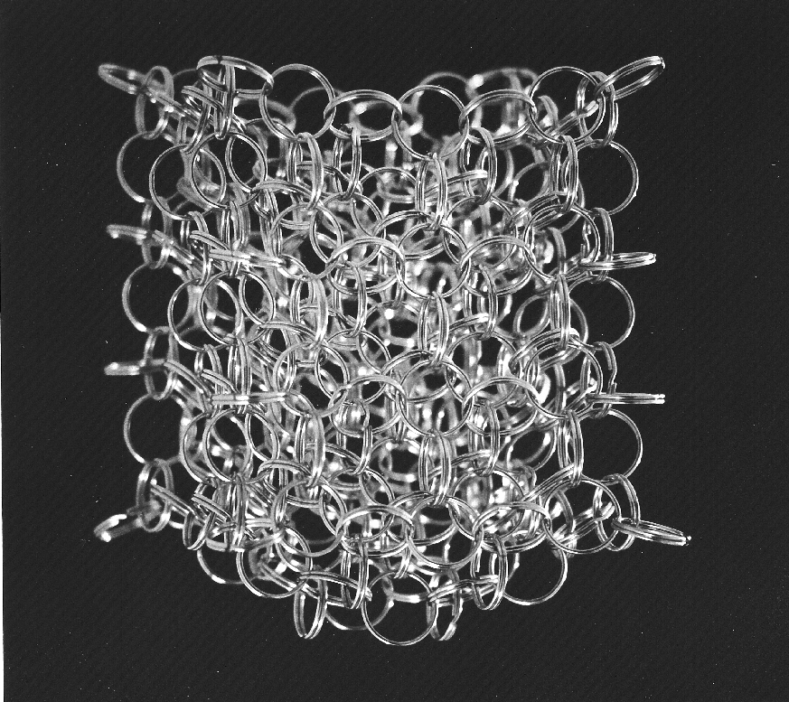
The image above represents “loop quantum gravity,” selected somewhat arbitrarily from Carlo Rovelli’s website. The inspiration for this image choice came from a lecture held at the Hayden Planetarium just last night. Lee Smolin showed up to promote his new book, The Trouble with Physics, which I will admit up front I have not read (although a copy now sits in my office, waiting for my attentions).

The use of a photographic subject to illustrate a highly abstract concept intrigues me greatly. In contrast to the award-winning attempt to make a tremendous amount of data look photographic, we have here a photograph attempting to make a tremendously complex concept look real. Furthermore, Rovelli offers the image (and another) effectively without comment, stating only that it gives “an intuitive picture of the ‘loopy’ structure of space predicted by loop quantum gravity at very short scale.” Hmmm.

The problem with expecting intuition when confronted with an image—particularly an image intended to function essentially as a metaphor—is that intuition is a hard-won and highly specialized skill. Personally, my intuition on astronomical imagery is quite respectable; on physics, pretty decent; on biology, almost non-existent. So the message that I will extract from Rovelli’s images differs tremendously from his own reaction, I’m certain, and a layperson’s response could have little or nothing to do with the specialists’ interpretation.

Smolin’s lecture (and presumably his book) suggested that physics needs to go back to its experimental roots, reconnecting highly-complex concepts to observable events, such as gamma-ray bursts, that could provide a real-world (or -universe) evidence for esoteric theories. A podcast of the lecture is scheduled to appear on Seed magazine’s website in the not-too-distant future. Keep your eyes (and Internet connections) peeled!