Kant and Kitties

I stumbled across a site called “The Desk of One Astronomer” recently, and it’s… Cute.

I like the overall design of the site, although it reminds me a bit of a mid-90s CD-ROM, and the videos featured (one on “Island Universes” and another on “The Cepheids”) charmed me in spite of their rudimentary design. The content strikes me as rather ambitious, but I admire the way it’s organized: you can locate the same information via multiple entry points, and the interface is consistently visual and inviting.

And I must admit that I’ve never seen a cat used to explain parallax. Adorable.

Evidently, the website sprung from work out of the SciVi group at California State University Los Angeles, which “trains undergraduate and graduate students from three different disciplines—Art, Physics and Astronomy, and Computer Science—to develop accurate and effective scientific visualizations of topics in Cosmology and implement their public dissemination.” Interesting. Should be worth watching in the future.

The Duelity of Nature

Thanks to a post on my friend David’s blog, I just ran across Duelity. It tells two creation stories—one from Genesis, one from modern science—using contradictory visuals and verbiage.

The introduction to the site hints at the conceit:

“According to the records of the General Organization of Development labs [GOD] it took a mere six days to manufacture a fully-operational universe, complete with day, night, flora and fauna, and installing Adam as its manager to oversee daily functions on Earth.

“If thou shalt believe the Book of Darwin, [’tis] five billion years after The Big Bang that we behold what the cosmos hath begat: the magma, the terra firma, the creeping beaste, and mankind, whose dolorous and chaotic evolution begat the gift of consciousness. ”

You get the idea. What I find interesting is that the approach is mirrored not just in the language used but also in the imagery that tells the stories. The General Organization of Development flick uses the visual language of a corporate training video, while the Book of Darwin employs an illustration style that recalls renaissance prints and stained glass. Brilliant stuff, really, and particularly impressive when viewed side-by-side, with the separate narratives intertwined.

I would say that I kind of object to the final tag line, though: “Duelity is a split-screen animation that tells both sides of the story of Earth’s origins in a dizzying and provocative journey through the history and language that marks human thought.” “Both sides”? As if there were only two…

Inscrutible Ice Cube

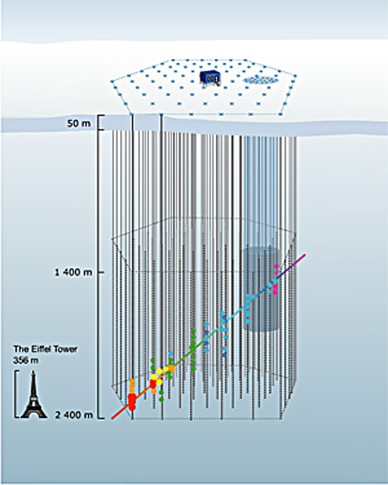
A press release from the University of Delaware uses the above image as a stand-in for a Flash animation (provided without explanation) elsewhere on their site. The caption (surprise, surprise) is utterly useless: “How does the IceCube telescope work? Click here to launch the animation, courtesy of the University of Wisconsin-Madison.” Um, thanks.

The thing is, it’s actually a nice enough animation. I like the little Eiffel Tower for scale, and the iconography is relatively clear, except for the color of the dots changing along the path… But it could certainly use some added text or something. And ironically, if you browse down the animations page and look at the very next option, you find a nicely-annotated Flash animation that actually clears up most of the confusion of the previous animation. The colors of the dots remain unexplained, but otherwise, it’s rather spiffy! (If you prefer, you can take a look at the annotated Flash in Swedish, too.)

So what gives? I hope it wasn’t a conscious decision to eschew the animation with text and supporting verbiage! “Oooh, it looks so cluttered that way.”) But the alternative explanation is plain sloppiness. Hmmm.

Nada y Nada y Nada

Today’s image comes to us from a University of Delaware press release about spintronics; you can also take a look at an associated animation that shows something similarly incomprehensible.

So, first off, you should know that “spintronics” refers to a flavor of electronics that relies on an electron’s spin (as well as its charge) to communicate information. It holds great promise for computation, blah blah blah, and indeed, the advances reported in the aforementioned press release sound significant. But the image…

For those who have studied quantum mechanics, the idea of spin being represented by an arrow will be familiar, but certainly the word “spin” does not connote such a mental image, and incorporating the 3-D arrow icon into the visuals (sans explanation) isn’t exactly a compelling starting point. Then, what exactly is going on, with an electron apparently splitting in two before one (half?) tumbles down a silicon ramp toward… What exactly? The whole sequence of images really, truly communicates nothing. Nada. Nada y nada y nada. Makes me feel like a nihilist.

Also, is it trying to look patriotic, with red electrons, blue silicon, and white “Al,” “CoFe,” and “NiFe” (which, taken together, look more like misspellings than chemical formulae)? The research group did get funding from the U.S. Office of Naval Research. Which also makes me feel like a nihilist.

It’s kewl that a researcher can learn to use freeware to create graphics, but that doesn’t mean the fruits of his efforts are ready for public consumption.

Have a great weekend! I myself am off to New York for a few days.

An Excercise

Play a little game with me, if you have the bandwidth (both in terms of time and in terms of connection speed). Take a look at a QuickTime of the concept referenced by the image above. (Actually, it’s only about 3 MB, so you don’t even need much in the way of connection speed.) As you’re watching it, see if you can figure out what’s going on.

The animation is quite clear. I followed most of the story without narration, but I didn’t quite catch the details, and without a narrative to support it, the excellent animation couldn’t carry all the weight of the narrative. This parallels the experience I had in testing animations created for one of the American Museum of Natural History fulldome programs: basically, without narration or subtitles, people don’t know what they’re looking at.

I couldn’t find the press release online, but here’s the description I received via email…

“This new class of objects was discovered using the European ‘INTErnational Gamma-Ray Astrophysics Laboratory’ (INTEGRAL) satellite. Twenty of these binary systems were found, with estimated distances lying between 7,000 and 25,000 light years from Earth, putting them all inside of our own Milky Way Galaxy. The nature of these sources was revealed through multi-wavelength observations, mainly from optical to mid-infrared (MIR) wavelengths, using European Southern Observatory (ESO) facilities.

“Scientists have found that most of these sources are made up of a compact object orbiting a supergiant star, an enormous star with 30 times the Sun’s mass and 20 times its diameter. Stars like this eject a huge amount of cold gas and/or dust at a rate equivalent to emitting the mass of our Sun in just 100,000 years. This type of object is called a High Mass X-ray Binary System (HMXB) and in most cases the compact object is a neutron star, an object of about 1.4 solar masses concentrated in a radius of only 10 kilometers (6.2 miles). Normally, an object like this would be an intense source of X-rays as the tremendous gravity and magnetic fields of the neutron star interact with the dense gas and dust emitted from the more massive supergiant star. However, for this new class of objects the cocoon of cold gas and/or dust is so dense it absorbs most, but not quite all, of the high energy X-rays. Only multi-wavelength observations, from X-rays to infrared, were able to reveal the nature of such objects.

“These systems seem to divide into two classes, likely depending on the size and eccentricity (ellipticity) of the orbit of the neutron star around its companion. In the first class of objects, such as IGR J16318-4848, the neutron star orbits around the supergiant star along a roughly circular orbit, like the Earth does around the Sun. However, in this case, the orbit is far smaller: the distance from the neutron star to the supergiant is less than the distance of Mercury from the Sun-even though the supergiant star’s radius is 20 times bigger than that of the Sun.

“Since the cocoon of cold gas/dust totally blankets the whole system, the neutron star stays permanently inside this dense cocoon, so there is a persistent source of X-rays. But in the second class, such as IGR J17544-2619,the orbit is more eccentric, and the neutron star crosses only periodically into this dense cocoon of cold gas/dust covering the supergiant star, causing intermittent emission of X-rays during that time.”

Now watch the animation again. All the elements are there, and the whole thing makes sense now.

The results were presented at the first GLAST Symposium, currently underway not far from my present location. As an aside, I’ll note that I find it interesting that the fulldome planetarium show Black Holes: The Other Side of Infinity will be shown as part of the conference. Yay! Domes!

Jamais deux fois—pas de tout!

For the second day in a row, I’m taking my cue from Astronomy Picture of the Day (APOD). What a way to start the new year. But instead of light from the early history of the Universe, in the above image we’re looking at light from about a second and a half ago.

APOD actually presents an image similar to the one above, which includes grid lines that make the changing size of the Moon easier to discern. What’s almost impossible to see, however, is the slight nodding of the Moon (its libration) over the period of a year. As I looked at the APOD image, I immediately thought, “This would be much better as an animation!” And indeed, the images above (and the ones featured on APOD) have been assembled into both an animated GIF and a Flash animation. Kewl! I’ve seen simulations of the Moon’s libration, but seeing actual photographs assembled in this way creates a stronger impression.

(I chose this sequence over the APOD version not just because I’m perverse but because it shows one full revolution of the Moon, rather than a revolution-and-a-half. I find it easier to watch when it baically goes through an approximate single cycle then repeats.)

All the images come from Photo Astronomique, a website that features a whole page of animations of celestial phenomena, in addition to other great astrophotography.