Nada y Nada y Nada

Today’s image comes to us from a University of Delaware press release about spintronics; you can also take a look at an associated animation that shows something similarly incomprehensible.

So, first off, you should know that “spintronics” refers to a flavor of electronics that relies on an electron’s spin (as well as its charge) to communicate information. It holds great promise for computation, blah blah blah, and indeed, the advances reported in the aforementioned press release sound significant. But the image…

For those who have studied quantum mechanics, the idea of spin being represented by an arrow will be familiar, but certainly the word “spin” does not connote such a mental image, and incorporating the 3-D arrow icon into the visuals (sans explanation) isn’t exactly a compelling starting point. Then, what exactly is going on, with an electron apparently splitting in two before one (half?) tumbles down a silicon ramp toward… What exactly? The whole sequence of images really, truly communicates nothing. Nada. Nada y nada y nada. Makes me feel like a nihilist.

Also, is it trying to look patriotic, with red electrons, blue silicon, and white “Al,” “CoFe,” and “NiFe” (which, taken together, look more like misspellings than chemical formulae)? The research group did get funding from the U.S. Office of Naval Research. Which also makes me feel like a nihilist.

It’s kewl that a researcher can learn to use freeware to create graphics, but that doesn’t mean the fruits of his efforts are ready for public consumption.

Have a great weekend! I myself am off to New York for a few days.

Quarks of Many Colors

I have to say, I’m kinda floored by this one.

The above image is associated with a December 2004 press release entitled “Jefferson Lab’s journey into the nucleus” that I ran across completely by accident. The non-animated version caught my eye, in part because of the caption: “An artist’s impression of a quark being struck by a virtual photon (a). As the quark propagates through nuclear matter, it loses energy by emitting gluons (b) and creating pairs of quarks and anti-quarks (c). As the system begins to return to equilibrium, two-quark systems (pions) are formed (d).” Admirably, it starts right off with the phrase “artist’s impression.” And quite an impressionistic impression at that!

The caption that appears with the above, animated image (and, inexplicably, the title “Simple Experimental Simulation”) could use a similar qualification, in my opinion: “This movie illustrates the action inside the nucleus of a deuterium atom containing a proton and a neutron, each with three quarks. An electron strikes a quark inside a proton, passing energy to the quark before the electron bounces back. The quark now has so much energy ‘stuffed’ into it, it creates a cascade of new particles as it flies out of the proton. The result is two new, two-quark particles.”

First off, I have to note that having the GIF loop creates a problem, namely that the linear process of the reaction is shown blending back into itself. Awkward to say the least. Initially, I was inclined to blame my browser, but then I took a closer look at the file and noted that it seemed to be designed to loop, and indeed, a quick check with Adobe ImageReady revealed it to indeed be designed as a loop. Yikes! Ideally, there would at least be a few frames of black between the end and the beginning of the sequence, but to design it to loop continuously is highly misleading.

Of course, there’s plenty of misleading aspects to this representation. Basically, what we’re looking at is a Feynmann diagram, which is normally shown as a tinkertoy-type diagram of lines and squiggles (tinkertoys and springs, I guess). The imagery above includes a lot more information—colors represent different types of quarks, for example—which strikes me as rather clever and quite aesthetically pleasing, but…

What troubles me about the image is that it’s using a somewhat representational style to illustrate a fundamentally abstract concept. The almost biological quality of the pions slithering off toward the end may be rather striking, but what does it mean? In terms of communicating the underlying concepts, well, I hate to sound boring, but a more straightforward approach may be better suited. I admire Jefferson Lab for trying something different, but caution is required—or at least a cautionary note!

The initial caption, clearly indicating “artist’s impression” from the get-go, addresses my cautionary concerns, but it’d be even better if there were a brief essay by the artist involved. What choices did he or she make in creating the image? What do the colors mean? What motivated the somewhat biological look of the illustration?

In a medium better known for its objectivity than its artistry, a diagram may deserve a colorful interpretation, but as always, the subjective layer may add unintended meanings.

The UR Image

I just returned from Boston, where I attended the Science and Society conference had poor network access. I had my laptop for making notes, however, so I have posted a few conference-related commentaries—one on Al Gore’s keynote address and another about an Einstein sketch that was used in a presentation.

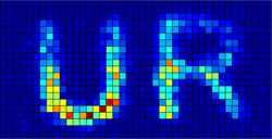
The picture above accompanied a press release from the University of Rochester, describing the storage of image data in a single photon. The concept is actually related to the topic of the single-electron experiment that I described in a recent post, albeit relying on the interference of photons, not electrons.

I’m intrigued by the choice of image used to support the press release. Thanks to digital photography (and probably the Internet, too), people now think of images as information in a way that probably didn’t seem as intuitive even a decade ago. So the use of an image to illustrate stored data makes more sense now that it would have previously.

FYI, the discovery is also described in a Washington Post article that appeared on Friday.

A diagram of the instrument set-up is perhaps not so helpful, at least not without a caption.

Interfering

I just finished reading Robert P. Crease’s The Prism and the Pendulum: The Ten Most Beautiful Experiments in Science. The image above comes from the experiment Crease describes in his chapter “The Quantum Interference of Single Electrons.” A related editorial from Physics World, the same publication for which Crease wrote his original articles about “beautiful experiments,” goes into greater detail about the double-slit experiment, and the Wikipedia article on the same topic does a better job explaining than I care to attempt.

Indeed, the story behind the images above (easily read as a sequential series by people familiar with comics) is long and complicated. It has to do with the so-called “wave-particle duality” of electrons, which basically means that, under certain circumstances, electrons’ behavior is described by the mathematics of waves, while under other circumstances, we can think of them as particles. (They’re neither: “wave” and ”particle” are simply two mental images that humans rely on to visualize such behaviors.)

At any rate, the sequential images reveal the build up, over time, of an interference pattern between individual electrons passing through a double slit of sorts. Our intuition of electrons as particles runs right up against their behavior as waves in this case, because the individual electrons that form the images above slowly build up into an interference pattern, the likes of which we expect from waves.

In case all this gives you a slight headache (as well it might), you can check out a couple of films that describe the phenomenon quite beautifully…

Crease references a 14-minute movie from 1974, available from the Italian Institute for Microelectronics and Microsystems, which tells the story carefully, beginning with ripples in a fountain and proceeding through light interference to electron interference. A word of warning, however: the movie files clock in around 150MB. (Nosing around the parent directory yields links to better-quality versions of the film, BTW, although the files sizes are even greater.) For those with a bit of physics background, the film succeeds in providing a good sense of what’s going on (with extensive use of animated diagrams), although the visualization of the actual data leaves a bit to be desired.

Fear not, however! A web page from the research and development group at Hitachi also describes the double-slit experiment, and it links to a page with movies, including a 10.4MB MPEG demonstrating the accumulation of electrons much more clearly than the 1974 film. But hey, they had 15 years to work out the kinks.

So where am I going with all this? Well, I found my response to the various media rather interesting. I majored in physics (well, astronomy, technically, but our slogan was, “more physics than physics majors”), so I knew the story the images were supposed to be telling. The sequential series above is certainly more than enough for me to get the gist. But actually watching the videos introduced some challenges: in particular, the limitation of the imaging capabilities in 1974 makes seeing the phenomenon tricky, but combined with the compression artifacts (e.g., the blockiness caused by the MPEG-4 compression), it starts to take some imagination to reconstruct the experiment in the mind’s eye. Thus, the images “say” only what we’re prepared to “hear.” The story I extract is the story I already know.

The Hitachi video pretty well circumvents the data problem with the 1974 film, however, so taken together, the narrative of the folder film plus the data representation of the latter tell a decent story. I think. But I’ve heard this one before.