Bad Radiation Dosage

I’m prepping material for my “Universe Update” program at NightLife, and I wanted to talk about how the Mars Curiosity rover (a.k.a. Mars Science Laboratory or MSL) measured its radiation exposure while in transit to the Red Planet. And I came across the hideous diagram pictured above.

Oh, NASA. What what what what what are you thinking when you put together a diagram like this for public consumption?

The title of the bar graph is “Comparison of Some Radiation Exposures to Mars-Trip Level,” and evidently, the designers are trying to convey the sizable quantity of radiation to which a traveler to Mars would be exposed: according to the accompanying press release, “The findings, which are published in the May 31 edition of the journal Science, indicate radiation exposure for human explorers could exceed NASA’s career limit for astronauts if current propulsion systems are used.” But the diagram doesn’t send that message well at all.

For the uninitiated, the x-axis of the diagram above uses a logarithmic scale, so each bold horizontal line corresponds to a factor of ten change in the magnitude of radiation dosage. (To their credit, the authors of the caption describe this in the second paragraph.) Eyeballing the bar chart, the “MSL Six Month Transit to Mars” dosage looks about 100 times the “US Annual Average, All Doses.” But ratio of the areas (which our eye-brain vision system perceives more naturally) is probably closer to 2.33:1. That’s a vast disparity between what we perceive versus the message NASA is intending to send.

(I should note that the press release from the Southwest Research Institute includes links to some nice images and diagrams, but they all relate to the process by which the numbers in the bar graph were derived.)

Compare this diagram to absolutely brilliant xkcd “Radiation Dose Chart” from several months ago. It even uses the same units as the NASA bar chart: millisieverts (mSv). In his diagram, Randall Munroe has created a much more complicated but much more viscerally satisfying visualization of the variation in radiation doses—from “Sleeping next to someone (0.05 mSv)” to “Ten minutes next to the Chernobyl reactor core after explosion and meltdown (50 Sv)”! That corresponds to a factor of about a million, meaning that the Chernobyl accident would give you a million times the dosage of a one-night stand.

If you want to try understanding the NASA data using the xkcd chart, look for “Normal yearly background dose… (~4 mSv)” near the center of the chart, which corresponds to the “US Annual Average, All Doses,” and “Dose causing symptoms of radiation poisoning if received in a short time (400 mSv, but varies)” in the middle right, which is roughly equivalent to “MSL Six Month Transit to Mars” on the NASA bar graph. Now, do you find that the xkcd gives you a better feeling for the ratio? It’s not trivial to compare those two numbers, but the area-based approach still works better than the NASA image—and it could have easily been adapted to depict the Mars radiation data in an easily-understood manner.

Next time, NASA designers should take a close look at Noah Iliinsky’s “Properties and Best Uses of Visual Encodings” chart and think about how the visual elements they choose underscore—or undermine—the message they’re trying to send. (More on Noah’s spiffy chart in my next post.)

A Fine Aerosol Diagram

New results from the Cassini spacecraft reveal the chain of events (so to speak) that leads to the formation of complex aerosols in its atmosphere. Aside from the spiffy science, the NASA announcement includes the very nice diagram pictured above.

What I like about the graphic is that it tells the story very plainly and simply, yet with considerable detail and substantial visual interest: nice little PAHs and aerosols, decent image of Titan’s surface, Saturn in the background (tilted too much with respect to the ring plane, but that’s nothing new), and so on. It even includes altitude info on the right-hand side clearly indicating where specific processes take place. All in all, a lot of info packed into a single image.

And anther detail. I’m already on record as not being a fan of lens flares in the fulldome environment, and in general, I seem them as kind of cheesy. But this might be the first time I’ve seen a lens flare used as a didactic element, suggesting the flow of photons from the Sun. Nice touch!

The only thing that gives me pause is the depiction of “energetic particles” as little arrows pointing away from Saturn. The particles are trapped in Saturn’s magnetic field, so they aren’t really shooting out of the planet in straight lines, which makes that depiction a little deceptive. But then, the only real solution would be to depict Saturn’s magnetic field with particles streaming from it, and that might be a little cumbersome. So I suppose I can forgive the diagrammatic shorthand.

Another more mundane quibble. The NASA webpage for the diagram include links to smaller versions at 1600×1200, 1028×768, and 800×600, but those are all windowboxed versions of the (obviously portrait, not landscape) diagram. Thus, the only version of above image that you can download at its original aspect ratio is the full-resolution version: a whopping 2000×2776 pixels! Not the greatest for, say, linking to blog entries.

Anyway, nice work, Cassinifolk! I like the diagram. And the story it tells…

Hole Lotta Electron Going On!

I know it’s been a good long while since I posted anything to the blog, and my instinct suggests that I should ease into things, maybe start out with an astronomical image and a snarky comment… Keep things simple!

But I ran across this image, and I couldn’t resist. It accompanies a press release about high-powered lasers at UC Santa Barbara. And um, wow! Take a look at the caption:

“Artist’s rendition of electron-hole recollision. Near infrared (amber rods) and terahertz (yellow cones) radiation interact with a semiconductor quantum well (tiles). The near-ir radiation creates excitons (green tiles) consisting of a negative electron and a positive hole (dark blue tile at center of green tiles) bound in an atom-like state. Intense terahertz fields pull the electrons (white tiles) first away from the hole and then back towards it (electron paths represented by blue ellipses). Electrons periodically recollide with holes, creating periodic flashes of light (white disks between amber rods) that are emitted and detected as sidebands. (Credit: Peter Allen, UCSB)”

If brevity is the soul of wit, well…

I think the first thing that confuses is the poorly-conveyed temporal element. If I’m supposed to read something as a sequence in time, either follow a convention (e.g., left to right for English readers, rather than bottom to top, as in this case) or execute it as a sequence of images… Or an animation. But the static image above doesn’t convey the sense of time passing or a series of events.

The more fundamental issue, however, seems to be the presentation of diagrammatic information in what I think of as a “reified” manner. By taking a basic representational diagram and adding elements that suggest a photoreal environment, the image ends up confusing the issues: it takes an abstract representation and describes it with a visual language that suggests real, physical objects. Instead of color-coded dashed lines, for example, we get sparkly little cylinders that look like beads you’d pick up on West 37th Street in Manhattan.

I can only imagine that some grad student got their hands on Blender and went a little wild… “Ooh, I can make these transparent and shiny!” Which is all well and good, but it gets in the way of communicating he fundamental concepts: the gloss may attract attention, but it obscures the underlying content.

(Just as an aside, when I went in search of the Wikipedia article on excitons, in order to provide a helpful link, I ran across an even more psychedelic image! But my little brain just couldn’t deal with writing about both that one and the one above…)

Honestly, I don’t know how to illustrate the remarkably complicated subject of the press release. But the above illustration does not seem to help.

And unfortunately, this kind of thing happens quite a bit in the world of press release images… Because the main interest lies in choosing the flashiest possible image(s), the clarity of the message often becomes obfuscated.

Polarized Colo(u)r

Long time, no write, except for that silly link last week. I’m still working on that little project in San Francisco, which consumes an extraordinary amount of time.

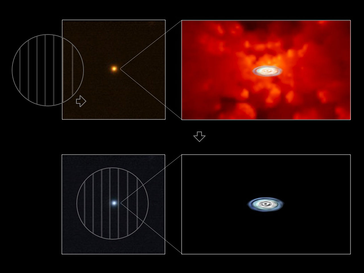
At any rate, I saw the above image, which accompanies a press release from the European Southern Observatory (ESO), and I figured I could express my thoughts quickly enough not to feel too guilty about taking the time to write.

The press release bears the title “Accretion Discs Show Their True Colours,” which describes the different appearance of quasars in polarized light. The press release describes the research well: “‘The crucial observational difficulty here has been that the disc is surrounded by a much larger torus containing hot dust, whose light partly outshines that of the disc,’ says Kishimoto. ‘Because the light coming from the disc is scattered in the disc vicinity and thus polarised, by observing only polarised light from the quasars, one can uncover the buried light from the disc.’”

The image does pretty well, too, except I have some nagging issues with it. Of course, the little circles with vertical lines suggest polarization to the initiated (although they also remind me of those glasses Chris Lowe wore back in the late 80s that I wanted so much), but I fear that visual shorthand is lost on a large percentage of the audience. And even if you get it, why does the little circle moving over the image change the color of the entire image? It would be much better if only the part inside the circle changed color. A little Photoshop work would make this image much, much clearer.

So how’s that for succinct?

(BTW, in nosing around for a link to “polarized light,” I ran across Polarization.com, which suggests to me that there really is a website for just about everything.)


Back to Jupiter

I know that I just blogged about the Jovian magnetosphere, but here I go again. And it’s another press release from SwRI, of all things. There’s a lot going on in this diagram! First off, kudos on getting the dipole to look right, but then things get a little confusing…

The profusion of orbit lines and magnetic field lines (or tubes, I guess, if I look at the high-resolution version of the image) might make sense to a well-informed viewer, but they seem confusing for the uninitiated. I’m also wondering why the faint structure that connects the moon Io to Jupiter, which indicates ionized gases trapped in Jupiter’s magnetic field, doesn’t actually follow a magnetic field line. Yeah, they got the dipole bit correct, but then garbled the message! And the Io torus, which also looks somewhat tubular in this depiction, doesn’t seem to lie in the same plane as the orbit lines. All very odd.

Here’s the image caption, BTW: “About [one] ton of volcanic gases are spewed out by Jupiter’s moon Io every second. When ionized, these gases become trapped in Jupiter’s strong magnetic field (shown in blue) and form a vast ring (shown in red) around the planet with Jupiter’s 10-hour spin period. Jupiter’s strong magnetic, rapid rotation and Io’s prodigious source of material result in a giant magnetosphere whose dynamics are very different from the Earth.” Not such a bad explanation, really, although it helps to know that the ionized material rotates along with Jupiter’s 10-hour period, whereas Io orbits more slowly, so the stuff gets smeared out along the length of the moon’s orbit.

If you’re interested in a bit more on the topic, you can also check out an actual image of the Io torus and even see its rotation with Jupiter (the latter page actually has a much better description of the torus than the above as well). Um, did I mention I almost did a Master’s project looking at the Io torus…?

Preaching to the Choir

A press release from the Southwest Research Institute describes observations made of Jupiter’s magnetosphere by the New Horizons spacecraft. The above image (sorry, it’s quite low-res, and to take a closer look, you’ll need to open up the huge version linked from the above) summarizes some of the results. To summarize my response: it would work quite well in a scientific publication, but it just doesn’t cut it for public use.

I admit that it’s nice to see actual data represented—and nice to see an attempt at providing context for them—but the context in which the data fails to help much; furthermore, it really only conveys the context for an expert viewer—one who knows about the solar wind, magnetic fields, and such. In a previous post, I complained about depictions of Earth’s magnetosphere; I won’t bother reiterating my gripes, but they can be applied to the top portion of the above image. Honestly, some version of the schematic portion of the image would probably have sufficed for a press release, but it would have required significant work to be made more comprehensible.

Also, we’re given no hint as to how to read the spectrograms below the schematic diagram, and furthermore, they utilize opaque units such as “Energy/Q [eV/q]” and “DOY 2007 [UT].” Oh, yeah, and pseudocolor. ’Nuff said.

Making matters worse, the picture’s caption incorporates a trult impressive quantity of jargon. To call it “incomprehensible,” at least for public audiences, would be kind. The press release is better, but not by much. The only audience I can imagine picking up on this story is a quite sophistication publication such as Scientific American. I guess that’s all well and good (better than nothing), but a little more effort could make this result more accessible to broader audiences.

(I’ll just add that the New Horizons folks actually produced a spiffy press kit that describes the fly-by, with some decent diagrams, too.)

BTW, I’m in Athens attending the Communicating Astronomy with the Public conference. Fun stuff! And I finally achieved my goal of presenting a PowerPoint using no bullet point slides. A personal victory.

More Abstraction

Okay, I give up.

No, not with the blog, in spite of my lousy track record posting lately. I give up trying to figure out the image above…

I mean, it’s pretty and all, but what does it mean? I’m so baffled that I won’t even complain about the pseudocolor (indeed, I’m quite fond of orange). I read through the press release and the accompanying caption (which seems to have been removed recently), but… Huh?

Here’s the caption, BTW: “Spectroscopic image showing the microwave-frequency magnetic resonances of an array of parallel, metallic thin film nanowires (‘stripes’). The peak in the center is due to resonances occurring at the stripe edges while the strong horizontal bar is due to resonances in the body of the stripes.”

Since I’m trained in astronomy, my tendency is to read frequency along the horizontal axis, which would imply a peak of some sort at a particular frequency, but that doesn’t feel right, somehow. Maybe it’s actually a spectrogram of some sort, with the horizontal axis representing the spatial extent of the nanowires?

Whatever the image tries to show, the real question is: why confuse people with it?

Ball and Stick, Apple and Orange

Today,
Science Daily reported on research from Rice University that had actually appeared in a press release from Rice last week. Go figure. The new article includes the above image, however, which could be perceived as an improvement (or not) over the text-only copy from Rice.

A quick glance at the image caused a sudden nag, and I started to browse on before I figured out what was bothering me.

The nanotube should be made of atoms, right? Presumably those little grey shiny balls in the molecular model above. But interior to the nanotube, we see brightly-colored (one might be tempted to call them radioactive-looking) blobs that look like a scanning-electron micrograph of something-or-other. But these are supposed to be atoms! Specifically, astatine atoms, which should be a fair bit bigger than shown here.

This isn’t a big deal, I suppose, but it’s oddly distracting. First off, they use different visual vocabulary to represent the same kind of thing: atoms are shown in two distinctly different ways in the above image. Secondly (and I know I’m going out on a limb here), the image they choose perhaps even vaguely suggests cancerous cells… And given that the press release concerns using nanotubes to treat cancer, that’s potentially problematic.

Holy CMB, Batman!

A press release from NRAO announces, “Astronomers Find Enormous Hole in the Universe.” Hmmm. I’ll refrain from commenting on the overzealous word choice (except insofar as I just did) and focus on the image above.

I have to admit that the first thing I thought of when I saw the diagram was a poorly-rendered traffic cone—with a circular base, executed with an acute lack of graphical perspective.

The caption reads: “Illustration of the effect of intervening matter in the cosmos on the cosmic microwave background (CMB). On the right, the CMB is released shortly after the Big Bang, with tiny ripples in temperature due to fluctuations in the early Universe. As this radiation traverses the Universe, filled with a web of galaxies, clusters, superclusters and voids, it experiences slight perturbations. In the direction of the giant newly-discovered void, the WMAP satellite (top left) sees a cold spot, while the VLA (bottom left) sees fewer radio galaxies.”

The viewer (i.e., astronomers with their WMAP satellite and radio telescopes) is off to the left of the image, and it would probably be worth continuing the sides of the traffic cone until they meet—at Earth! Otherwise, it really doesn’t make much sense. Given its opacity and apparent solidity, the traffic cone looks like a structure, and truncating it simply exacerbates the problem.

Plus, the pictures of the two telescopes distract from what’s going on and further confuse things. They hover there by the tip of the cone, as if they belong there. But the radio telescope wasn’t even part of the observation depicted by the diagram: radio observations supplied confirming evidence.

I admit that I don’t have an immedite solution on how to depict the observations better, although the above image could be improved by making the cone appear more transparent, more a part of some continuous medium affecting the observations, and more connected to an observation point to the left of the image. Oh, and more appropriate in its perspective.

Curiously, the image is offered as a 73KB JPEG, a 278KB JPEG, and… a 34.3 MB TIFF! Now, I’m all about lossless compression of images, and I noticed that the giant TIFF had no compression whatsoever. So, just for kicks, I saved it out with LZW compression and it shrunk to 9.1MB. Yeah, disk space is cheap, but c’mon, let’s be sensible.

Stellar Tiramisu?

The press release from ESO compares a red giant to tiramisu—because, as Luca Pasquini puts it, “There is cocoa powder only on the top!” Hmmm.

(The cocoa powder analogy has to do with the distribution of heavy elements in stars with planets. We know that extrasolar planets are preferentially seen around stars with high iron content, but do the planets form around stars with a lot of iron distributed throughout, or do planets sprinkle iron, cocoa-like, on the stars’ surfaces?)

The image above does a bang-up job, I must say. It possesses clarity, first and foremost, comparing apples to apples and balancing the diagrammatic and the photorealistic with aplomb. I like the clear labels (with caveats to be addressed below), and the two stars even show limb darkening. Most especially, I must express my deepest appreciation for the inclusion of a small figure (in the lower right) to communicate scale! Yes! Fantastic! Super! Well done!

I would not go so far as to suggest that the diagram is flawless in its execution, however. Aside from a slight irrelevance to the topic at hand, the main liability I can detect is the inconsistency between the left- and right-hand images: “radiative zone” gets labelled only on the left, while ”burning shell” appears on the right. Something of a fumble in the home stretch…