Biochemical Art

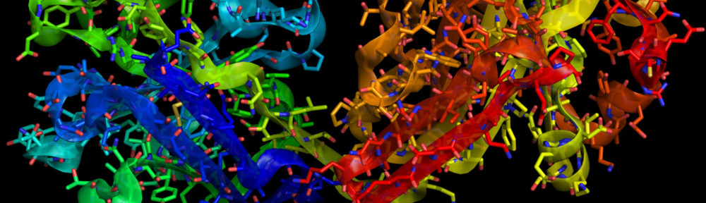
I’m attending the Gordon Conference on Visualization in Science and Education, and this morning, we had a chance to hear (and see) David Goodsell from the Scripps Institute. Goodsell complements his research work with significant and influential dabbling in artwork. Above, you can see an image of blood serum taken from a collection of images he created for Biosite. His website describes the image as follows:

“Blood serum is shown in the picture, with many Y-shaped antibodies, large circular low density lipoproteins, and lots of small albumin molecules. The large fibrous structure at lower left is von Willebrand factor and the long molecules in red are fibrinogen, both of which are involved in blood clotting. The blue object is poliovirus.”

Goodsell preserves the shapes and relative sizes of the molecules while flattening the typical three-dimensional representations of molecules. He also represents the structures in cross section, using orthographic rendering to allow depicting large areas (large, that is, relative to the size of the molecules).

All of Goodsell’s images make good use of color, and I find the above image a particularly striking example. The poliovirus sticks out like a sore thumb (attractively composed asymmetrically within the frame), as of course it should. And it’s exceedingly pleasant to see depictions of molecules freed from the garish pseudocolor rainbow that seems to dominate the medium. Goodsell’s galleries include many more examples…

Evidently, Goodsell is also responsible for the “Molecule of the Month” at the RCSB Protein Data Bank (PDB). I haven’t taken a close look yet, but I plan to!

BTW, my home institution just started including me in a new category for the “Science in Action” podcast. Take a listen! I’ll have two more podcasts this week, mostly talking about the conference.

Molecular Dominoes

A press release from the National Institute of Standards and Technology (NIST) uses the above image to describe “the growth of a layer of molecules as they gradually cover the surface of a small silicon rectangle.” Unfortunately, the image doesn’t seem to illustrate much at all.

As usual, I’ll quote the entire caption… “Schematic of the monolayer self-assembly process studied by the NIST/NCSU team. The silicon substrate is approximately 1 x 5 cm in dimensions. The source (left) is a mixture of organosilane (OS) molecules and parafin oil (to control the evaporation rate.) The whole system is enclosed in a Petri dish. The concentration of OS molecules is higher near the source and the ordering process initiates near this region. Molecules behind the advancing self-assembly front are relatively ordered, while molecules ahead of the front are engulfed and incorporated as the front reaches them. The molecules at the leading edge of the front are less ordered and this region becomes broader as the front advances—this is the key phenomenon measured in the experiment.”

Um, right.

Basically, to illustrate such a phenomenon, you’re probably better off using a series (i.e., at least a pair) of images to show, for example, an “advancing self-assembly front.” As it stands (or, in the case of the molecules on the right-hand side, leans), the image doesn’t really reveal the process very well.

Furthermore, if you read the accompanying press release, you find that the actual observations show irregularities in the advancing front, with variations in density that the simple model does not explain. So although the illustration receives top billing with the press release, it doesn’t actually show us what’s interesting about the press release!

An AVI available with the release claims to show “a mean field reaction-diffusion model of the monolayer self-assembly process,” but I couldn’t get the movie to play on my Macintosh.

Pull My Finger

New York Magazine recently posted “The Science of Gaydar” to its site, which uses the above figure to illustrate one of various physical attributes that are statistically correlated with sexual orientation (straight on the left, gay on the right, by the way). Others include fingerprint density, hair whorl direction, and handedness. With minimal captioning and added text, the magazine’s designers have created a sequence of simple, easy-to-understand images. Admittedly, it’s not exactly rocket science, but clarity and elegance go a long way in my book.

For example, note how the type in the above image guides you toward seeing which digit is longer. Placing the text above and below the dotted line gives you a tiny bit more information than you would otherwise have, and the result is both aesthetically pleasing and impressively lucid. Great work!

FYI, my index finger is indeed longer than my ring finger. Go figure.

Colorbar Confusion

A press release from Purdue University describes the effect of greenhouse gas emissions on “heat stress,” using the diagram above to illustrate the difference in effect between accelerated emissions (top) and decelerated emissions (bottom). A description from the web page:

“This image illustrates heat stress in the 21st century for two greenhouse gas emissions scenarios. The top panel shows the expected intensification of the severity of extreme hot days given accelerating increases in greenhouse gas concentrations. The bottom panel shows the expected decrease in intensification associated with decelerated increases in greenhouse gas concentrations.”

(I apologize for the nearly illegible size… The Purdue website offers up the diagram in the teeny-tiny size above, or print quality, which I assumed would be excessive.)

There are a couple of things I find odd (and counterintuitive and frankly counterproductive) about the diagram…

Firstly, the color spectrum used in this false-color representation of the data feels wrong to me, since it ranges from cool blues through warm oranges and reds and thence to… The beginnings of a cool violet? Particularly since we’re talking about temperature (well, sort of) here, and most people have grown accustomed to weather maps colored by temperature. Stopping at red gives you plenty of color resolution. (And maybe next time, you can choose something other than the garish rainbow colors?)

A more egregious error permeates the diagram, however. Perhaps we can simply call this the “apples and oranges&rduo; issue: two images, side-by-side, offered up for comparison, need to share enough to allow for easy comparison. I last blogged about this in relation to an NCAR visualization of Hurricane Katrina, but the idea is simple enough: don’t ask the viewer to do unnecessary work in interpreting your imagery, because unnecessary work leads to unnecessary risk of miscommunication. In the case of the two images above, the color bars are flipped for no apparent reason, so increasing values get warmer (in hue) on the top and cooler (in hue) on the bottom. Why? Also, the scale of the two color bars changes, running from 3 to 8 on top and from –3 to 0 on the bottom. Why? Why? Why?

(Well, okay, I can acknowledge one drawback in this particular case. Since the two datasets do not overlap, coming up with a single colorbar would be a little tricky; indeed, you’d almost need to insert an intermediate model showing, say, no change in greenhouse admissions, which would presumably result in values in between. But the issue of inverting the colorbar still stands: “red on top bad, red on bottom goooood” simply leads to confusion.)

I find behavior of this sort annoying when watching a scientist presenting data in a talk, but as part of a press release, it just saddens me. My fear is that the folks in the university press offices don’t even try to fix these problems… Perhaps because they don’t care, but perhaps because they don’t even think the data should be easily understood.

Hmmm. Maybe it’s time for a Tufte-like “Graphics 101” for science types? I looked for such a thing just now, but I didn’t find anything. Anyone reading know of such a thing?

Inscrutible Ice Cube

A press release from the University of Delaware uses the above image as a stand-in for a Flash animation (provided without explanation) elsewhere on their site. The caption (surprise, surprise) is utterly useless: “How does the IceCube telescope work? Click here to launch the animation, courtesy of the University of Wisconsin-Madison.” Um, thanks.

The thing is, it’s actually a nice enough animation. I like the little Eiffel Tower for scale, and the iconography is relatively clear, except for the color of the dots changing along the path… But it could certainly use some added text or something. And ironically, if you browse down the animations page and look at the very next option, you find a nicely-annotated Flash animation that actually clears up most of the confusion of the previous animation. The colors of the dots remain unexplained, but otherwise, it’s rather spiffy! (If you prefer, you can take a look at the annotated Flash in Swedish, too.)

So what gives? I hope it wasn’t a conscious decision to eschew the animation with text and supporting verbiage! “Oooh, it looks so cluttered that way.”) But the alternative explanation is plain sloppiness. Hmmm.

Moon and Pen

Above, we have Ewen Whitaker’s 1954 map of the lunar south pole, which shows up as today’s Lunar Photo of the Day (LPOD), although of course, it’s not a photo… Well, why be picky? It’s a gorgeous drawing described as follows in the LPOD entry: “Despite a fleet of lunar probes and modern high resolution imaging, the best observer’s map of the south polar region of the Moon remains one drawn a half century ago.”

What strikes me as utterly compelling about the above image is what I read as simplicity and clarity in it: the bold lines that delineate craters and ridges, the dotted lines offering a sense of depth, the multiple but surprisingly unobtrusive names and labels. At the same time, these are conventions that I recognize and understand (as well as the general depiction of perspective), and I’m curious to know how a novice would read this image.

Perhaps because I draw, I find such illustrations very compelling. But I think it’s simply the human touch… Utterly apparent in the handwritten words (right down to the question marks) and the quality of the lines on the page (or computer screen). These elements pull me into the image in a way that almost no Adobe Illustrator images can.

But LPOD author Chuck Wood makes an interesting point: there is a clarity and interpretive value lent by the human touch. “The best observer’s map of the south polar region” issues from an artist’s pen, not a digital camera.

Yesterday’s LPOD tells a related but somewhat different story, comparing a drawing and a photo of the same region of the Moon. As the post says, “Sally, an experienced observer and skilled artist, captured the essence, the feeling of this area, and Simon captured the reality. ” The drawing and photo, side by side, reveal something unsurprising yet somewhat poignant. The eye and hand versus the CCD.

Motionless Conveyor Belt

Today’s image comes from a press release telling us that “Optoelectronic Tweezers Push Nanowires Around” (whether we like it or not, I suppose).

I’m minutes away from attending a symposium here in Edmonton, Alberta, so this will have to be brief. But I was struck, the moment I saw the above image, that I felt as though I knew what was going on. It’s analogous to a board game in which pieces are moved along a path; the thing is, it’s probably even more analogous to the cartoons used to describe a charge-coupled device (CCD), with which I’m all too familiar.

So my question is how familiar this iconography would be to somebody unfamiliar with computers and CCDs and such. Does it immediately call to mind games of parcheesi and thus convey its message clearly and concisely? Or does it in fact communicate little or nothing? The caption explains that it’s an “image of an ‘optical conveyer belt’ in which particles can be trapped while moving under the influence of electric fields,” which is probably exactly the right amount of information to convey the essence of what’s happening (in spite of misspelling “conveyor”). But what kind of mental image is the reader left with?

I guess I feel as though I’m coming at the image with a lot of (possibly erroneous) information—about electronics, about how CCDs operate, which makes me read a certain amount into the image as it’s presented. I’m curious what someone without my background (or biases) sees in it.

Anyone care to offer their $0.02?

Wee Molten Mercury

Wow! Has it really been over a month since I posted anything? I cannot apologize enough for my laxity, but I hope you will forgive me. In the last several weeks, I have actually made a leap across country to accept a new position as Director of the Morrison Planetarium and Science Visualization at the California Academy of Sciences in San Francisco, California. I talk about the shift on my Yahoo 360° blog, but in this forum, I’ll stick to kvetching about visualizations.

Today’s image comes from an NRAO press relase about measuring slight variations in Mercury’s spin rate, which leads to the conclusion that Mercury’s core is molten, not solid. Yay! Great science. But this picture… (I apologize to Bill Saxton, whose name appears so prominently associated with the picture. I don’t know you, Bill, but I have to admit that your image doesn’t win me over.) As we used to say in the 80s, “So close and yet so far.”

The caption for the image runs a little long for haiku, but not by much: “High-precision planetary radar technique sent signal to Mercury, received reflection.”

The essential point of the image, therefore, must be the little lines (with directional markings) that run between Earth and Mercury: yellow represents radio transmissions, red represents signals reflected back toward Earth (information that could have gone into the caption, I’m just sayin’…). I actually think this comes across pretty well in the picture.

But then, things go slightly awry. In addition to the elements above, we have orbit lines as well as the Sun and Venus—all confusing the central message of the diagram. I even had to do a double-take, looking at the spherical object partially eclipsed by the Sun for a moment before I realized it was Venus (i.e., the planet in between Mercury and Earth that has nothing whatsoever to do with the story). What makes matters worse is that Earth’s orbit and Venus’s seem to lie nearly atop one another! We all know the Mies van der Rohe quote about less being more, and indeed, in diagrams, the aphorism often holds true.

A further note… This strikes me as a situation in which the perspective view is not particularly helpful. A top-down view might communicate the whole situation more clearly, particularly since it would give a little more room to show the path difference between the reflected signals.

(And I can’t help but add one final complaint, which has to do with the random, speckled, “starry” background. Grrrr. We have perfectly good, real stars to use as a background, so why create unrealistic artwork when the real thing looks much, much better?)

Whew! Well, it’s nice to be back. I thought about posting something cheery and positive for my return to the blogosphere. You can see how easily that impulse was overcome!

Nursing Old Wounds

I just finished reading Chances Are… by Michael Kaplan and Ellen Kaplan, which made reference to Florence Nightingale’s statistical diagrams, one of which I reproduce above.

One might think of Florence Nightingale as some kind of übernurse, but she also made significant contributions to the understanding of infectious diseases—and importantly, a statistical approach to understanding disease. In the diagram above, time progresses clockwise around the polar plot, from April 1854 to March 1855; the bluish-green area represents the deaths from “Preventable or Mitigable Zymotic diseases,” the pinkish-red area the deaths from wounds, and the greyish-black area deaths from all other causes.

Honestly, the diagram has become noteworthy for its uniqueness. People didn’t actually rush out and begin producing pie-like charts of this ilk, but some designers have looked upon Nightingale’s graphics with some admiration, and indeed, the fact that she chose to represent the information graphically says quite a bit.

Interestingly, I had just run across Nightingale’s work in I. Bernard Cohen’s final book, The Triumph of Numbers: How Counting Shaped Modern Life. A pithier, slimmer, and more colorful exercise than the aforementioned volume, albeit one left unfinished at the time of his death.

In general, the Kaplans’ book promises a bit more than it manages to deliver, but it’s a thoughtful discussion on the topic of probability and its intersection with science, thought, and everyday life. They manage to make connections to topics as varied as law, insurance, and global warming, while bringing in the work of mathematicians as varied as Pascal and Kolmogorov, Quetelet and Bjerknes. My greatest complaint? A lack of footnotes, appendices, and references: the complex and often obscure topics could benefit from each and every one.

As a final note, I’ll mention, too, that the image above comes from a “timeline of timelines” that I found in Cabinet magazine online. Interesting stuff…

Stereo(tactic) Photography

Inspiration for today’s image comes from the Merriam-Webster “Word of the Day” today: stereotactic. (Because I subscribe to “Word of the Day” via email, I receive such tidbits on a daily basis. What better blogging inspiration than one’s inbox?)

As I read the definition, I felt that it cried out for an image, and sadly, Merriam-Webster doesn’t indulge its readers (at least its non-paying readers) with such niceties, so I did a quick Google image search. Most of the top results look fundamentally like the image above, but it immediately attracted my attention.

The image comes from the University of Arizona’s Biomedical Communications page of medical photography. It’s categorized as “Illustrative Photography,” along with images as varied as fall leaves, a sunset, and a palm tree silhouette. Ignoring those others for a moment, however, I have to express admiration for the “stereotactic” image.

I like it because none of the other drawings or diagrams I saw gave me any (or at least much) more information than I get from the above, although multiple views of the device could certainly make things clearer. The photo manages to illustrate its concept with remarkable clarity and aesthetic sense. Good work, in my opinion. Perhaps others’s opinions vary?

As an aside, I should add that the Wikipedia article on stereotactic devices actually has no illustrations whatsoever. I wonder if the U of A would put this one in the public domain…?