Wow! Has it really been over a month since I posted anything? I cannot apologize enough for my laxity, but I hope you will forgive me. In the last several weeks, I have actually made a leap across country to accept a new position as Director of the Morrison Planetarium and Science Visualization at the California Academy of Sciences in San Francisco, California. I talk about the shift on my Yahoo 360° blog, but in this forum, I’ll stick to kvetching about visualizations.
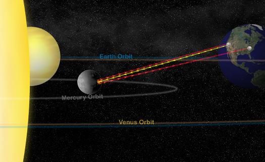
Today’s image comes from an NRAO press relase about measuring slight variations in Mercury’s spin rate, which leads to the conclusion that Mercury’s core is molten, not solid. Yay! Great science. But this picture… (I apologize to Bill Saxton, whose name appears so prominently associated with the picture. I don’t know you, Bill, but I have to admit that your image doesn’t win me over.) As we used to say in the 80s, “So close and yet so far.”
The caption for the image runs a little long for haiku, but not by much: “High-precision planetary radar technique sent signal to Mercury, received reflection.”
The essential point of the image, therefore, must be the little lines (with directional markings) that run between Earth and Mercury: yellow represents radio transmissions, red represents signals reflected back toward Earth (information that could have gone into the caption, I’m just sayin’…). I actually think this comes across pretty well in the picture.
But then, things go slightly awry. In addition to the elements above, we have orbit lines as well as the Sun and Venus—all confusing the central message of the diagram. I even had to do a double-take, looking at the spherical object partially eclipsed by the Sun for a moment before I realized it was Venus (i.e., the planet in between Mercury and Earth that has nothing whatsoever to do with the story). What makes matters worse is that Earth’s orbit and Venus’s seem to lie nearly atop one another! We all know the Mies van der Rohe quote about less being more, and indeed, in diagrams, the aphorism often holds true.
A further note… This strikes me as a situation in which the perspective view is not particularly helpful. A top-down view might communicate the whole situation more clearly, particularly since it would give a little more room to show the path difference between the reflected signals.
(And I can’t help but add one final complaint, which has to do with the random, speckled, “starry” background. Grrrr. We have perfectly good, real stars to use as a background, so why create unrealistic artwork when the real thing looks much, much better?)
Whew! Well, it’s nice to be back. I thought about posting something cheery and positive for my return to the blogosphere. You can see how easily that impulse was overcome!