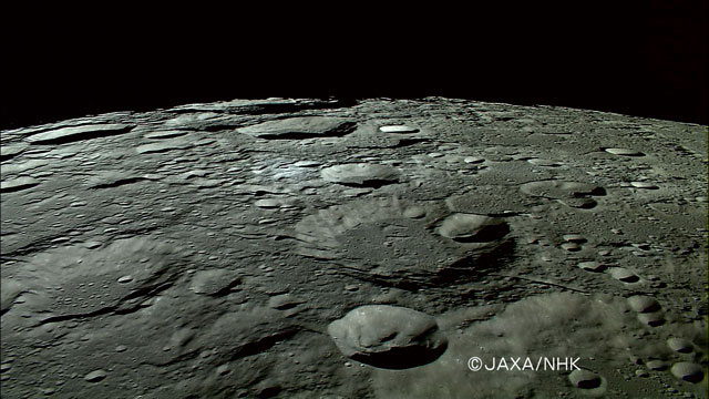
Just an FYI, really. The above image comes from a JAXA web page describing the first high-def video taken from lunar orbit. You can watch a down-res’ed version, too.
Spectacular! Now if we could see it in actual high-definition…
Just an FYI, really. The above image comes from a JAXA web page describing the first high-def video taken from lunar orbit. You can watch a down-res’ed version, too.
Spectacular! Now if we could see it in actual high-definition…
And if I see it crescent, what does that make me?
I know I’ve commented on comics before, as well as on incorrectly rendered moons. But the Family Circus above represents a classic astronomical faux pas—a couple, actually. With a bit of plain stupidity mixed in.
The plain stupidity I’ve already made reference to: it’s a crescent moon, duh. But also, if the moon were seen as a crescent as depicted, the sun would also be up in the sky—i.e., it would be daylight! And a more subtle point can be extrapolated from the orientation of the crescent: either Grandma’s getting Dolly and Billy up very early in the morning wherever they live in Middle America, or they’re staying up after dark in the Southern Hemisphere.
Anyway, it’s like shooting fish in a barrel. I couldn’t resist, as a way of breaking my week-long silence.

Above, we have Ewen Whitaker’s 1954 map of the lunar south pole, which shows up as today’s Lunar Photo of the Day (LPOD), although of course, it’s not a photo… Well, why be picky? It’s a gorgeous drawing described as follows in the LPOD entry: “Despite a fleet of lunar probes and modern high resolution imaging, the best observer’s map of the south polar region of the Moon remains one drawn a half century ago.”
What strikes me as utterly compelling about the above image is what I read as simplicity and clarity in it: the bold lines that delineate craters and ridges, the dotted lines offering a sense of depth, the multiple but surprisingly unobtrusive names and labels. At the same time, these are conventions that I recognize and understand (as well as the general depiction of perspective), and I’m curious to know how a novice would read this image.
Perhaps because I draw, I find such illustrations very compelling. But I think it’s simply the human touch… Utterly apparent in the handwritten words (right down to the question marks) and the quality of the lines on the page (or computer screen). These elements pull me into the image in a way that almost no Adobe Illustrator images can.
But LPOD author Chuck Wood makes an interesting point: there is a clarity and interpretive value lent by the human touch. “The best observer’s map of the south polar region” issues from an artist’s pen, not a digital camera.
Yesterday’s LPOD tells a related but somewhat different story, comparing a drawing and a photo of the same region of the Moon. As the post says, “Sally, an experienced observer and skilled artist, captured the essence, the feeling of this area, and Simon captured the reality. ” The drawing and photo, side by side, reveal something unsurprising yet somewhat poignant. The eye and hand versus the CCD.
The above image is circulating via email accompanied by the following message:
“A scene you will probably never get to see, so take a moment and enjoy God at work at the North Pole. This is the sunset at the North Pole with the moon at its closest point. And, you also see the sun below the moon. An amazing photo and not one easily duplicated. You may want to pass it on to others.
“The Chinese have a saying that goes something like this:
“ ‘When someone shares with you something of value, you have an obligation to share it with others!’ ”
First of all, allow me to assure you that you have no obligation to pass this along to anybody! It’s not what it purports to be. And why do we always attribute sayings to the Chinese? I recently kvetched to some colleagues about the “picture is worth a thousand words” saying being so described, when in fact, it’s due to Fred Barnard, an American advertising manager in the 1920s. Anyway, anyway, anyway,…
This picture is not from the North Pole; it’s computer generated. How can I tell? (Aside from the tell-tale fakeness of the image?) First, the sun and moon are basically the same size as observed from Earth, so you would never see a giant moon like the one above. Also, because of Earth’s tilt, a crescent moon can never appear directly above a setting sun at the North Pole.
This isn’t “God at work”! This is Bryce 3D!
Sigh.
I keep starting to write annoyed and disparaging things, but perhaps I should just go to bed. Just, please, don’t forward this image to anybody. Ever.

Okay, I just returned to New York from San Francisco and immediately had to present a Virtual Universe program at the Hayden Planetarium, so I’m a little worn out. A cross-country flight, an hour or so of talking, plus dinner with friends has left me a tad exhausted.
Therefore, I’m simply going to react to the image above. Taken by an astronaut (nameless, but perhaps not a would-be kidnapper) and stunningly subtle and moving in its content and composition. At first glance, it looks like something done by a member of the International Association of Astronomical Artists, but no… It’s a photograph taken from orbit.
It almost doesn’t look right to me—seems like the shuttle would be higher up than that, field of view strikes me as too small, hard to imagine an astronaut keeping the camera still enough for such an exposure, etc. But the directness of the image manages to overcome all that. The knowledge that a human captured the image makes it intimate, somehow, and the unusual perspective makes it striking. I dunno, maybe I’m just tired, but this picture speaks volumes to me at the moment.

For the second day in a row, I’m taking my cue from Astronomy Picture of the Day (APOD). What a way to start the new year. But instead of light from the early history of the Universe, in the above image we’re looking at light from about a second and a half ago.
APOD actually presents an image similar to the one above, which includes grid lines that make the changing size of the Moon easier to discern. What’s almost impossible to see, however, is the slight nodding of the Moon (its libration) over the period of a year. As I looked at the APOD image, I immediately thought, “This would be much better as an animation!” And indeed, the images above (and the ones featured on APOD) have been assembled into both an animated GIF and a Flash animation. Kewl! I’ve seen simulations of the Moon’s libration, but seeing actual photographs assembled in this way creates a stronger impression.
(I chose this sequence over the APOD version not just because I’m perverse but because it shows one full revolution of the Moon, rather than a revolution-and-a-half. I find it easier to watch when it baically goes through an approximate single cycle then repeats.)
All the images come from Photo Astronomique, a website that features a whole page of animations of celestial phenomena, in addition to other great astrophotography.

