Antarctic Mysteries

An article in today’s New York Times describes new websites from NASA and from USGS, showing high-resolution imagery of Antarctica. Check it out now before it all melts away!

I have some quibbles with the operation of the USGS site (the Java applet behaves a little oddly, provides effectively no information about the location displayed, and shows a map of Antarctica surrounded entirely with white), but it holds promise. And the NASA site has some spiffy stuff…

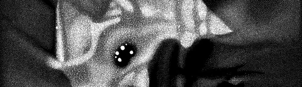
The image above comes from the “Antarctic Mysteries” game, which presents several unidentified photos for the viewer to identify. As a “game,” well, it’s not the most compelling, but I imagine I’m not the only person who looks at the grid of pictures, wonders what such-and-such might be, then clicks on the link to find out. Abstract and unusual, the images seem quite compelling.

What I truly admire, however, is the little extra info that the site provides about each image. For example, the feature above is about 25 kilometers across, located at 79°S, 80°W. Even better, the description includes a note: “This image appears darker than bright white snow because it has been enhanced to make slight contrasts in the snow more visible.” Excellent! Now, that wasn’t so hard, was it? One itsy-bitsy little extra line of text? Good work, NASA!

Inscrutible Ice Cube

A press release from the University of Delaware uses the above image as a stand-in for a Flash animation (provided without explanation) elsewhere on their site. The caption (surprise, surprise) is utterly useless: “How does the IceCube telescope work? Click here to launch the animation, courtesy of the University of Wisconsin-Madison.” Um, thanks.

The thing is, it’s actually a nice enough animation. I like the little Eiffel Tower for scale, and the iconography is relatively clear, except for the color of the dots changing along the path… But it could certainly use some added text or something. And ironically, if you browse down the animations page and look at the very next option, you find a nicely-annotated Flash animation that actually clears up most of the confusion of the previous animation. The colors of the dots remain unexplained, but otherwise, it’s rather spiffy! (If you prefer, you can take a look at the annotated Flash in Swedish, too.)

So what gives? I hope it wasn’t a conscious decision to eschew the animation with text and supporting verbiage! “Oooh, it looks so cluttered that way.”) But the alternative explanation is plain sloppiness. Hmmm.

Holy Ozone, Batman!

(N.B. that the animated GIF above is rather large, about four megabytes, so it could take a little while to load in your browser. If you prefer, a smaller version is also available online.)

Not a new story, really, but an interesting choice of animation to illustrate it. New data from the SCIAMACHY instrument onboard the European Space Agency (ESA) satellite Envisat shows a record-breaking ozone hole—after a few years of improvement, the hole seems to be deepening once again.

When I first glanced at the above image sequence, I reacted with a basic, nonplussed “hmmm.” The data in the middle look screwed up, and I’ve never been a big fan of false color, so I scanned down and started reading the article on the ESA website. When I glanced back at the animated GIF, it was much more interesting! How embarrassing to discover that I’m as much a victim of our culture’s impatience effect as the museum- and planetarium-goers I’m trying to entice into taking lengthier looks at things.

Basically, the above animation does’t hit its stride until about halfway through (mid-September), at which point the change is quite striking (and depressing): a big, black hole develops over Antarctica, swallowing up the continent’s outline like a killer blob from a 1950s sci-fi film. And like the slower-paced films of that era, you have to wait a little while for the punchline.

The only other issue I have with the image is that it doesn’t quite underscore the story, namely that the ozone hole is “deeper” than at any time in the last eight years. To communicate that, the page of figures on the ESA website relies on a bunch of wiggly graphs. All well and good, but how ’bout a side-by-side comparison of two years, even as a still image? Or perhaps a viewer that would allow you to select two years to show side-by-side, clicking through dates in lock step? That would be an impressive and intuitive interface.

Environmental data demand good visualization, for personal impact and political import both. Sadly, we have no superheroes to save us from the ozone problem, and with humanity’s track record for addressing long-term problems, we need all the help we can get.