NSF Visualization Challenge 2008

Another year, another NSF/AAAS Science and Engineering Visualization Challenge. With the opening of my institution mere days away (tonight’s the gala), I’ll limit my comments to short and snarky.

As usual, the quick and dirty way of catching up on the challenge winners is to enjoy the Science magazine interactive thingie: you can browse the images, listen to the podcast, etc. The one thing you can’t do unless you subscribe to the magazine is actually read the article. Bummer. The NSF provides a fairly thorough description of the winners with plenty of links, so you can still get a good sense of who did what.

Most of the winners are truly impressive, and thus unworthy of comment (except I’ll note that I quite enjoyed the “Smarter than the Worm” video). Instead, I’ll of course mention the one I didn’t much care for… The “squidsuckers” image above. We’re looking at tiny suction cups (each less than half a millimeter in diameter, with chitin “fangs”) on the arm of a Loligo pealei squid.

First off, I find the garish colors a bit of a turn-off, and the mediocre alignment of the color to the underlying image doesn’t help. Jessica Schiffman, the doctoral student at Drexel University who created the picture, claims that the film Little Shop of Horrors inspired the color scheme (presumably the Frank Oz version, not the original black-and-white movie). That’s cute and all, but I wonder if a novice viewer would interpret these tiny little maws as individual Audrey Juniors, waiting to consume the squid’s prey rather than simply latch onto it.

Cycling on Water

Images like the one above would captivate me as a child. Better even than some Richard Scarry book, they offered a chance to escape into a single-image story that quite often related to the real world (or universe) around me. I specifically remember water-cycle images as utterly entrancing.

I came across the above in a NASA press release on changes in freshwater distribution, which has some other interesting images that I’ll get to in a moment. But the diagram showing the water cycle usually has lots of arrows in it, kind of like the one associated with the Wikipedia article on the topic. But this one goes for a more organic style, replete with numerous labels (e.g., “soil heterogeneity”) but only a few, sparsely distributed arrows. I’m not sure I feel the connections as well as I’d like.

Of course, nowadays, one also has animations to illustrate the process, such as the 44.0MB epic (oddly entitled “EnergyUncomp640.mpg”), also linked to by the press release. In the animation, we see elements of the water cycle played out in sequence—cleverly coincident with the day-night cycle, beginning at dawn with evaporation and ending at night with clouds disappearing stage right. Again, no arrows. I wonder if the temporal element obscures the underlying process… In other words, does the beginning-to-end sequencing of a cycle not do justice to its cyclicity?

Nitpicks, but… I’m curious.

Both the animation and a high-resolution version of the above show up on GSFC’s excellent “Water Cycle” site, which offers much more detail on the processes involved and pays special attention to the human role in the environment.

But back to the aforementioned press release. It also shows diagrams of data from the Gravity Recovery and Climate Experiment (GRACE), which appear along the right-hand side of the web page (too tricky to reproduce here, since they show up as either uselessly tiny or overly large images on the site). One thing I like about the two images is that they use the same color scale (i.e., a given color represents the same quantity in both images); unfortunately, the color bar is unlabelled, so we have no idea what the units are, or really, what quantity we’re talking about at all. What annoys me, however, is that the sorry old crimson-to-violet color bar rears its ugly head, so we have a rainbow of colors with no logical change represented by, say, the shift from warm colors to cool colors (if there is such a meaning, it’s not described in the captions or in the text of the press release).

So, for example, if we have a map of the United States like the one shown in the press release, I’d want to know that the red regions represent, say, areas with decreasing water resources whereas green regions represent increasing freshwater availability. The color bar wouldn’t have to be labelled with units, but including words that describe what the colors mean would be nice—certainly better than numbers devoid of any context.

The GRACE website also includes a truly bizarre visualization of Earth’s gravitational anomolies. I, um, really don’t know quite what to say. Perhaps I should sleep on it…

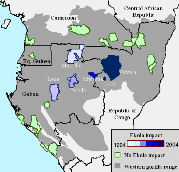
Gorrillas off the Map

The image above comes from a Max Planck press release about the effects of ebola on gorilla populations in southern Africa, which was also published in the current issue of Science magazine. The research has disturbing implications (as discussed in a New York Times piece today), but of course, I’m interested in the diagram…

The caption for the image reads simply enough: “Protected areas with major ape populations.” But it took me a moment to absorb exactly what the image was communicating. The grey area represents the range of the gorilla; the outlined regions indicate protected areas (as per the caption). The color of the protected areas is tan if unaffected by ebola, or in the range from white to dark blue depending on the year of the outbreak(s). For some reason, I found this initially unclear.

I think it’s because the affected areas vary in value—i.e., from a very light color to a very dark color—whereas, if I were creating a similar map, I would opt for varying the value between affected and unaffected regions. To represent the dates, I’d most likely use variation in hue while keeping the value pretty much the same. (If you’re unclear on my usage of the terms “value” and “hue,” I’d recommend a page from Charlotte Jirousek’s online textbook on “Art, Design, and Visual Thinking” at Cornell University.)

Aside from the color choice, I think this is a pretty decent diagram. A fair bit of information crammed into a quite small space.

Questions

This may seem lazy, but… We ended our visualization conference today with a discussion of imaging philosophy. And the above image came up in discussion. It’s the (in)famous “Pillars of Creation” image of the Eagle Nebula, taken by the Hubble Space Telescope, of course, and it’s gotten about as much visibility as any astronomical image of the last few decades. So without much ado, maybe I could just pass along a few questions for those of you who consider yourself members of “the general public” (whatever that means, anyway).

Did you know that the Eagle Nebula doesn’t shine in those particular colors? In fact, it looks more like this pink-ish image from Rob Gendler, which is at least closer in color to what you would see with your eye up to a telescope. Does it bother you that the image represents something that you wouldn’t see through the eyepiece of a telescope? Do you think image specialists are lying to you by presenting images in this manner? (You can learn how the Hubble team makes thir color images by reading “Behind the Pictures” at their website.)

For that matter, how do you think we should describe images like the one above? They’ve often been called “false color.” Does that sound appropriate? What does the term suggest to you? Hubble describes such images as ”representative color.” How does that sound?

As you might guess, those of us in the biz have our own ideas, but I’m curious if anyone out there would like to share their opinion(s).

Thanks!