
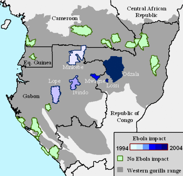
The image above comes from a Max Planck press release about the effects of ebola on gorilla populations in southern Africa, which was also published in the current issue of Science magazine. The research has disturbing implications (as discussed in a New York Times piece today), but of course, I’m interested in the diagram…
The caption for the image reads simply enough: “Protected areas with major ape populations.” But it took me a moment to absorb exactly what the image was communicating. The grey area represents the range of the gorilla; the outlined regions indicate protected areas (as per the caption). The color of the protected areas is tan if unaffected by ebola, or in the range from white to dark blue depending on the year of the outbreak(s). For some reason, I found this initially unclear.
I think it’s because the affected areas vary in value—i.e., from a very light color to a very dark color—whereas, if I were creating a similar map, I would opt for varying the value between affected and unaffected regions. To represent the dates, I’d most likely use variation in hue while keeping the value pretty much the same. (If you’re unclear on my usage of the terms “value” and “hue,” I’d recommend a page from Charlotte Jirousek’s online textbook on “Art, Design, and Visual Thinking” at Cornell University.)
Aside from the color choice, I think this is a pretty decent diagram. A fair bit of information crammed into a quite small space.