Phobos in Stereo

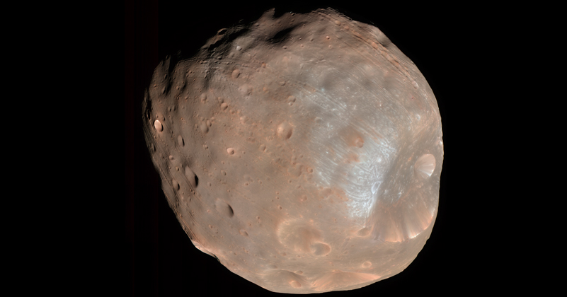
Sometimes I just want to post a kewl image, and this qualifies! The above image of Mars’s moon Phobos stopped me in my tracks this morning, for a multitude of reasons’

First off, it’s color. I don’t recall any earlier color images of Phobos, although I’m too lazy to go check.

Secondly, it’s available in stereo! Which is to say, stereoscopic, not stereophonic. What the rest of the world calls “3D.” This happens to be on my mind, since I’m involved with this crazy construction project, which will eventually house a gorgeous planetarium (of course) as well as a stereoscopic theater. I’m keenly interested in finding content for it, particularly real-world content that isn’t computer-generated. (If you want to watch a video of me from the recent CineGrid conference, you can learn more about my vision for media in the new California Academy of Sciences.)

But lastly, I was especially surprised because the image was taken by the HiRISE camera aboard NASA’s Mars Reconnaissance Orbiter (MRO). HiRISE has taken all kinds of spiffy images of the surface of Mars, but I can only attribute it to a lack of imagination on my part that HiRISE snapping a picture of one of Mars’s moons never occurred to me.

Mars versus HTML


What started out as an impassioned diatribe turns out to be a mere complaint about HTML…

I get press releases in my email. They have URLs. I follow those URLs and (once in a while) end up writing about the press releases on my blog. So, this morning, I received “ESA: Mars Express watches a dust storm engulf Mars,” which pointed me to a page on the ESA site that featured the three images above, inset at different points in the article, and described (from left to right) as, “a dust storm on Mars,” “temperatures in the Martian atmosphere,” and “Mars – thermal radiation spectra.” I clicked on the wee pictures, hoping to be linked to something—nada—and looked for a link to a page of graphics that might offer some explanation—nada y nada y nada.

My ire began to build. That’s an artist’s conception of a dust storm, not an actual image! It should be labelled as such! And those graphs, lacking any axes, any interpretation? Argh! Then I noticed the URL. “SEMPWD361AF_index_2.html”? Hmmm. I changed the “2” to a ”1,” and lo and behold,… A whole page about the images.

Then I remembered the typical ESA page-naming scheme. I changed the “1” to a ”0” and found exactly what I expected in the first place.

So what can I say now? Other than recommend the email notices include the top-level ”index_0.html” link? Well, I think the caption for the animated dust storm should clearly say “artist’s rendition.” And the abscissas in the temperature plot should match. Otherwise, I guess I just have to get started with my day…

Poisoned Intution

The above image comes from a NASA multimedia piece released the other day. Although the caption doesn’t say so, I’m 99% sure that’s exaggerated terrain. It would be nice if the caption indicated that.

This actually qualifies as one of my “Planetarium Pet Peeves” and thus requires little further complaint on my part. I’ll quote two of my colleagues on the topic, even though their words also appear on the “pet peeves” page…

As Chris Anderson puts it, “When we fly audiences over a vertically exaggerated landscape, we poison their intuition about the way these worlds would actually appear.” Or, as my colleague Carter Emmart has been known to observe, “even Iowa looks mountainous when you exaggerate its terrain by a factor of ten.”

Foregrounding

A brief note today, although I should note that I’ve had some networking issues over the last few days, so I’ve actually posted several new items on my blog: a pointer to some sexist imagery, my first-ever post on a video segment, and the obligatory reference to the discovery of Supernova 1987A twenty years ago. Sorry for the glut of words!

Anyway, today’s image comes from ESA’s Rosetta spacecraft. Eventually, the mission will explore Comet 67P/Churyumov-Gerasimenko in excruciating detail, but earlier today, the craft swung by Mars and snapped the above image. According to the ESA website, Rosetta’s lander took the picture less than five minutes before closest approach to the Red Planet.

What I really enjoy about the image is, quite simply, the spacecraft. Yeah, the Mars rovers show up in their own images, but something about seeing the spacecraft in the foreground, Mars just 1,000 kilometers behind… It offers a distinct perspective that most such images lack. I don’t suppose it was conscious decision (rather that the Rosetta lander couldn’t image Mars without getting some hardware getting in the way), but I find it very effective. Yes, we actually build these things and send them into space!

It makes me look forward to 2014, when we’ll get data back about the comet, too.

A Decade Apart, But…

Having returned to New York from the American Astronomical Society meeting in Seattle, I thought I might blog about a non-astronomical topic. But then I saw the latest image from the Mars Reconnaissance Orbiter HiRISE camera. Astronomy it is!

The above image (listed under “Topographic Map of Landing Site Region” on the aforementioned HiRISE page) shows the location of the Mars Pathfinder: the HiRISE image forms the background, while the color-coding (in addition to contour lines visible in higher-resolution images than the one above) represents the same topography as reconstructed from the stereo imagery from the Pathfinder itself. So we’re comparing two very different data sets here, collected nearly a decade apart. Normally, false-color imagery makes me wince, but I have to admit that the picture above makes good use of the technique.

You may also recall the famous panoramic image taken by the Mars Pathfinder, and the new HiRISE page offers a variation that shows the Sojourner rover at various points in its exploration of the site. The latter image has labels that match the false-color image above, so you can try to imagine the site from two very different perspectives, in much the same way that an earlier HiRISE image was coupled with Opportunity data.

Radar on Mars

The above image comes from an ESA press release about radar imaging of subsurface structures on Mars. Basically, the top two “radargrams” somehow map onto the (very colorful) martian surface images below. On the one hand, I can understand why the writers of the press release might be loath to go into detail about the technique employed in going from the top image to the bottom, but I also wonder what people think when they see images like the rainbow-colored pair.

I mean, I look at the superimposed dark radar image and the superimposed dotted white lines—and they don’t even seem to coincide! The image doesn’t support the message.

In a case such as this, it strikes me as potentially helpful to show an image of a simplified situation. Show me the geometry of a crater, perhaps as a cutaway, then show me what an idealized radargram of that would look like. Put in context with actual data, such a cartoon often clarifies an otherwise confusing situation.

You Got Frost in My Crater!

I’m on the road again, with less-than-stellar Internet access, but here goes. Malin Space Science Systems posted a page on Cantauri Crater and another on Sirenum Crater, both of which show evidence that suggests water flowed on Mars within the last decade—in not just one but two locations! A NASA press release also describes the findings.

It’s hard to come up with a better example of a picture being worth a thousand words, because the pair of images above make the story quite clear. The light-colored gully just looks like what planetary geologists suggest that it is. N.B., however, that the later image was taken in 2005. It’s not like they downloaded the data from the Mars Global Surveyor and posted them the next day! The science team went back and observed the same features over a period of a year, under a variety of lighting conditions, in order to make sure they weren’t falling victim to a trick of light.

So with the clarity comes a caveat: the picture may tell a story in and of itself, but good researchers don’t rely on a single image to form their results.

Orbiter Sees Rover

Too freakin’ kewl. The HiRISE camera aboard the Mars Reconnaissance Orbiter (MRO) captured the above image of the Opportunity rover. You can also take a look at a higher-resolution version of the image or a close-up portion of the image that shows the rover.

Now compare it to what the Opportunity rover is looking at now. Coordinated observations! Yay!

Now, if only we could get a high-res camera in orbit around the Moon in order to take pictures of Apollo landing gear! Oh, wait,
that will happen eventually
, I guess. (Of course, people will still question the authenticity of such images, but… C’est la vie.)

High-Resolution Abstract Art

Having blogged remote sensing on Earth in my last post, I guess I should make the leap to remote sensing on Mars…

So, what annoys me about the way the press release describes the above image is that, although the story is “the highest-resolution camera ever to orbit Mars,” the reader is given no sense of scale. You have to go to the caption on the mission webpage to find out that the resolution is about a foot per pixel. If nothing else, the press release could indicate the size of something in the image—for example, the small crater in the lower right-hand corner is about 15 feet across (I checked).

To be honest, I’d like to see a graphic scale on the image, marking out a distance of, say, 100 feet. But that ruins the aesthetic that has started to develop around NASA images. Images from the rovers have their own appeal, but the Mars orbiters send back images that function more as abstract art (take, for example, the Mars Express image of Aureum Chaos). A little scale in the corner of the image would ruin that. I have in mind Elizabeth Kessler’s thesis about Hubble images and their relationship to American culture as I write this.

Mars Facial Reconstruction

The Face on Mars is back! Now using data from the Mars Express orbiter, we have the above reconstruction of the site that was orginally observed by the Viking orbiter back in 1976. The lighting in the original image (as well as a few “bit errors” in the transmission of the data to Earth) made the geological feature look a little like a face, which of course caused some people to speculate that Martians built the site to resemble a face.

The whole story gets interesting on many levels. First of all, no one denies that the initial image looks like a face: people differ on the explanation, however, divided between those who attribute it to Martians and those (including me) who atrribute it to the human propensity for seeing faces everywhere. Humans have evolved to recognize faces, so our brains are built to see the pattern clearly, even when reduced to its simplest elements (think yellow smiley face).

The other thing I find interesting from a science visualization standpoint. The new Mars Express image is not a “picture” of Mars in the same way that the 1976 image is. Instead, it is a reconstruction of data taken by a stereo camera on the orbiting satellite. Basically, you can use information from multiple images taken along a single orbit to reconstruct the three-dimensional shape of the geological formation. But the image as presented is not like a point-and-shoot photo of the site.

So you can almost see where the argument that pro-Martian face-makers could go with this… The orginal image supposedly had “errors” that made it look more like a face. To make the thing look less like a face, those scientists have to resort to all kinds of fancy technical trickery! Such are the complex origins of images to which we are exposed.