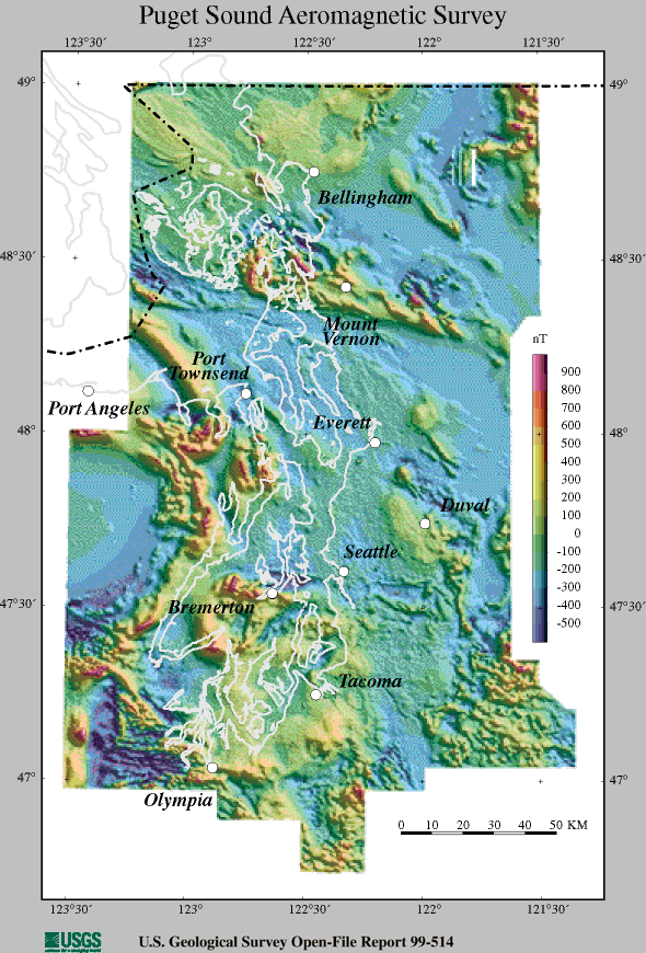
I just arrived in Seattle, Washington for the 209th Meeting of the American Astronomical Society (AAS). I couldn’t find anything else to blog about, so I decided to point out a rather spiffy aeromagnetic survey of Puget Sound.
I didn’t spend a lot of time trying to figure out the above image, but it’s not the easiest thing to read (however interesting the data is). The white line represents the coastline and the color represents the intensity of the magnetic field, but… What exactly is going on with the faux terrain shading? I’m not quite sure.
Anyway, the next few days will probably be taken up with a lot of astronomy stuff as I blog about whatever I see around the meeting. You’ve been warned!

