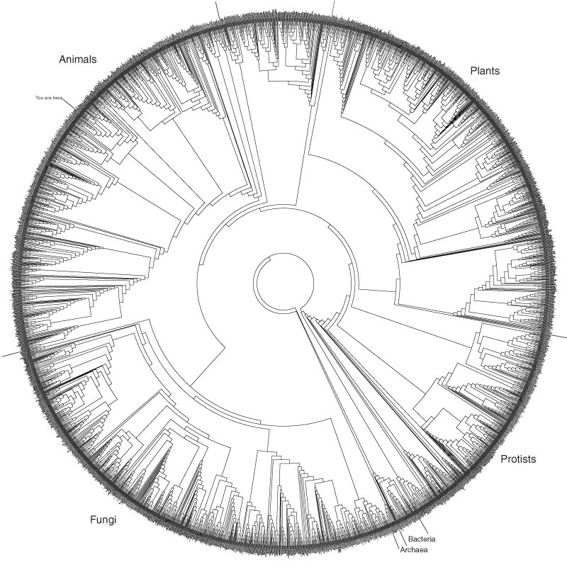
I just ran across the above image, although it has evidently been around for a while. It shows about 3,000 species, arranged in a circle and linked by relationships revealed through analysis of subunit rRNA sequences. A fuller description on the Hills/Bull Laboratory website gives more details, as well as a PDF that allows for either large printing or significant zooming.
What I find absolutely intriguing about this is that the diagram really only offers aesthetics over other illustrations of the Tree of Life, perhaps linking as it does to the “Circle of Life” concept (insert cheesy Elton John ballad here). Siyo Nqoba! But really, the circular representation has no meaning; it just looks good. And there’s absolutely nothing wrong with that, particularly since it evidently continues to inspire people to blog about it. Let’s hear it for aesthetics!
Anyway, for kicks, compare the above to Darwin’s 1837 sketch of branching species, as he was beginning to work out the concepts we now know as Darwinian.
To digress further… Does everyone know about the Darwin Correspondence Online Database? Hours of fun! But sadly, the database privileges the written word over the drawn image, as in this letter to Huxley, which ends with an annoying “DIAGRAM HERE.” Grrr.

