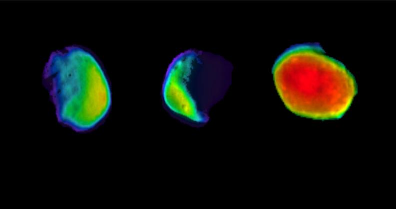
The image above was released as part of a press release entitled, “Why This Martian Full Moon Looks Like Candy.” Geez, what a great question, let me think a minute…
Maybe because you color-coded it to look “like a rainbow-colored jawbreaker” (to quote the press release)? It’s not as if Phobos is actually radiating the ugly rainbow color palette! It was a choice—likely on the part of an ill-informed scientist who created the image and certainly on the part of a lazy press officer who decided to roll with it and compose an insipid headline rather than trying to create an intelligible message for public audiences.
(Sigh. Deep breath…)
To their credit, they at least released a captioned image, too, with accompanying color bar and added information.
And I will note that, what with our possibly intuitive mapping of red to hot and blue to cold—reinforced by water taps and weather maps having long employed red and blue for temperature—there are worse applications of the rainbow palette (for anything other than temperature, basically).
Once upon a time, I wrote thoughtful, nuanced posts for this blog. Now I’m just railing about ending the rainbow! But desperate times call for desperate measures, I suppose, so I’ll just mention that there’s oodles of research out there that demonstrates how the rainbow color palette works against our natural visual perception—an open letter to the climate science community outlines the most egregious issues. I’ll put some more on my resources page soon. “End of the rainbow” even has its own hastag on Twitter!
My real issue with this, at the end of the day, is not even so much the poor (a.k.a. default) choice of color palette as the choice of how to reify the choice by suggesting that the moon of Mars actually looks like candy.
All I can say is, NASA, please don’t give us candy! Give us something nutritious instead.
And maybe next time, I can write about something more substantive, too.