Purple Rose of Virgo?

Okay, I liked the Woody Allen film as much as anybody, but why has ESO titled its latest press release “the Purple Rose of Virgo”?

Aside from my lack of comprehension regarding the obscure (I’m not sure I could even call it “pop”) culture reference, I have a gripe with the reference to color. “Purple” is a tricky color, and one that doesn’t occur via blackbody radiation. So it seems inappropriate to describe a galaxy by a color it only possesses because of image manipulation.

In the biz, we call this “color enhanced.” But it should not suggest the actual color of the object, nor should it be used as the basis for a press release title!

Grumble. Time for more coffee.

(Oh, by the way, that’s a supernova below and to the right of the center of the galaxy! Nifty.)

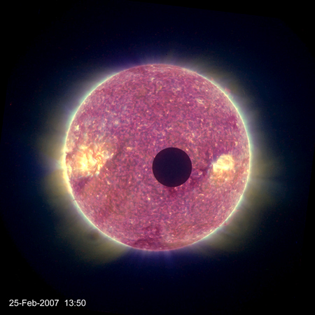
Lunar Transit

NASA’s Solar TErrestrial RElations Observatory (STEREO) mission released a spiffy video of the Moon transiting the Sun. I find myself oddly captivated by the video, watching it over and over…

It reminds me of the good ol’ days of the SGI Reality Centers, when managing high-resolution data was a bigger deal than it is today. They would loop TRACE imagery of the Sun. I think I could watch it for hours, although I never really had the chance. And when we tested audiences for our Cosmic Collisions space show, it seemed I wasn’t alone, since people responded most positively to the solar images.

At the same time, I kind of dislike the color. It seems garish, even though I know it’s done in the standard mappping style. Heck, the web page even tells us: “The Sun as it appears in these the images and each frame of the movie is a composite of nearly simultaneous images in four different wavelengths of extreme ultraviolet light that were separated into color channels and then recombined with some level of transparency for each.” Except for the “some level of transparency” bit, that’s a fairly lucid explanation.

More lucid than this post, I suppose. But you should watch the movie!

Little Day-Glo Orange Spot

The above Hubble image, released back in April, is in the news again because the origin of the so-called “Little Red Spot” seems to be “the only survivor among three white-colored storms that merged together” in the last decade, resulting in a ruddy storm with wind speeds that rival its Great Red Sibling.

But I find this image slightly disturbing. The almost radioactive, day-glo red of the two spots (and excessive blue of the normally white bands) deserves greater attention than it receives in the picture’s caption. All we learn is that “two filters are shown in red/orange (F892N, near-IR strong methane band) and blue/cyan (F502N continuum/cyan light),” which I find less than satisfying. Is that “red/orange” and “blue/cyan” on top of a “true-color” image? I take it to be the case, but the verbiage leaves me guessing. (Certainly when you compare the above to another Hubble image of the same part of Jupiter, taken around the same time, the colors are quite different.)

This is a good place to spend a little time, in my opinion, explaining a bit of process. Mention something about “particular wavelengths of light” or “enhanced color” or something. Make it clear that we’re not seeing Jupiter as it would appear were one to put one’s eye up to Hubble’s eyepiece.

(Um, just in case… That last line was a joke. Hubble has no eyepiece. It’s in space. For more info on how Hubble images are made, please read the lovely “Behind the Pictures” page at the Hubble website.)