
A new press release from the European Southern Observatory (ESO) announces a lack of observational evidence for dark matter nearby: “New measurements show that the amount of dark matter in a large region around the Sun is far smaller than predicted and have indicated that there is no significant dark matter at all in our neighbourhood.”
Pretty significant stuff, but let’s take a look at the accompanying images…
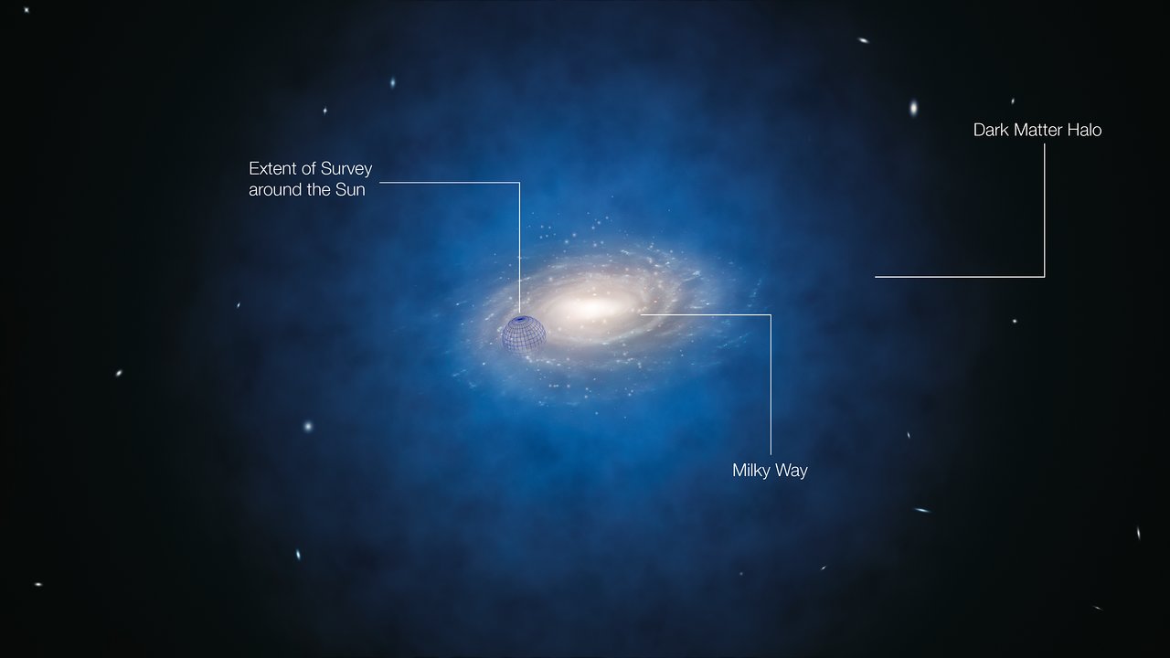
I admire their simplicity, but hey, with dark matter, what choice does a visualizer have? The depiction of the dark matter halo around the Milky Way looks a little clumpy to me, but again, what else can you do? A uniform blob of blue around a galaxy image doesn’t communicate much…
(Admittedly, at the scale of this image, simulations reveal the Milky Way’s dark matter environment to be somewhat clumpy, albeit not in the way depicted in the animation. It’d be keen to use computational data in a visualization such as this one, but I suppose limited time and resources prevent that.)
Anyway, I like the annotated version of the image above; in particular, the indication of the volume of space relevant to the survey.
The accompanying video (available in ESO’s typical plethora of formats) is also an exercise in simplicity, offering a straightforward revolution around the three-dimensional model used to produce the still above. I kinda wish they included the sphere around the Sun once again, just to convey the scale of the survey, but I can guess why they avoided it… Then you have to think about labels, and labels mean language, and it is the European Southern Observatory, after all. Gotta make good b-roll for Hungarian nightly news, I suppose.
And on a final note, not that I would ever nitpick, but… Are those actual galaxy locations in the background? I’ve flown around the Local Group quite a bit, and although adjusting the brightness of the nearby galaxies can change the appearance considerably, I don’t recognize anything in the background. Just curious.
Nice work from ESO, understated but effective. And maybe someday, these kind of press images can be more data-driven.
