Bent Light, Broken Caption

Too much to blog about! I’m getting backlogged… And just to complicate matters, here’s a new graphic from the European Sapce Agency that’s too much to pass up.

The image above shows Titan, Saturn’s largest moon, as seen in a slightly odd mix of visible and infrared light (if you really must know). The white line beneath Titan shows a “light curve,” which represents the intensity of light on the vertical axis, time on the horizontal axis, indicating the brightness of the star measured as it “passed behind” Titan through a trick of rotational and orbital dynamics in our solar system. The dimming of the star as it passes behind Titan reveals information about the moon’s atmosphere, and the peak of light in the center shows that the atmosphere acts like a lens, focussing light from the opposite side of the planet. The press release goes into some detail about how much we can learn from such observations, right down to predicting a bumpy ride for a spacecraft!

Now, I won’t claim my explanation above as the be-all-end-all, but I think the caption on ESA’s page doesn’t offer enough information about what’s going on in the still image. It never explains the term “light curve,” for example. I understand the reluctance to put words on the graphic (not so much for NASA, but for ESA serving a multilingual constituency), but the caption should compensate.

The animation of the graphic shows what’s happening much better, and I imagine the still image will make sense to people once they’ve seen the animation. N.B. that the caption for the animation is the same length as the caption for the still image—a stylistic requirement, I’m guessing. But the still image, with so much less information in it and so much more information implied by it, requires more verbiage to support it.

Quarks of Many Colors

I have to say, I’m kinda floored by this one.

The above image is associated with a December 2004 press release entitled “Jefferson Lab’s journey into the nucleus” that I ran across completely by accident. The non-animated version caught my eye, in part because of the caption: “An artist’s impression of a quark being struck by a virtual photon (a). As the quark propagates through nuclear matter, it loses energy by emitting gluons (b) and creating pairs of quarks and anti-quarks (c). As the system begins to return to equilibrium, two-quark systems (pions) are formed (d).” Admirably, it starts right off with the phrase “artist’s impression.” And quite an impressionistic impression at that!

The caption that appears with the above, animated image (and, inexplicably, the title “Simple Experimental Simulation”) could use a similar qualification, in my opinion: “This movie illustrates the action inside the nucleus of a deuterium atom containing a proton and a neutron, each with three quarks. An electron strikes a quark inside a proton, passing energy to the quark before the electron bounces back. The quark now has so much energy ‘stuffed’ into it, it creates a cascade of new particles as it flies out of the proton. The result is two new, two-quark particles.”

First off, I have to note that having the GIF loop creates a problem, namely that the linear process of the reaction is shown blending back into itself. Awkward to say the least. Initially, I was inclined to blame my browser, but then I took a closer look at the file and noted that it seemed to be designed to loop, and indeed, a quick check with Adobe ImageReady revealed it to indeed be designed as a loop. Yikes! Ideally, there would at least be a few frames of black between the end and the beginning of the sequence, but to design it to loop continuously is highly misleading.

Of course, there’s plenty of misleading aspects to this representation. Basically, what we’re looking at is a Feynmann diagram, which is normally shown as a tinkertoy-type diagram of lines and squiggles (tinkertoys and springs, I guess). The imagery above includes a lot more information—colors represent different types of quarks, for example—which strikes me as rather clever and quite aesthetically pleasing, but…

What troubles me about the image is that it’s using a somewhat representational style to illustrate a fundamentally abstract concept. The almost biological quality of the pions slithering off toward the end may be rather striking, but what does it mean? In terms of communicating the underlying concepts, well, I hate to sound boring, but a more straightforward approach may be better suited. I admire Jefferson Lab for trying something different, but caution is required—or at least a cautionary note!

The initial caption, clearly indicating “artist’s impression” from the get-go, addresses my cautionary concerns, but it’d be even better if there were a brief essay by the artist involved. What choices did he or she make in creating the image? What do the colors mean? What motivated the somewhat biological look of the illustration?

In a medium better known for its objectivity than its artistry, a diagram may deserve a colorful interpretation, but as always, the subjective layer may add unintended meanings.

The UR Image

I just returned from Boston, where I attended the Science and Society conference had poor network access. I had my laptop for making notes, however, so I have posted a few conference-related commentaries—one on Al Gore’s keynote address and another about an Einstein sketch that was used in a presentation.

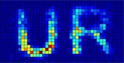
The picture above accompanied a press release from the University of Rochester, describing the storage of image data in a single photon. The concept is actually related to the topic of the single-electron experiment that I described in a recent post, albeit relying on the interference of photons, not electrons.

I’m intrigued by the choice of image used to support the press release. Thanks to digital photography (and probably the Internet, too), people now think of images as information in a way that probably didn’t seem as intuitive even a decade ago. So the use of an image to illustrate stored data makes more sense now that it would have previously.

FYI, the discovery is also described in a Washington Post article that appeared on Friday.

A diagram of the instrument set-up is perhaps not so helpful, at least not without a caption.

Einstein, Illustrator

I have to say that the speakers at the Science and Society Conference, which I happen to be attending, seem averse to using much imagery in their presentations. We’ve seen a video clip and a few PowerPoints, but not as much as I was counting on. In part because I had hoped to blog about and belit—er, critique them here.

Interestingly, in his talk, Gerry Wheeler inserted a diagram similar to the one above (sans kanji). It’s adapted from a letter Einstein wrote to Maurice Solovine on 7 May 1952, depicting a diagram of Einstein’s epistemological view of the scientific process. Briefly, “E” represents the world of sense experience, “A” the axioms of science, and “S”es the specific statements (predictions) that result from the axioms. Arriving at the axioms occurs through a process of “intuitive connection,” according to Einstein, but lead to the specific statements that can be compared to the real world of experiment and experience.

I’m curious why Einstein chose to sketch the idea in such a manner; I’ve looked over some of his papers (my institution organized an entire Einstein exhibit, after all), but he didn’t seem like much of a sketcher to me. And I haven’t asked Wheeler, but I’m curious if part of the reason he highlighted the diagram is because, well, it’s a diagram.

A diagram (particularly in a letter) stands out on a page. It draws your attention. And if you’re at all visual, which I think most folks are, then it may very well stick in your head, becoming a stand-in for the concept it represents. At first glance, it’s hard to see why Einstein would bother sketching this very conceptual and abstract process, but as a communication technique, it certainly makes the point well.

And perhaps, too, the concept resided in Einstein’s brain in a visual way. Perhaps the sketch was the most obvious means of expressing his thought.

I dunno. Perhaps.

Anyway, you can find a low-resolution scan of the actual letter on a Japanese web page describing its contents (Babelfish does an interesting job translating the page, BTW). I assume it’s also reproduced as part of an American Psychotherapy Association article I found, but I didn’t shell out the five bucks to find out—regardless, the article offers a translation of the letter for free! You can also look for a copy of Letters to Solovine, which includes the letter (and many more) in its entirety.

Gore on Television

No picture, just words for this post.

In his opening remarks for the Science and Society Conference, former Vice President Al Gore spoke “off the record,” so I don’t know if I’m supposed to blog about it. So we’ll see if this gets me in trouble.

He spoke about climate change, of course, as well as the Republican “war on science” (although he didn’t use that phrase), although Gore saved his harshest words for television. His objections will sound familiar (the dumbing-down of news and such), but he offered an interesting argument for television’s addictive aspects, namely that it triggers our evolutionary responses to rapid movement in our visual field. Gore also blamed the problems (at least in part) on a transition to “symbolic, image-based communication versus word-based communication.“

Whoa! A rather strong statement from a guy with a movie that just came out on DVD.

I’m just going to ramble for a moment, here, but… The argument, I suppose, would go that television makes us dumber, basically (or as I prefer to say it, television sucks out your brain), which probably has something to do with the fact that engages less cerebral parts of your brain. Perhaps we’re more easily victimized by a technology that communicates directly with the reptile brain in our heads rather than engaging the more abstract language centers we utilize when we read The New York Times or The National Enquirer.

Can’t say I’m inclined to argue much, but of course, there’s unquestionably a place for the medium—the problem is that it has become the dominant means for people (well, Americans at least) to learn about the world.

I was delighted to catch all Gore’s references to Walter Ong’s ideas about transitions in communication technology causing cultural shifts and spurring the advancement of science. I’ve been a fan of Orality and Literacy for some time, and I enjoyed hearing his ideas strung together so fluidly by Gore. And the references ranged much more widely than Ong—history, science, and philosophy all strutted and fretted their hour upon the stage, and I, personally, left thrilled and depressed, thinking how great it would be to have a president who could weave such a narrative.

[Addendum:]

As Rita Colwell, former director of the National Science Foundation, put it at the end of the conference, where was that Al Gore back in 2000?

Stars, Planets, and Dwarfs

The above, rather featureless image of the Sun comes from a Google video that shows the scale of spherical objects in the Universe. It begins with an image of Mercury (N.B. not Pluto) and proceeds through all the planets of our solar system, from smallest to largest, then through a selection of stars of increasing size. The snapshot shows the transition from the planets (those itty, bitty blobs on the right, which are just the giant planets of our solar system) to the stars…

It’s cute. I like it. But here’s the caveat: some stars are smaller than the planets pictured. So the sequence gives the impression that there’s a much greater distinction between the two categories (of “star” and “planet”) than actually exists. In fact, an continuum exists that gives astronomers a bit of a headache. (Check out a comparison chart not dissimilar from the above from the educational resources at the Dwarf Archive.)

Communicating the scale of the Universe is a tricky thing, but as the recent Pluto controversy has shown us, classifying objects (even spherical ones) can be even trickier!

Tip of the hat to my friend who pointed this out.

Missing Link, Missed Opportunity

The above image of a 40,000-year-old skull named “Oase 2” accompanies a press release from the University of Bristol describing how the skull represents a potential intermediate between modern humans and Neanderthals. Allow me to quote at length…

“By comparing it with other skulls, Professor Zilhao and colleagues found that Oase 2 had the same proportions as modern human crania and shared a number of modern human and/or non-Neanderthal features.

“However, there were some important differences: apparently independent features that are, at best, unusual for a modern human. These included frontal flattening, a fairly large juxtamastoid eminence and exceptionally large upper molars with unusual size progression which are found principally among the Neanderthals.”

All well and good, but hey, couldn’t we get some kind of visual representation of that? I mean, I don’t expect to become a paleontologist just by glancing at an image with a press release, but wouldn’t it be keen to point out, I dunno, the aforementioned frontal flattening? Or maybe show me what exactly is meant by “juxtamastoid eminence”? Just to give the reader a sense of what the scientists are looking for. Instead, we get the above: 180 by 185 pixels of black-and-white imagery.

Speaking of black-and-white, what’s the strip at the bottom? I’m guessing it shows scale, but we should either be told what the scale is or we should use Photoshop to get rid of it!

The version of the press release from EurekAlert does a little better: a view of the front of Oase 2 offers more resolution, if nothing else (and the little black-and-white strip appears once again, albeit at the right of the image).

Another missed opportunity.

ESA to Use

I stumbled across ESA’s MERIS Images RApid VIsualization (MIRAVI) page just today. “MERIS” stands for Medium Resolution Imaging Spectrometer, an instrument onboard Envisat that measures solar radiation reflected by the Earth in fifteen regions of the visible and near infrared spectrum; it images the entire surface of Earth every three days. The image above happens to have been the most recent image when I first glanced at the page: the Dominican Republic and Puerto Rico as they appeared this morning (my time).

I like the interface to the data. A map on the right had side allows you to select what part of Earth you want to explore, searching for images of whatever part of the globe you zoom in on. Images appear on the left, and when you select one, its area appears in red on the global map. Nice, simple, straightforward. I love Google Earth, don’t get me wrong, but this interface to rapidly-updated data does a good, no-frills job.

Inside the Image, from B to Z

A friend just pointed out to me that Apple has launched a feature called “Inside the Image” on its science site. Perhaps this is a prelude to the Image and Meaning 2.3 workshop being hosted at Apple HQ in Cupertino (I’m going to attend, actually), since the first “Inside the Image” is written by none other than Felice Frankel, who started Image and Meaning several years ago…

It looks like I now have some competition in the science imagery blogging game (although I don’t expect that the Apple page will updated on a near-daily basis), since the site is devoted to describing “how images made in laboratories and publications in science advance our understanding of the world around us.”

The first installment discusses the images above and contrasts the time-sequenced grid with a sequential display of the images played out as a film of sorts. The images show a Belousov-Zhabotinsky reaction, a nonequilibrium chemical reaction that can result in oscillating patterns. Typical of Frankel’s imagery, the above distills the event with stunning elegance and simplicity, as if she had photographed the Platonic ideal of the experiment. (Compare Frankel’s elegant images to a gallery of others’ attempts at capturing the same sort of reaction. She’s good! Look for many more examples, along with detailed descriptions of how she works, in her book, Envisioning Science: The Design and Craft of the Science Image.)

Frankel ends her column with a rumination… “ If we study one frame next to another, as we may here in this grid, we might get to see ‘more’ in a way. We can compare one moment to the next and truly see more of what’s going on. See for yourself. Are you seeing the same information in both of these visual expressions of the B-Z Reaction?” Frankel’s tentative query suggests an argument from Susan Sontag’s (brilliant, I should note) On Photography, which privledges the still photographic image over the film or video. The difference lies in subject matter: Sontag addresses imagery rooted in the real world, in experiences not far removed from our day-to-day existence, whereas Frankel’s photography most often traffics in abstractions of highly specific and elusive scientific “moments.”

In short, I’m not sure that viewing the images side-by-side allows us to “compare one moment to the next and truly see more of what’s going on.” I have previously argued in this space that a sequence of images arranged as a film clip often permits one to see relationships that are easily missed when the same images are viewed in the comic-strip style above—admittedly, those were images showing the extremely subtle effect of lunar libration, but that kind of direct comparison, cross-fading from one still image to another, shown at the same scale, provides an excellent opprtunity to notice minute differences.

Furthermore, I would point out that a grid-like arrangement of images does not always indicate time-resolved data—a grid of MRI images, for example, often shows spatially-separated “slices” of a brain.

So there’s a place for both arrangements, but in general, I prefer to see time-sequenced images organized temporally, not spatially.

One final gripe. I’m also slightly annoyed by the incomplete information given about the reaction: we’re told that images were captured every 11 seconds, but then Frankel admits that she “edited the number of images down to 12 to create this grid in Photoshop on my Mac,” leaving me to wonder how long this reaction actually took. I mean, it’d be nice to know…