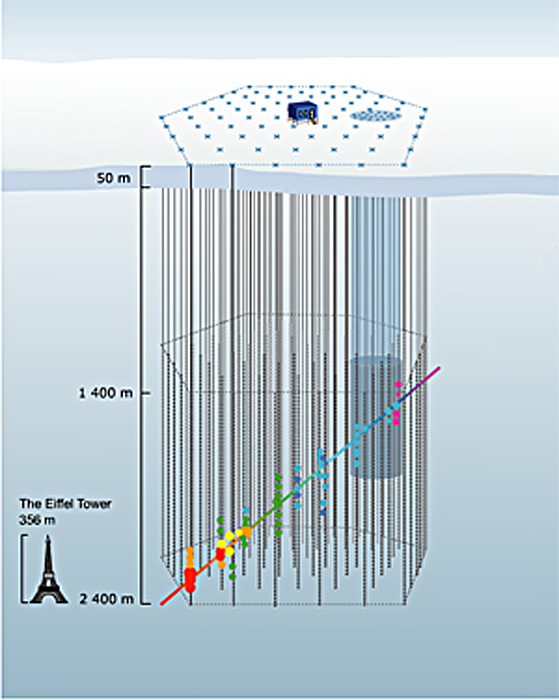
A press release from the University of Delaware uses the above image as a stand-in for a Flash animation (provided without explanation) elsewhere on their site. The caption (surprise, surprise) is utterly useless: “How does the IceCube telescope work? Click here to launch the animation, courtesy of the University of Wisconsin-Madison.” Um, thanks.
The thing is, it’s actually a nice enough animation. I like the little Eiffel Tower for scale, and the iconography is relatively clear, except for the color of the dots changing along the path… But it could certainly use some added text or something. And ironically, if you browse down the animations page and look at the very next option, you find a nicely-annotated Flash animation that actually clears up most of the confusion of the previous animation. The colors of the dots remain unexplained, but otherwise, it’s rather spiffy! (If you prefer, you can take a look at the annotated Flash in Swedish, too.)
So what gives? I hope it wasn’t a conscious decision to eschew the animation with text and supporting verbiage! “Oooh, it looks so cluttered that way.”) But the alternative explanation is plain sloppiness. Hmmm.
