Inscrutible Ice Cube

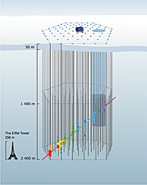
A press release from the University of Delaware uses the above image as a stand-in for a Flash animation (provided without explanation) elsewhere on their site. The caption (surprise, surprise) is utterly useless: “How does the IceCube telescope work? Click here to launch the animation, courtesy of the University of Wisconsin-Madison.” Um, thanks.

The thing is, it’s actually a nice enough animation. I like the little Eiffel Tower for scale, and the iconography is relatively clear, except for the color of the dots changing along the path… But it could certainly use some added text or something. And ironically, if you browse down the animations page and look at the very next option, you find a nicely-annotated Flash animation that actually clears up most of the confusion of the previous animation. The colors of the dots remain unexplained, but otherwise, it’s rather spiffy! (If you prefer, you can take a look at the annotated Flash in Swedish, too.)

So what gives? I hope it wasn’t a conscious decision to eschew the animation with text and supporting verbiage! “Oooh, it looks so cluttered that way.”) But the alternative explanation is plain sloppiness. Hmmm.

Interfering

I just finished reading Robert P. Crease’s The Prism and the Pendulum: The Ten Most Beautiful Experiments in Science. The image above comes from the experiment Crease describes in his chapter “The Quantum Interference of Single Electrons.” A related editorial from Physics World, the same publication for which Crease wrote his original articles about “beautiful experiments,” goes into greater detail about the double-slit experiment, and the Wikipedia article on the same topic does a better job explaining than I care to attempt.

Indeed, the story behind the images above (easily read as a sequential series by people familiar with comics) is long and complicated. It has to do with the so-called “wave-particle duality” of electrons, which basically means that, under certain circumstances, electrons’ behavior is described by the mathematics of waves, while under other circumstances, we can think of them as particles. (They’re neither: “wave” and ”particle” are simply two mental images that humans rely on to visualize such behaviors.)

At any rate, the sequential images reveal the build up, over time, of an interference pattern between individual electrons passing through a double slit of sorts. Our intuition of electrons as particles runs right up against their behavior as waves in this case, because the individual electrons that form the images above slowly build up into an interference pattern, the likes of which we expect from waves.

In case all this gives you a slight headache (as well it might), you can check out a couple of films that describe the phenomenon quite beautifully…

Crease references a 14-minute movie from 1974, available from the Italian Institute for Microelectronics and Microsystems, which tells the story carefully, beginning with ripples in a fountain and proceeding through light interference to electron interference. A word of warning, however: the movie files clock in around 150MB. (Nosing around the parent directory yields links to better-quality versions of the film, BTW, although the files sizes are even greater.) For those with a bit of physics background, the film succeeds in providing a good sense of what’s going on (with extensive use of animated diagrams), although the visualization of the actual data leaves a bit to be desired.

Fear not, however! A web page from the research and development group at Hitachi also describes the double-slit experiment, and it links to a page with movies, including a 10.4MB MPEG demonstrating the accumulation of electrons much more clearly than the 1974 film. But hey, they had 15 years to work out the kinks.

So where am I going with all this? Well, I found my response to the various media rather interesting. I majored in physics (well, astronomy, technically, but our slogan was, “more physics than physics majors”), so I knew the story the images were supposed to be telling. The sequential series above is certainly more than enough for me to get the gist. But actually watching the videos introduced some challenges: in particular, the limitation of the imaging capabilities in 1974 makes seeing the phenomenon tricky, but combined with the compression artifacts (e.g., the blockiness caused by the MPEG-4 compression), it starts to take some imagination to reconstruct the experiment in the mind’s eye. Thus, the images “say” only what we’re prepared to “hear.” The story I extract is the story I already know.

The Hitachi video pretty well circumvents the data problem with the 1974 film, however, so taken together, the narrative of the folder film plus the data representation of the latter tell a decent story. I think. But I’ve heard this one before.
Well-Behaved Sheep

I always wonder how people without a physics background perceive images such as the one above. It illustrates an ellipse of cobalt atoms (the series of peaks encircling the colorful, rippled interior) enclosing electrons (basically the ripples). So much symbolic language is built into this illustration that I can’t imagine it communicating much of anything to an audience not steeped in the visual parlance of physics. The cartesian plane representing the substrate on which the cobalt atoms are placed, the color-coded quantity in arbitrary units, the unexplained labels “F1”and “F2” right in the middle of everything… What does all this say to the non-specialist?

The image caption describes the enclosed electrons as “behav[ing] like standing waves in a pond.” So if uninitiated readers can wrap their heads around the idea that electrons (which they probably imagine as little particles) behave like waves, then the description might mean something to them.

That description is a far sight better than the press release from the Max Planck Society, which claims that “randomly vapour-deposited atoms arrange themselves in regular structures within the circular fencing – as if they were sheep arranging themselves neatly in a pen.” Now, I didn’t grow up on a farm or anything, but sheep don’t strike me as the most self-organized critters. I mean, if you pack any roughly regularly-shaped objects tightly enough, you often end up with patterns, but that’s not what they’re talking about here. The analogy falls short.

In short, the image above neatly illustrates a problem I touch on in my “What Is Viz?” PowerPoint, namely the challenge of a well-developed visual language getting in the way of communicating. Graphic elements that make sense when presenting data to one’s peers can prove insurmountable to a wider audience unacquainted with the (often complex) grammar and vocabulary of such a visual language.

What Are the Chances?

Two violent physics simulations in one day?

A friend just pointed me to a post by David Pogue at The New York Times in which he describes Line Rider, an online applet that allows you draw (potentially dangerous) terrains that a little sledder proceeds to cruise along (potentially fatally), subject only to the law of gravity. Oddly enough, Seed magazine’s “Daily Zeitgeist” for today linked to a video on YouTube that also uses physics simulators for nefarious ends.

It’s about time we brought some humanity to an otherwise abstract science!