Visualizing Dark Matter

So I’d just finished writing my previous post, and lo and behold, a press release from Hawaii arrives in my email inbox. The image above shows gravitational lensing in a group of galaxies—which is to say, not a cluster of galaxies but a structure much smaller and less massive. This is the first time lensing has been observed resulting from such low-mass collections of galaxies.

Coincidentally, the discovery of the first gravitational lens was published exactly twenty years previous—in January 1987—also by the Canada-France-Hawaii Telescope (CFHT). The original image can be found on the page of images that accompanies the new announcement.

The image lacks much meaning for the uninitiated, although an accompanying image that shows how lensing works can clarify the concept greatly. (Unfortunately, those vary widely in quality and ability to induce or reduce confusion, but that’s a subject for a lengthier post.) Even better, you can connect research images with, say, an animation (with appropriate descriptive elements) that shows lensing, along the lines of one available on the Wikipedia site.

As an aside, I should mention that the light gets bent more by dark matter than the luminous matter in the galaxies. So in a sense, gravitational lenses allow us to visualize dark matter… (That’s my excuse for the subject of this post.)

Colliding Lasers

A EurekAlert about lasers mimicking the properties of superfluids uses the above image to illustrate its message. The caption reads, simply enough, “Princeton University researchers used lasers to model colliding shock waves in superfluids.” And somehow, the image communicates enough (not much, but enough) to make me appreciate that, get the punchline, and move on. I get the idea that the image was made using lasers, and it looks like something is colliding, so… Okay, I’m with you.

Or maybe it’s just the colors. I like the colors.

Doctor Octopus

As the holidays approach, my comments get more insipid. But I saw the image above as part of a Johns Hopkins press release about using a “snake-like robot” for minute medical procedures. Perhaps this is just a continuation of the previously-referenced “tactilizing” work, but I was rather charmed by the picture.

Of course, I am a bit of a comic-book freak. And even though Spider-Man was never a favorite, the association with Doc Ock at least enhances the kewlness factor.

What the heck are the little colored things it’s picking up, though?

Zoom in the New Year

The Hubble Space Telescope released the image above as part of a “Celestial Season’s Greetings” release. Nice enough picture, and although I’m unclear on the seasonal part, I find it interesting that Hubble site has joined in the zoomify style of presenting images.

I ran across “The Big Picture” site at Caltech this week as well, although I think it’s been around for a while.

An interesting, new, albeit content-less way of interacting with the imagery.

CG Takes Flight

A press release from Brown University describes the evolution of structures required for flight. Turns out that a specific ligament (labeled “AHL” in the above image) provides stabilization to maintain a gliding posture in pigeons—computer modeling permitted the calculation of the necessary forces and also resulted in a pretty spiffy image to illustrate the findings. It actually took me a moment to see the symmetry in the image, but as soon as I “read” the pigeon’s beak pointing to the right, it snapped into place. Nice work.

The caption for the above reads, entertainingly enough, “Using computer modeling, treadmills and the fossil record, researchers have shown that the acrocoracohumeral ligament (AHL), a short band of tissue that connects the humerus to the shoulder joint in birds, was a critical element in the evolution of flight.” The treadmills, BTW, came into play when alligators (close but obviously flightless relatives of the birds) were x-rayed while walking; researchers found that muscles, not ligaments, supported the shoulder. The fossil record seems to indicate that the ligament structures evolved gradually.

Also, it’s worth noting that the image is credited to the researcher himself, David Baier, who seems to have recently gotten his Ph.D. It’s great to see imagery coming directly from the person doing the work. The Brown University Ecology & Evolutionary Biology Newsletter from May 2004 describes some related work and makes mention of Baier.

Fungi Card Catalog

The image above accompanies a press release from Berkeley about research being done with a vast collection of fungi. Matteo Garbelotto (the fellow in the picture) is sifting through 28,000 samples housed at the Venice Museum of Natural History to create a database of fungal DNA.

I have previously belittled the use of scientist-at-work images, but I quite like this one, in large part because it represents an aspect of the scientific endeavor that doesn’t occur to most people. The sheer scope of this kind of collections-based research is familiar around the halls of my home institution, but I don’t think it occurs to the majority of people how much drudgery goes into a lot of research. And how, sometimes, you just have to flip through things the good old-fashioned way.

That said, it would have been nice to complement the images with a high-tech DNA something-or-other, just to illustrate the contrast between 19th-century card catalogs of fungi and 21st-century methods of analysis.

I also have to note, admitting my typical ignorance of most science biological, that I had no idea of the role played by fungi until I read Michael Pollan’s brilliant Omnivore’s Dilemma. As the Wikipedia article on fungi notes, “Fungi often have important symbiotic relationships with other organisms. Mycorrhizal symbiosis between plants and fungi is particularly important; over 90% of all plant species engage in some kind of mycorrhizal relationship with fungi and are dependent upon this relationship for survival.” Holy toadstool, Batman!

Radar on Mars

The above image comes from an ESA press release about radar imaging of subsurface structures on Mars. Basically, the top two “radargrams” somehow map onto the (very colorful) martian surface images below. On the one hand, I can understand why the writers of the press release might be loath to go into detail about the technique employed in going from the top image to the bottom, but I also wonder what people think when they see images like the rainbow-colored pair.

I mean, I look at the superimposed dark radar image and the superimposed dotted white lines—and they don’t even seem to coincide! The image doesn’t support the message.

In a case such as this, it strikes me as potentially helpful to show an image of a simplified situation. Show me the geometry of a crater, perhaps as a cutaway, then show me what an idealized radargram of that would look like. Put in context with actual data, such a cartoon often clarifies an otherwise confusing situation.

Cycling on Water

Images like the one above would captivate me as a child. Better even than some Richard Scarry book, they offered a chance to escape into a single-image story that quite often related to the real world (or universe) around me. I specifically remember water-cycle images as utterly entrancing.

I came across the above in a NASA press release on changes in freshwater distribution, which has some other interesting images that I’ll get to in a moment. But the diagram showing the water cycle usually has lots of arrows in it, kind of like the one associated with the Wikipedia article on the topic. But this one goes for a more organic style, replete with numerous labels (e.g., “soil heterogeneity”) but only a few, sparsely distributed arrows. I’m not sure I feel the connections as well as I’d like.

Of course, nowadays, one also has animations to illustrate the process, such as the 44.0MB epic (oddly entitled “EnergyUncomp640.mpg”), also linked to by the press release. In the animation, we see elements of the water cycle played out in sequence—cleverly coincident with the day-night cycle, beginning at dawn with evaporation and ending at night with clouds disappearing stage right. Again, no arrows. I wonder if the temporal element obscures the underlying process… In other words, does the beginning-to-end sequencing of a cycle not do justice to its cyclicity?

Nitpicks, but… I’m curious.

Both the animation and a high-resolution version of the above show up on GSFC’s excellent “Water Cycle” site, which offers much more detail on the processes involved and pays special attention to the human role in the environment.

But back to the aforementioned press release. It also shows diagrams of data from the Gravity Recovery and Climate Experiment (GRACE), which appear along the right-hand side of the web page (too tricky to reproduce here, since they show up as either uselessly tiny or overly large images on the site). One thing I like about the two images is that they use the same color scale (i.e., a given color represents the same quantity in both images); unfortunately, the color bar is unlabelled, so we have no idea what the units are, or really, what quantity we’re talking about at all. What annoys me, however, is that the sorry old crimson-to-violet color bar rears its ugly head, so we have a rainbow of colors with no logical change represented by, say, the shift from warm colors to cool colors (if there is such a meaning, it’s not described in the captions or in the text of the press release).

So, for example, if we have a map of the United States like the one shown in the press release, I’d want to know that the red regions represent, say, areas with decreasing water resources whereas green regions represent increasing freshwater availability. The color bar wouldn’t have to be labelled with units, but including words that describe what the colors mean would be nice—certainly better than numbers devoid of any context.

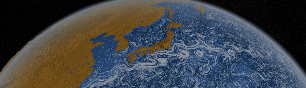
The GRACE website also includes a truly bizarre visualization of Earth’s gravitational anomolies. I, um, really don’t know quite what to say. Perhaps I should sleep on it…

What a Drag

Recently, commenting on images seems to mean complaining about captions. How sad. But here I go again…

The image above accompanies a press release on a three percent reduction in upper-atmosphere density by the year 2017. The caption for the image reads simply, “The outermost layer of the atmosphere will lose three percent of its density over the coming decade.” Which is all well and good (I mean, the caption is all well and good), except that it leaves one wondering what the satellite is doing in the image. Perhaps the caption could be expanded slightly to read, “The outermost layer of the atmosphere, which extends as high as some satellite orbits, will lose three percent of its density over the coming decade.” Just as a first pass.

A little later in the press release, we find out that “lower density in the thermosphere, which is the highest layer of the atmosphere, would reduce the drag on satellites in low Earth orbit, allowing them to stay airborne longer.” Well, golly, that makes an even better caption: “The outermost layer of the atmosphere will lose three percent of its density over the coming decade, allowing satellites to stay aloft longer.” (Somehow, “airborne” seems inappropriate when applied to a satellite.)

And while I’m discussing language instead of images, what’s up with the headline for this press release? “Scientists Predict Carbon Dioxide Emissions Will Reduce Density of Earth’s Outermost Atmosphere by 2017.” Um, well, actually, emissions have already reduced the density, and they will most likely continue to reduce the denisty long after 2017. Somewhat deceptive.

Pencil versus CAD

A Monday-afternoon lamentation on seeing ESO’s press release on the European Extremely Large Telescope. I noticed the above computer-generated rendering of the telescope, and I reflected back on my recent trip to Pasadena, where my coworkers and I wandered along the corridors of the Caltech astronomy department admiring the drawings of Russell W. Porter, who created remarkable illustrations of many of the telescopes at Mount Palomar.

Caltech’s archives offer mediocre reproductions of Porter’s work, but Bruce Weertman has assembled a much more impressive page of the drawings. Nothing compares to seeing the originals, however, and although I have heard tell of a book collecting his work, my (admittedly cursory) searches haven’t revealed anything definitive.

Looking at the above image, the little tiny figures on the lower half of the (oddly shiny) disk show two people and a pick-up truck to scale with the rest of the telescope. Extremely large indeed! Porter provides a similar sense of scale in virtually all of his drawings (an overview of the 200-inch telescope at Mt. Palomar, for example), and many of his illustrations also show the path light follows through the telescope in addition to mechanical deatils such as gears and supports. He packed a lot into his work.

According to an article on Kevin Hulsey’s website, “famed artist Maxfield Parrish was quoted as saying the following about Porter’s drawings: ‘If these drawings had been made from the telescope and its machinery after it had been erected they would have been of exceptional excellence, giving an uncanny sense of reality, with shadows accurately cast and well nigh perfect perspective; but to think that any artist had his pictorial imagination in such working order as to construct these pictures with no other mechanical data than blue prints of plans and elevation of the various intricate forms is simply beyond belief.’ ”

Long before CAD programs made the job easy (or at least easier), Porter sketched out spectacular visualizations of these phenomenal mid-century achievements. I wonder what we lose by working in an almost exclusively computer-generated realm nowadays. I’m not suggesting going back (necessarily), but… Just wondering.